Complexity in Financial Services: Can We Really Bank Simple?

Financial confusion Despite the best intentions of governments worldwide, does anyone really believe that consumer financial services will become simpler anytime soon?

Yet, I’ve been intrigued by Bank Simple and apparently, so have many others. Evidently, Twitter/Square founder Jack Dorsey and TechCrunch founder Michael Arrington talked about Bank Simple on stage at the TechCrunch Disrupt conference this week.

While most articles are hopeful, first-mover skeptics have already posted counterpoints to the startup’s “motherhood and apple pie” messaging (make sure you read the comments on Ron Shevlin’s post).

I can’t remember any financial entity, other than those with celebrity founders (Square, Revolution Money, Virgin Money) receiving this much attention before it even launched (note 1).

imageI still don’t know exactly what Bank Simple will offer. Certainly, they have a great name and a positioning that’s right for the times. But can they live up to it? Basic banking really is pretty simple. You deposit some cash, earn some interest, then take it out and give it someone else. Rinse. Repeat.

Innovation often creates complexity
Banking got complicated only when new features were introduced. People got tired of going to the bank, pulling cash out of the vault, and hauling it around to pay people. So checks were invented. Payment became much easier, and personal security greatly enhanced. And as a nice by-product, the returned check was the first PFM tool, serving as a handy authenticated record of who was paid for what, when.

That worked great for a couple generations, but then too many people wrote too many bad checks and it started to become a slow and cumbersome process to identify yourself at the point of sale. So debit cards came along to speed the purchasing process, fight fraud, and return some fee income to the issuing banks (note 2). And the electronic records of merchant name and SIC code made record keeping even easier, originally on paper statements and now online.

Those two innovations, checks and debit cards, really helped consumers save time and hassle. But did they make finances simpler? Not really. Those payment services led to NSF/overdraft fees, PIN vs. signature decisions, card authorizations, check-hold times, float, authorization holds, chargebacks, annual fees, check-printing fees, positive pay, reverse positive pay, remote deposit capture, mobile remote deposit capture, Quicken, My Spending Report, Mint, interchange regulation. The list goes on and on.

It may not be simple, but no one (except visitors to this UAE hotel) is going back to carrying gold nuggets to the general store to buy crackers out of a barrel.

Technology MIGHT be the answer
Technology advances often bring wonderful, sometimes life-altering, benefits (think electricity or water purification), but often at a cost of increased complexity. As much as I love, love, love the Internet, it’s not known for its overall ease of use.

But there’s a glimmer of hope on the horizon, and you are carrying it in your purse, pocket, or briefcase.

The smartphone.

I’m still amazed at my iPhone after more than 2.5 years of continual use (note 3). It’s the one and only device I’ve owned that makes life better AND simpler, albeit at a hefty monthly fee.

And I believe mobile apps will ultimately make banking better AND simpler. Why?

  • The phone knows who you are and where you are, vastly simplifying authentication at the point of sale and reducing fraud significantly.
  • The phone (via real-time links to the bank and retailer) knows exactly how much money you have and what you are buying, virtually eliminating overdrafts and unknowingly overspending.
  • The phone can provide an instant, secure way to pay any person or any business, with immediate settlement.
  • The phone has built-in scanning capabilities for depositing checks, capturing receipts, documenting insurance claims, etc.
  • The phone has access to every database on the planet to assist in shopping, evaluating, financing, insuring and closing any deal for any thing.
  • And if you have a question about any of the above, just speak into the device and you’ll get an answer in moments via voice recognition self-service.

So yes, there is hope for banking/financial simplification, and I think it will almost exclusively come through mobile apps with the occasional visit to an online mission control (note 4). So if you want to compete with Bank Simple, or Bank of America for that matter, get cracking on your mobile strategy (note 5).

Notes:
1. Now that Twitter’s Alex Payne has been added as a co-founder, Bank Simple could probably be classified as a celebrity-founded company.
2. I’m still using my first-gen phone bought in Oct. 2007. The battery is still very strong, the touch-screen virtually unmarked, system performance seems unchanged, and it only crashes a couple times every year despite being carried, set down, and tucked away day in and day out.
3. This is a vast oversimplification of the move to debit cards, but the point is they disrupted checks at the point of sale.
4. If you are still unconvinced that mobile will overtake online for banking tasks, here’s a thought:  Consider how often you go online now to check the local weather. A waste of time — right? — when all you have to do is press a button on your smartphone. The same near-instant response will happen for basic banking info.
5. In our Online Banking Report, we’ve published several reports on mobile banking strategies.

Links from My FIS Presentation

image Thank-you to all FIS clients that attended my What’s new in mobile/online banking presentation in Orlando or Milwaukee. I had a blast and I greatly appreciate your attentiveness as I tried to explain the innovations from the following 40+ companies. Feel free to email me if you have any questions.

As promised, here are the links so you can dig deeper yourself. The entire deck is available to conference attendees through the FIS website. The links are in the order they were presented (with slight variations between the two): 

Mobile

1. Addison Avenue Credit Union augmented reality mobile ATM finder: https://addisonavenue.com/mobile/. Powered by Junaio from Metaio.

2. Tombstonebuilder.com for custom gravestone graphics

3. E*Trade Mobile Pro iPad app: http://itunes.apple.com/us/app/e-trade-mobile-pro/id313259740?mt=8

4. NBA mobile’s Game Time Courtside iPad app: http://itunes.apple.com/us/app/nba-game-time-courtside/id364284970?mt=8

5. My Kitchen iPad YouTube video (293,000 views) (see end of post for video)

6. Square’s iPad POS system app: http://itunes.apple.com/us/app/square/id335393788?mt=8

7. Mitek mobile deposit: http://www.miteksystems.com/OOMPH_MobileDeposit.asp

8. PayPal mobile Bump-to-Pay app: http://itunes.apple.com/us/app/paypal/id283646709?mt=8 powered by Bump Technologies

9. USAA mobile: https://www.usaa.com/inet/ent_utils/McStaticPages?key=usaa_mobile_iphone_main

10. Starbucks card mobile payments app: http://www.starbucks.com/coffeehouse/mobile-apps/starbucks-card-mobile

11. PayPal text-message security option: https://www.paypal.com/cgi-bin/webscr?cmd=xpt/Marketing_CommandDriven/securitycenter/PayPalSecurityKey-outside

12. Bank of America Safepass text-message security option

13. Chase Bank text banking: https://www.chase.com/index.jsp?pg_name=ccpmapp/shared/assets/page/Chase_Mobile_Banking

14. Virtual Bank Web-based mobile apps: http://www.virtualbank.com/VBanking.aspx

Online

15. Mint.com online financial management; financial fitness

16. PNC Bank Virtual Wallet calendar view financial management

17. Bobber Interactive teen/pre-teen game-oriented savings platform

18. SmartyPig goal-based savings combined with prepaid cards

19. Betterment savings account replacement launched this week

20. Credit Karma private-branded Sears Card site

21. DebtGoal debt-management and payment tools

22. Payments in social gaming at Zynga’s Farmville and Foopet’s Foobank

23. Kwedit’s virtual credit services and real payments for virtual goods

24. Blippy’s real-time transaction and media consumption streams

25. Parkzing automated parking ticket reminder and payment service

26. MoneyAisle’s new auto refinance auction service

27. TransFS’s merchant card processing lead-gen site

Channel Integration/Social Media

28. Baker Tweets

29. Quicken Loans Twitter feed

30. Social media links at Amplify Credit Union 

31. Chase Bank’s Chase Community Giving Facebook fan page

32. University of Wisconsin Credit Union Sourcecode blog supporting online banking users

33. Truliant Federal Credit U
nion
 blog

34. PNC Virtual Wallet Inside the Wallet blog (accessible only from within online banking)

35. Young & Free South Carolina from South Carolina FCU powered by Currency Marketing 

36. Kennebunk Savings employee directory and branch finder

37. Bank of Montreal branch finder (link in upper right of homepage)

38. Blue Shoe Mobile Solutions low-cost ($500) iPhone app creation for restaurants

New Online Banking Report Available: Online Personal Financial Management (OFM) 3.0

image

Online Personal Financial Management 3.0
Taking online banking to the next level with personal financial management tools and guidance (note 1).

It’s been almost four years since our last full report on online financial management (OFM). At that time (summer 2006), there was no Mint, no My Portfolio from Bank of America, and few offerings from major fintech vendors.

Yodlee was the only major player with a true OFM product, one that by year-end 2006 would be on the map in a serious way as the machinery behind BofA’s new offering (2006 post).

Back then, users that wanted financial management features still relied on desktop software, primarily Intuit’s Quicken and Microsoft Money.

The market has changed dramatically since then:

  • Microsoft discontinued its desktop PFM altogether in 2009.
  • Mint launched in 2007, quickly picked up a million users, and was acquired by Intuit for $170 million in late 2009.
  • Intuit put Quicken online, then discontinued it, in favor of its new Mint.com brand.
  • Intuit purchased Digital Insight and is now providing Quicken-like functions to more than 200 banks and credit unions.
  • More than two dozen online personal finance companies have launched. And other than Mint, most have struggled to gain users. Many of the startups are now pursuing distribution deals through banks and credit unions.  

That’s a lot of change in less than four years. But it’s nothing compared to what will happen in the next four. In the report, we look at the increased role OFM features will play in future online and mobile offerings from financial institutions, specifically:  

  • The key tenets of online money management, and why less is more for many banking customers
  • How to mix and match features to develop the ultimate OFM package
  • How the mobile channel fits in to the mix
  • OFM website traffic (U.S.) for the past three years
  • Current number of OFM users and a 10-year forecast
  • The unique user experience of PNC Bank’s Virtual Wallet (see previous post)
  • Why banks and credit unions have the upper hand in the battle for OFM users, but the rise of social networks creates interesting opportunities

Future file: The rise of the Virtual Credit Union?
In all our reports, we try to shed light on what’s around the corner. From where we sit today, it seems likely that most money-management activity will take place through online/mobile channels at traditional financial institutions. But we also consider an alternate future where the social networks rise up to become powerful brokers of financial services (think Facebook Credits) and become what we call “virtual credit unions.”

While it’s too soon to predict whether the social networked-fueled virtual credit union takes root — regulatory issues are a huge wildcard — there’s no doubt the social networks will have a dramatic impact on payments and financial services consumption.  

——————————

Notes:
1. The latest report is available at no extra charge to OBR subscribers here; and can be purchased for US$495 by others here. See the Table of Contents here (PDF). 
2. In this report, we use OFM as the acronym for online financial management. But these features are also referred to as PFM (personal financial management) in many sources including previous OBR and Netbanker articles.

PNC Virtual Wallet Redefines the Online Banking User Experience

image I have been using my new PNC Virtual Wallet account for a week now (previous coverage of the application process). The account takes a novel approach to core online banking and money management. Honestly, the user experience is so different, I’m still digesting it.

I think I love it, but I want to make sure it’s not just the novelty I’m attracted to. And that it really makes sense for users to interact with their bank accounts this way. I cover the PFM/OFM features in the most recent Online Banking Report and will publish a complete analysis in the future. But <spoiler alert>, I’ll reveal the account’s secret now.

Calendar view.

PNC did not invent the calendar approach to tracking finances. Most of the OFM/PFMs and online banking platforms we’ve had on stage in Finovate during the past three years, eg. Mint, Fiserv, Metavante, Intuit and others, have it. 

But Virtual Wallet (VW) defaults to calendar view. And they don’t let you change that. If you are a VW user, you will be managing your finances in calendar-flow mode. The designers took a risk here, but I think it pays off. They are targeting younger users, who have not grown up viewing reverse-chronological transaction lists, so why not train them from the get-go in how to manage the past, present, and future on a single page.

The first time you log in, the software asks when you get paid so it can add those happy events to your cash-flow calendar. Then as soon as you start making transactions they show up on the calendar along with your current balance in a blue bar at the top of each date (see screenshot below). Also, future events such as bill payments, are shown on the appropriate day to keep you from overdrawing your account.

It’s a good way to see what’s happening. But it also seems like a little more work. Like I said, I’m still evaluating the user experience tradeoffs here.

image

The Pig
image As much as I enjoy exploring the big-picture ramifications of this new user experience, the real reason I finally opened a VW account is for the pig. Maybe it’s the Iowa boy in me, but I’m a sucker for pigs.

VW has a cute feature, admittedly aimed at somewhat younger customer than your typical banking industry analyst, that allows you to make a checking-to-savings transfer by punching the pig graphic at the top of the screen (note 2). And the oinking sound, followed by a the cash register, kaching, punctuates the transfer perfectly.

But it was a little annoying to have to confirm each punch with a popup window asking if I really did want to send $1 to my savings account (see note 1). How about just building an undo button to protect those who get a little carried away clicking that little oinker (see the pig in the upper right in screenshot).  

Notes
1. Users can change the default transfer amount so that punches are equal to more than $1. 
2. Users can customize the look and sounds their pig makes. I switched mine to an orange flame motif, which I’m not sure my farming ancestors would approve of.
3. We awarded PNC’s Virtual Wallet with an OBR Best of the Web in our recap of the most important innovations of 2008 (OBR here).
4. For more on adding appropriate online financial management (OFM) features to your online banking offering, see our latest OBR published just yesterday: Online Financial Management 3.0.

Wells Fargo Bank Offers $25,000 to Go to Paperless Statements

image Full disclosure: I’ve always liked sweepstakes. Even though I’m a Diet Coke addict fan, I’ll gladly grab a different cola if it has an “instant win” cap. It’s like a free lottery ticket.

So when banks try to save a few coins switching customers over to estatements, I think it’s the perfect time to give some of it back in the form of a sweepstakes. You’ve created a little excitement in online banking and likely made it all back with a lift to the estatement response rate. ING Direct, Chase and many others have taken this approach in the past (previous coverage).

Wells Fargo’s current sweeps is pretty straightforward (link to details). For every account switched to paperless statements, customers get one entry in the sweepstakes. Ten customers will win $2500 each and one will get $25,000. A relatively small, but effective $50,000 prize pool.

The contest runs from April 12 through June 4.

Login splash screen (interstitial) (19 May 2010)

image

Landing page after choosing “Switch now” above
Note: Link to View Samples (see below)

image

Sample statement (click to enlarge)

image

What is Bank Simple?

image There’s a new “banking entity” in formation, Brooklyn, NY-based Bank Simple operating (temporarily I assume) at the .net version of its name <banksimple.net>. I chatted with the founders, Josh Reich and Shamir Karkal earlier this year and am anxiously awaiting more info on the launch.

From reading its trademark application, website, and blog, I have a feeling Bank Simple will launch as a banking front-end (eg. Mint, Obopay), and not as an actual bank. Given the market’s (and Washington’s) appetite for startup banks right now, they may have little choice. But who knows where they go from there. It sounds like they want tight control over the user experience, so they may eventually need to be a bank.

But from their FAQs and a few tidbits found through deep Googling, it sounds like Bank Simple will be much more than web-based software. Initially, it is launching a card-based service with combined debit/credit and rewards built in (de-coupled debit again?). Here’s what they say in the About section:

We will launch later this year with a simple card with in built checking, savings, rewards and a line of credit. As we add more competitive banking services, you can personalize your features as your needs change.

Bank Simple talks about customer service (answering the phone), taking deposits by mail (and this is a rumor, by mobile remote deposit) and other traditional banking activities. So that is much more than an online PFM (can we agree to call that OFM?).

They made the tech press this week when they added a new co-founder, Alex Payne, one of early engineers at Twitter. So expect streaming information, ala Blippy and Swipely, and social networking to be a crucial part of the mix.

The startup is looking for summer marketing interns, but there are no permanent jobs posted, another reason to believe they will not be operating a full-blown bank in the near term.

It sounds like a good plan. Marry the utility of PayPal with user experience of ING Direct. Throw in a little Mint-like design and some Twitter hype, and it’s a VC’s dream. 

Bank Simple’s pre-launch placeholder homepage (18 May 2010)
Note: Site is in closed beta, request an invitation through the “join” button

image

Note: In Online Banking Report, we have written about creating a virtual bank, sans the charter, several times in the past 15 years. The most recent full report was in Oct. 2000, Creating the Amazon.com of Financial Services. But we updated the tables (now called Creating the Facebook of Financial Services) last year in our 2010 Planning Guide.

Logout Marketing: PayPal’s 20-Word “Bill Me Later” Sales Pitch

image Although it usually takes me 40 pages or more to get my points across in Online Banking Report, I am a strong believer in succinct online copy. I especially love online pitches that take no more words than Google’s homepage (the gold standard).

Today I found a great example after logging out from my PayPal account:

You are Pre-Approved to use Bill Me Later!
One Click. Two Questions. No Third Degree.

Choose Bill Me Later when you checkout with PayPal.

20 words. Point made. Give the copywriter a bonus.

PayPal’s logout pitch (14 May 2010)

image

Landing page (link)

image

Note: I’m counting Bill Me Later as one word since it’s a brand name.

Bobber Interactive, Expensify, oFlows and Wikinvest Named Best of Show at FinovateSpring 2010

image Thanks to everyone who made Finovate 6 the biggest and best so far. Four presenting companies receiving the most audience votes were named FinovateSpring 2010 Best of Show.

At the end of the day, each audience member (not associated with a presenter) chose their three favorites. The four companies with the most votes received awards. In alphabetic order, the winners are:

image          Bobber Interactive: Launched a youth-oriented online 
          banking/savings program with gaming and social features.  

image   Expensify: Demoed new tools for managers to track and monitor 
   employee spending via “expense reports that don’t suck.”

image                oFlows: Showed its new end-to-end paperless loan-
                application system.

image      Wikinvest: Launched its new Hurricane stock information
      system to deliver real-time info faster than other outlets.

Congratulations! And thanks to everyone who participated.

Note: Videos of each demo will be posted on the Finovate website within a few weeks.

Finovate Spring Launches Today

Finovate 6 kicks off today with MoneyAisle
stepping up to the demo plate at 8:30 AM (Pacific time). The event is sold out and we are looking forward to the largest
Finovate audience ever, more than 500 banking and fintech execs.

For
background on the 36 demoing companies, see our
previous posts
(logos below). You can follow the days
announcements here or by following our Netbanker Twitter account or watching the
#finovate hashtag on Twitter.

The event will not be broadcast
live, but we’ll have videos available here in about two weeks.

See you at the show!

image

FinovateSpring 2010 Launches Tomorrow

image Finovate 6 kicks off tomorrow with MoneyAisle stepping up to the demo plate at 8:30 AM (Pacific time) Tuesday. The event is sold out and we are looking forward to the largest ever Finovate audience, more than 500 banking and fintech execs.

For background on the 36 demoing companies, see our previous posts (logos below). You can follow the day’s announcements via our Finovate website, by following our Netbanker Twitter account, or watching the #finovate hashtag on Twitter.

The event will not be broadcast live, but we’ll have videos available on our website within two weeks.

image

Chase is First U.S. Bank with a Native iPad App

Last week, Spain’s BancSabadell and “la Caixa” became the first banks in the world with iPad apps. But the U.S. was still shut out until today, when Chase became the first U.S. bank with a native iPad app (iTunes link). It doesn’t yet show in the Finance category of my iPad. But if I search for Chase, it appears as a download option.

imageIt successfully downloaded, and about 60 seconds later, I was looking at my Chase account. Unlike some banks, it was not necessary to activate the app in online banking. First-time users log in to the app with their online banking credentials. Then an 8-digit code is sent to a pre-existing phone number or email address. Users then enter this code into the iPad.

Chase’s app is basically a stretched-out version of its iPhone app. But the extra real estate does make it easier to accomplish tasks, such as sending a bill payment (right screenshot). But the biggest initial benefit of the iPad app is all the blog posts and news articles it will generate. 

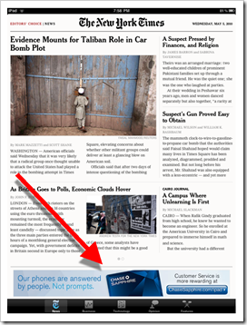
Chase is betting big on the iPad platform, taking a reported six-figure sponsorship of the NY Times iPad app (see inset, click to enlarge). The bank really had no choice but to support that advertising expense with a banking app of its own. Chase launched its iPhone app in Dec. 2008.

Chase Bank’s native iPad app (5 May 2010)

image    image

Note: For more on mobile banking and payments, see the most recent issue from Online Banking Report.