Keylogging Fraud Hits the Front Page

Nyt_iconDespite the old saying that there's no such thing as bad publicity, online banking credibility took a hit today courtesy of The New York Times, page one. In the second-most-emailed article of the day, the story chronicles the threat from keyloggers around the globe. In the fourth paragraph, the article tells of a Brazilian scheme, dismantled two weeks ago, that netted $4.7 million from 200 accounts at six banks. A separate keylogging incident in France is also said to have netted $1.1 million.

Action items
While there isn't a whole lot you can do about keylogging, you should take these steps to help keep the problem in perspective:

  1. Remind customer service staff that customer accounts are protected by numerous technology safeguards, policies limiting consumer liability, and internal controls that make withdrawing money online quite difficult.
  2. Encourage customers to use triggered alerts so they know within minutes when a large withdrawal occurs.
  3. Educate customers on the benefits of safe computing, including links to resources, downloads, and so forth.
  4. Mitigate customer concern with plain-language guarantees that eliminate any customer liability for fraud perpetrated against their accounts. For a great example, see E*Trade's Compete Protection Guarantee (NB Jan 18).

For more information, read recent security articles from NetBanker or Online Banking Report (# 96/97).

JB

News from the Online Fraud Cyberwar

The same week that Pay By Touch settled outstanding government claims against CardSystems, news of a new computer breach that could be at least as damaging emerged from California, while keylogging made the front page of the New York Times.

Continue reading “News from the Online Fraud Cyberwar”

Interview with P2P Lender Prosper’s Chris Larsen

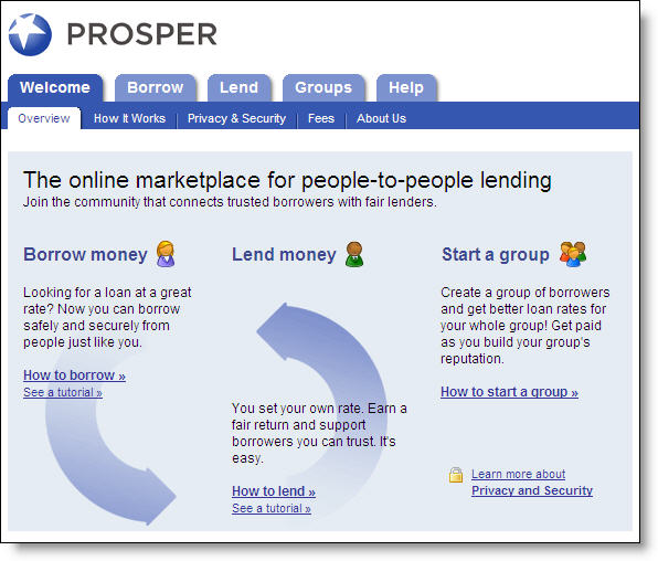
Prosper_homepage_chart_1Chris Larsen, who helped invent financial e-commerce by creating E-Loan <eloan.com> in 1997, is back on the scene mere months after selling the company to Popular Inc. last summer for $300 million. His new company, Prosper.com, first discussed here on Feb. 6, is built around the idea of creating communities of people who lend to and borrow from each other. The idea, he says, isn’t too far away from Jimmy Stewart’s savings and loan in Frank Capra’s film, It’s a Wonderful Life, where ordinary people lent to each other and made them all more prosperous.

The business premise is comparable to the model of Zopa, the UK-based, person-to-person lending site that opened last summer (see NB Nov. 22) with funding from Benchmark's European unit. But while Larsen concedes the similarity, he says he had the idea first. “This is something Bob [Kagle] and I talked about long before the Zopa guys had come to Benchmark [Europe] —since 2003, in fact,” he says.

Robert Kagle is a Benchmark Capital partner who provided much of the original financing for E-Loan, and who served as an E-Loan director. The Prosper idea attracted them, adds Larsen, because while the E-Loan idea worked relatively well—it originated and sold $26.7 billion in mortgages between 1997 and June 2005—it wasn’t really what they’d wanted to do, which was more along the lines of Prosper.

Larsen says, “[At E-loan] we were beholden to the capital markets, rather than being able to create a whole new marketplace that’s supported just by people. This is more of a pure model, an opportunity to start from a clean sheet of paper and design something from the ground up.” Plus, he adds, the public that could support a Prosper didn’t exist in 1997. “You couldn’t do [Prosper] back then. PayPal very much blazed a trail, and you really couldn’t do this until they had come along.”

The company
Prosper is funded by venture capital funds that include Accel Partners, Benchmark Capital, Fidelity Ventures, and the Omidyar Network. Prosper opened with something of a bang the week of Feb. 6, getting plenty of high-profile press in the mainstream media, and, according to Larsen, attracting more than $750,000 to its loan pools in the first week of business. And the first week’s business seems promising: As of Feb. 24, 301 loans were up for auction, up from 168 a week earlier. Loan sizes range from $1,000 to $25,000.

How it works
Prospective borrowers are first given a credit rating by Prosper after being vetted by credit score, a fraud check, and income. The borrower then lists the reason for their loan, uploads pictures if desired, and selects a starting interest rate, essentially the highest rate they would accept.

Individual lenders, who go through their own authentication process before being allowed to participate, can bid for as little as $50 of any particular loan, specifying the minimum rate they will accept. Prosper charges the borrower a 1 percent loan-origination fee and levies a 0.50 percent annual servicing fee to the lender on the outstanding balance.

Analysis
One of the problems faced by the venture is adverse selection, the tendency for loan applications to be dominated by those most in need of credit and least likely to repay. If poor credit risks overrun the venture, higher quality applicants, and the investors looking for them, will desert both Prosper and Zopa.

Another question is whether lenders will feel adequately compensated for their risks. Larsen says he wants his lenders to “capture the 10 percent spreads between short-term money and credit card deposits,” and compares the expected returns at Prosper to the AA corporate credit market, which currently gives investors a 7 percent return, or 6.5 percent after defaults. Zopa says it has provided lenders a 7 percent average return with no defaults in the seven months it’s been open for business, but this is not a period statistically significant enough to predict future performance.

On the other hand, much of business is betting on horses, and on jockeys, and Larsen has proven himself adept at both picking horses and riding them. It may be that the time is right for a business built more along the lines of Jimmy Stewart’s small town savings and loan, and less along the lines of a modern bank's unyielding underwriting algorithms. (Contact: Prosper.com, Chris Larsen, 415-362-7272)

AR

Previous articles:
Prosper Feb. 6
Zopa Nov. 22

E-billing at the Point of Sale for eCommerce

Bigals_ebilling_logoModaSolutions <modasolutions.com> and several merchant clients including Big Al’s <bigalsonline.com> online aquarium supply store and CompSource <c-source.com>, an electronics retailer, are making waves in online bill payment circles. In one of the more counterintuitive developments we’ve ever seen, Big Al’s is seeing 6 percent of its customers opt for a convoluted two-step bill payment process at checkout. To increase buyer comfort levels, the connection to online banking is reinforced through banners and copy (see the logo from Big Al’s above and the banner at CompSource below).

Secure_ebill_csource_banner_1

How it works
Rather than simply entering a credit card number or inputting checking account info to authorize a funds transfer, the SECURE-ebill system allows a customer to complete the checkout process without entering any personal payment info. The system then kicks an email to the customer summarizing the amount owed and the merchant’s contact info. Customers are then instructed to log in to their bank’s bill pay system, set up Big Al’s as a payee, and then pay the amount owed. Payments are routed through MasterCard’s RPPS for electronic settlement within 48 hours.

To summarize:

  1. Customer shops at merchant online
  2. Customer selects SECURE-ebill option during checkout (see screenshot #1 below)
  3. Email is sent to customer restating the amount due and deadline to pay (see screenshot #2 below)
  4. Customer logs in to online banking at their bank
  5. Customer sets up the merchant as a payee
  6. Customer pays the bill using online bill pay
  7. Payment is settled electronically through MasterCard RPPS
  8. Merchant ships the goods

Results
Approximately 6 percent of all Big Al orders now choose the SECURE-eBill option. Of those, nearly 40 percent are new customers. In addition, the cost to process the checks is 60 percent less than the discount rate the company would have paid had the customer paid with a credit or debit card.

At CompSource, customers are rewarded with a 5 percent savings ($25 maximum discount) at checkout when selecting the ebilling option. The company has not released results, but it must really like the system. Its website has numerous references to the 5 percent savings, including a link by each price reminding users that they could save "up to 5%."

Analysis
If you consider the time it takes to log in to your bank account, set up a new merchant, then pay the bill, it will take three to five times as long as using a credit card at checkout. However, it is slightly faster to check out using the ebill option because you avoid entering a credit card number, expiration date, and security code.

As irrational as it seems to regular online shoppers, this system evidently has considerable appeal. How else can you explain 6 percent penetration at Big Al’s with no merchandise discount? Evidently, it appeals to customers who are either concerned about entering payment info on a merchant’s website, or who somehow like the extra control they get by entering the payment into their bill pay system where they can keep closer tabs on the payment. It’s a good lesson in payment system design: Not all customers trust the most efficient system.

Merchants like it because it increases sales. And transactions cost less than credit card interchange, although the interchange savings are likely eaten up by extra customer service and reconciliation costs at the merchant.

JB

Continue reading “E-billing at the Point of Sale for eCommerce”

Bank of America’s Preapproved Card Offer at Logoff

Bofa_instantcredit_atolblogoutBank of America is making it super easy for online banking customers to accept a new business platinum credit card. The preapproved offer is displayed after logging out from an online banking session. In this example, we had just finished paying our Bank of America credit card bill and were greeted with well-crafted page shown here (click on inset left for a closer view).

Analysis
Using the log-off screen is a great way to get your preapproved offers in front of users at just the time they are thinking about their finances. We also recommend offering a link to the offer within the online banking area. That way, if a user is running a bit low on cash, for example, while paying bills, he or she could click on the offer to obtain additional cash.

JB

CashAdvance.com’s Audio-Visual Loan Application

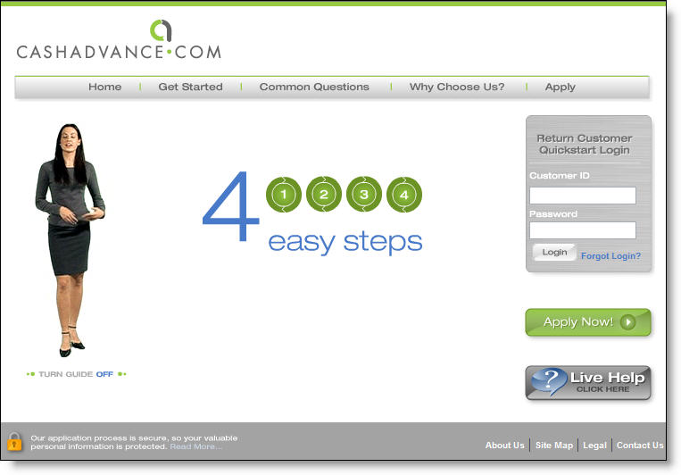
Cashadvance_avhelperNot knowing what to expect, I clicked on CashAdvance‘s <cashadvance.com> banner on eBay last night. The well-designed banner and intriguing name successfully caught my eye. It turns out that CashAdvance is the LendingTree of payday lending, referring online applicants to its lending clients, who advance $100 to $500 against next week’s paycheck. You find payday lenders all over the country, especially in strip malls and lower-income urban areas, but they are relatively new online. According to its website, CashAdvance.com was established in 1997 and has served more than a million customers.

While the product is straightforward and not a particularly good value for mainstream banking customers, financial institutions can learn a lot from how CashAdvance’s loan application is presented. While many banks and credit unions bury their application several layers deep in their website and/or post small "apply now" buttons, CashAdvance uses its spokesmodel Jade (see inset) to reassure visitors and explain the application to them in plain language and a calm voice. With broadband connections used by more than half of U.S. Internet users, it’s high time that financial institutions make better use of audio and video for customer service and sales assistance.

Cashadvance_homepage CashAdvance’s understated and well-crafted homepage uses Flash animation to deliver an audio pitch from Jade along with several benefits of its product (click on inset right for a closer look). Other than the fine print along the bottom, there are just 30 to 40 words on the entire page. While that won’t work for a full-service financial institution’s homepage, it’s a good approach for a lender’s landing page.

Cashadvance_calltoactionAfter the 30-second animation has run its course, an Apply Now button is left in the middle of the page (see left), along with Jade fidgeting slightly, making you feel like you should do something. A prominent Live Help button is available during daytime hours. Users also have the option of turning the animation off with a small button underneath the graphic.

JB

Motorola Introduces Real Mobile Payments to US Market

Two weeks ago, Motorola Inc. introduced the same mobile payments platform already being used in Japan and India, opening the door for U.S. banks on a retail payments future that could spell prosperity or doom, depending on the choices they make.

Those loaded alternatives have little to do with the immediate future for mobile payments in this country. Buying cheeseburgers by waving a cell phone will begin as a gee-whiz novelty in this country, packaged in ways that will preserve the bank brand, and allay the current boardroom anxiety that banks are fated to become mere payments utilities.

The real danger to banks is the next generation of m-payments, when the payments chip is miniaturized to fit into a ring or necklace; at that point, opportunities to remind customers of which bank’s card they’re using will disappear, along with the visible screen, taking with them much of the bank’s relationship with its customers. But this generation is here now, says Dan Schatt, a Celent Communications analyst, and likely to shake things up.

Continue reading “Motorola Introduces Real Mobile Payments to US Market”

Chase Bank Pioneers New Advertising Outlet

ImagesIn a novel advertising gimmick, Chase Bank affixed two-foot long banners, each pointing to one of 90 electrical outlets in the Indianapolis International Airport. The unique signage, which also includes four months of exposure on in-terminal flight-information monitors, will cost the bank $65,000 for the year, or just under $200 per day.

The signs and slogans are designed to appeal to traveling businesspeople. They include:

This outlet works. Now you can too.

You and your laptop may sigh with relief now.

Congratulations. You found a charge chair.

Analysis
We’ll leave the question of cost effectiveness of "outlet advertising" to the outdoor advertising pros. However, similar tactics could be used throughout a community to market online banking and small business services to users of WiFi-equipped cafes and coffee shops. For example, a bank could sponsor a WiFi directory that included names, locations, and hours of WiFi-equipped locations throughout town. For extra credit, include a map of electrical outlets, desired by many laptop owners so they don’t have to worry about having to rely on their batteries which are drained relatively quickly when going online.

Most coffee shops aren’t going to want a bank slapping advertising stickers on their walls. However, tent cards or brochures carrying the bank’s logo could provide WiFi instructions and locations of wall outlets.

With summer just a few months away, this would be a perfect task for a summer intern. Working with existing WiFi directories, the intern could scout out possible locations, map the electrical outlets, document contact information at each location, and post it all to the bank’s website. Alternatively, a bank could contract directly with an existing locator service to carry the bank’s advertising message.

–JB