Prosper Traffic Spikes, Hits Major Bank Levels

Prosper homepage Preparing a table for our upcoming report on social finance, we were slogging through website traffic at Compete.com and discovered a startling statistic. In March, traffic to the person-to-person lender Prosper.com was four-fold that of January, growing to more than 1 million unique visitors. That puts it in rarefied company, approximately the same as a top-20 bank such as SunTrust, which according to Compete had just 10% more traffic in March (see chart below).

If those numbers are accurate, and they weren’t driven by unsustainable events such as a a mentions in major blogs or media, Prosper may have moved past the early adopter stage, and into the more mainstream web-based financial services arena.

It appears the traffic is converting to registered users. The last time we checked, April 25, the homepage said it had 240,000 registered users. Today, it says 270,000. That’s 12% growth in 15 days.

Whitney Joins the Short List of Banks with Seven-Year Archives

With the disastrous floods of 2005 still fresh in the minds of its customer base, New Orleans-based Whitney Bank became one of the first banks to offer customers seven years of online archives (press release here). In past research (here), we found that major financial institutions provided an average of 11 months of online statement storage (see background below). 

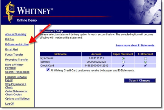
Whitney's expanded storage should help it increase its estatement penetration past the already-healthy 33% mark (of online banking users). The bank wisely reminds users that statements are stored online with an "estatement archive" link in its online banking area (see screenshot below). 

However, the bank is missing an opportunity to differentiate itself by not mentioning this important feature on its website. Even the online demo mentions the previous 2-year retention policy. 

Whitney Bank online demo showing estatement archive

Background
In our 2005 report on the subject (here), we reviewed the online archive capabilities at 50 major banks and credit unions and found only two banks offering more than three years of online storage:

  • E*Trade Bank provided seven years images, but only 18 to 24 months of transactions and statements
  • ING Direct archives all transactions since inception, currently 6.5 years ago, but only a year's worth of statements

At that time, Whitney provided 2 years worth of statement storage, the longest in our survey of 50 banks. 

If anyone knows of other financial institutions offering more than 3 years of online storage, please leave a comment below, or email me and we'll add you to the list. Please include a link to the place on your website where the storage information is documented.

1995 Web Pioneer, Salem Five Launches Mobile Banking

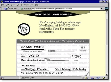
Salem Five morgage coupon in use from 1995 to 1997+Twelve years ago I spoke at the very first for-profit conference on online banking. It was held in San Francisco and put on by IQPC. One of the handful of bankers taking the stage was the marketing director from a small Massachusetts-based bank, Salem Five Savings Bank

In 1995, Salem Five was one of the first 100 banks in the world to launch a website and continued to pioneer website functions during the last century, even launching a dedicated direct bank <directbanking.com> which has now been rolled back into the parent.

One early innovation was a mortgage lead generation tool consisting of an interactive $100-off closing costs coupon. It was still in use several years later when we named it an Online Banking Report Best of the Web winner in 1997 (see circa 1997 screenshot above, and the Online Banking Report article archived here).

It was "interactive" because in order to print it, the customer was required to first enter  their name and phone number into the on-screen coupon. It was a great promotional idea, especially for 1995. And I still remember receiving a phone call the Saturday morning after I tested the coupon from the cheery Boston-based loan agent, wondering if I was moving to their area and interested in a mortgage. To this day, one of the best follow-ups I've experienced to an online lead.

Mobile Banking Launch
In April, Salem Five took another pioneering step, becoming one of the first community banks pushing mobile banking (here). However, its mShift-powered service is a WAP solution, not likely to be widely adopted in its current form. Last week another mShift client, Cardinal Bank, launched a similar mobile offering (here). 

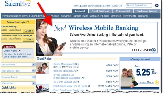
The bank is making sure its customers know about it with a page-dominating banner in heavy rotation on its homepage. Note: Salem Five uses both "wireless" and "mobile" to describe the service.

Salem Five homepage (8 May 2007)

Salem Five homepage with wireless mobile banking banner

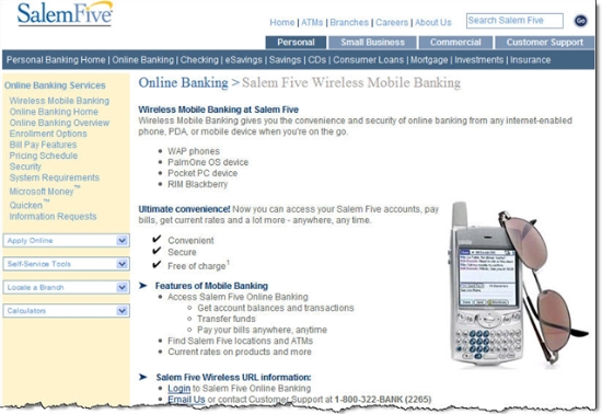
Salem Five mobile banking landing page

Salem Five mobile banking page

For more information on mobile banking see our full report at our sister publication, Online Banking Report (here).

Here’s a Financial Institution Blogger that Does it Right


Link to Piedmont CU homepage One of the biggest questions surrounding financial institution blogging, is whether anyone would actually want to read one. We are firmly in the camp that EVERY bank, credit union, and financial services company should have a blog (see our Online Banking Report on blogging here). But with so few actually doing it, it's hard to find examples that provide a good mix of community news, financial advice, along with that right "tone" that makes it readable and believable. 

Here's one to watch. After just two months bloggin, Dan Veasey, Director of Marketing and Biz Dev at Piedmont Credit Union in Danville, VA, looks like he has what it takes. When I first looked at his blog (here), there were only a few entries, and its credibility was hampered by the limitations of the Blogger template. Well, Dan took the advice of several industry observers and moved it to a WordPress template several weeks ago.  

With the conversion behind him, Dan has been concentrating on the content, which is really what it's all about. For example, in the past week Dan had a great content mix with local news (Starbucks opening), humor (sponsoring a digit of the number pi), CU business (annual meeting invitation), and serious financial subjects (budgeting for a family). He uses a friendly tone that establishes his credit union as the kind of place you want to like. And he drops in a picture or two to break up the text. 

Now, all this takes time, so he may need to bring in another author to keep up the pace; but so far, it's great work and a good example to follow.  

Here are the previous five posts: 

Piedmont CU blog posting

Finally, Someone Explores the Downside of Going Paperless

First National Bank estatement graphic I was glad to see Eleanor Laise explore both the pros AND cons of turning the paper off  in Tuesday's Wall Street Journal (here). Sometimes, we in the industry get so excited about the supposed win-win of estatements (save trees, save money, save clutter, thwart dumpster divers, and so on), that we forget about the very real consumer behavior issues that work against going completely paperless.

For example, here are some of the potential pitfalls of paperless finance: 

  • Statements and notices lost in overflowing email in-boxes
  • Email address changes that are not communicated to the financial institution
  • Spam filters trapping financial notifications and alerts
  • Hard drives crashing and erasing records
  • New computers being installed and records lost in the process
  • Laptops being stolen along with the digital papertrail
  • Computers infected with viruses rendering them inoperable or worse, sending financial data to the thieves 
  • Stress at tax-time trying to remember web addresses and login credentials to access last year's financial info
  • Finding out on April 14 that your credit card issuer only stores 12 months of records online, so Jan/Feb/Mar of the last tax year are no longer available online, and will take days to retrieve through customer service
  • Forgetting to rebalance your investments because you never take the time to login and look at your online statement
  • Forgetting to report investment income/losses on your taxes because you had no paper trail and forgot about the account
  • Trying to explain to the tax auditor that you don't have paper copies because you "are saving trees" 
  • Backup files being lost, forgotten, or corrupted

At one time or another, everything on this last has happened to me. That's why, even though I prefer trees to be alive, I've resisted going paperless for most bank and credit card statements (note 1). Also, as an industry observer, I like to see the statement stuffers for research purposes. 

Action Item
However, most of these problems can be solved over time by a single online banking improvement:

Guaranteed, long-term storage of financial transaction records, statements, check images, and other financial documents. 

By long-term we mean at least five years to cover tax audits. But much better would be life-of-the-account storage, which we believe is a tremendous retention tool and much less costly than free bill payment. See our Online Banking Report, "Lifetime Statement Archives," for the full business case.

Update: Gonzobanker published a how-to on going paperless today (here).

Note:

1. Of course, I'd save many more trees by turning my newspaper subscriptions off. A few days worth of newspapers at our house weighs more than a year's worth of financial statements. But I still like the scanability and serendipity of browsing a printed publication.   

Jupiter and Compete Reach Opposite Conclusions on Current U.S. Demand for Mobile Banking

Market research is an amazing thing. You can take the same study and reach two entirely different conclusions. Or you can achieve totally different results by the way the question is worded, what multiple choice answers are provided, what questions preceded it, or even the tone or style of the interviewer. Then there are issues with how the sample was selected, online vs. phone, whether it is representative of a national audience, whether incentives were provided, etc. etc. etc.  

That's not to say that market research should be ignored. Just that you need to be careful with it. And if you make decisions based on market research, you need to understand how and when it was collected, what the exact questions were, and who underwrote the study.

Case in point: Mobile banking demand

In the past two weeks, two reliable research companies, Jupiter Research and Compete, Inc. released research finding on whether U.S. consumers think they will want to use mobile banking when it becomes available. This type of "what if" question is even more problematic than other types of market research. Because the participant doesn't use the service in question, the interviewer first has to paint a picture of what it might look like at some future point, then ask the respondent what their level of interest is. So, the results are highly dependent on how the hypothetical service is described, and if it's a telephone interview, how enthusiastic the questioner is about it. Imagine the difference in response to these two questions:

1. How would you like to press a button on your cellphone that gave you instant, secure, free access to your bank account balance so you didn't ever bounce a check again?

or

2. At some point in the future, you might be able to download and install a Java application over the air for your mobile device that provided a subset of the functionality of online banking ported to a 2 inch screen. And, as long as you never left your phone somewhere by mistake, it should be as secure. How excited would you be about that?

Unfortunately, I haven't seen the exact questions or methodology used to produce the following press releases, so I can't say exactly how the companies reached their conclusions. However, Compete will be presenting their finding in a free webinar Thursday, so you might want to listen in. If you can't make it, I will file a followup blog post. Full disclosure: After spending much of Q1 researching and writing about mobile banking and payments, and yes, selling reports of my findings, I'm firmly in the pro-mobile banking camp (see previous coverage here). 

Finding 1: Considerable interest in Mobile Banking

Author: Compete, Inc.

Link: http://blog.compete.com/2007/05/01/mobile-banking-rebirth/

Synopsis: In an April survey of online banking users, only 19% said they would definitely not use it, while 11% said they definitely would. The vast majority (70%) between the extremes need more info before they decide. There is a measurable advantage for the negatives (38% won't/probably won't use) over the positives (29% will/probably will), but that's doesn't seem particularly negative for a service that does not yet exist.

Note: Compete will be presenting the results in a free webinar Thursday, May 3, at 2PM Eastern. Presenters: Paul Zeckser, Director Financial Services Practice & Ryan Burke, Director, Telecommunications and Media Practice

Compete results


Finding 2: Little interest in Mobile Banking

 Author: Jupiter Research

Link: http://www.jupiterresearch.com/bin/item.pl/press:press_release/2007/id=07.04.23-mobile_banking.html/

Synopsis: Limited data was released to the public, but in a press release last week, with the title, JupiterResearch Finds Limited Consumer Interest in Mobile Banking, the company said only 8% of consumers were interested in mobile banking. No supporting data was provided. We will invite report author Asaf Buchner, who I respect greatly, to provide more background on Jupiter's findings.

Note: Below is the exact quote from the press release. The specific scenario here, "using mobile browsing to check account balances," may be part of the reason for the lower interest. Only about 10% of U.S mobile phone owners use mobile browsing today.  

Just eight percent of online consumers who own a cell phone are interested in using mobile browsing to check account balances.

Washington DC-based Cardinal Bank Launches WAP Mobile Banking Site

Cardinal Bank mobile bank home WAP sites, mini websites that can be viewed on mobile devices, may lack in usability, but they are inexpensive to build and keep you in the game with the BofAs and Citibanks. And a shot of a mobile phone looks good on the homepage (see note 2), probably a bigger benefit than the actual service itself.

The latest bank to officially launch mobile banking is $1.7 billion Cardinal Bank <cardinalbank.com>, who's WAP site has its own URL: <gocardinal.net> (note 1). The WAP site consists of four main tabs  (see inset):

  • Home
  • Rates
  • Find Us
  • Sign On

The secure signon leads to full-service online banking including balance and data access, funds transfers, and bill payment (see screenshots below). While the bank may not get a lot of users, at least they have eliminated one reason for a heavy mobile user to look elsewhere for a bank. Nice work.

For more information, see our Mobile Banking Report (OBR 138/139).

Cardinal Bank mobile bank signon  Cardinal Bank mobile bank rates Cardinal Bank mobile bank find us 

Note:

1. While the .net address has two less keystrokes on a phone keypad than .com., it still a relatively cumbersome address for those without an QWERTY pad. If possible, invest in a URL with just a few characters and/or one the maximizes the use of the first letter of each key's triad (A, D, G, J, M, P, W). And don't ever use X, which is not on standard 10-key pads.

2. Cardinal Bank leverages the cachet of mobile banking with a prominent graphic on its homepage. It would be more effective if it was a closer shot, so the Cardinal logo was  visible on the Treo screen. 

Cardinal Bank homepage with mobile banking

Links from ABA’s Webinar: Extreme Website Makeovers

Thanks to everyone who tuned in today to the American Bankers Association webinar on website design. And for those of you on the call, please let me know what you thought of the presentations either by private email, or via the comments below. It's the first time I've been involved in a 2-hour Webinar, and I'm curious about the experience from the listener's perspective.

The ABA's Doug Johnson pulled together the following panel and served as master of ceremonies: 

  • Jim Bruene, editor & founder, Online Banking Report and NetBanker blog
  • Clay Morgan, creative services manager, Intuit's Digital Insight
  • David Rubini, product usability director, Intuit's Digital Insight
  • Richard Carlisle, CIO, Valley National Bank of New Mexico
  • This session was a Web-based version of the session we gave in Palm Springs earlier this year (coverage here). My 20-minute presentation included examples from some favorite financial websites. Here are the links:

    Overall Bank/Web 2.0 Design
    1. Buxfer buxfer.com: Web 2.0 design/functionality (A-)
    2. Wesabe wesabe.com: Quicken meets Zagat (A-)
    3. Billq mybillq.com: Award-winning bill payment tracker (A)
    4. Prosper prosper.com: Before and After shots of its recent web redesign, nice job reducing clutter, (A-)

    Homepage Focus
    5. Wachovia wachovia.com: Not-so-great design, and way too cluttered (C+)
    6. Google google.com: Legendary focus on what matters (A++)
    7. Bank of America bankofamerica.com: Good design, but still too much clutter (A-)
    8. ING Direct ingdirect.com: Great design, no clutter (A)

    Sales
    9. Attention: U.K. montage: smile.co.uk, egg.co.uk, alliance-leicester.co.uk
    10. Interest: E*Trade Bank etradebank.com: Great at selling key products (A)
    11. Desire: High-yield savings montage: emigrantdirect.com (A), hsbcdirect.com (A), mybankingdirect.com (A)
    12. Desire: Progressive Insurance progressive.com: Great comparisons to competition using scrolling summary of other users' search results (A-)
    13. Action: NextCard: No longer online (A+)

    Customer Interaction/Satisfaction
    14. Wells Fargo blogs blog.wellsfargo.com: Look especially at the StudentLoanDown (A), which demonstrates how to communicate with a Web-savvy niche audience
    15. UW Credit Union RSS feeds uwcu.org/rss: One of the first, if not THE first, U.S. financial institution to offer RSS feeds of its Web-based. The CU has also added RSS auto-discover technology as seen in the address box (screenshot below)

    ANZ Bank Posts Podcasts in Snazzy Microsite

    Some of the features built into financial websites are at least as much for show as they are for actual customer utility. Podcasts probably fall into that category. Really, who wants to listen to a bank's four-minute treatise on "home loan jargon" or nine minutes on "paying off your home loan sooner" (see screenshot below)? The answer: people serious about understanding the mortgage process and getting a fair price, an important market segment.  

    Podcasts are just rebranded versions of streaming audio, a technology that predates Web 2.0, iPods, and even broadband. But today, the name has a definite cachet thanks to Apple, and they draw website viewers, and the occasional listener.

    Because of the low cost and favorable ROI, it makes complete sense for financial institutions to repurpose marketing, service, and educational messages into audio files and post them to your website (see previous coverage here). Many of the programs will have a multi-year shelf life, so over time they will get a significant number of plays.

    While you are at, spend a few more dollars to do the things Australia's ANZ Bank did in their podcast microsite at <anzpodcasts.com.au>, the best banking audio education center we've seen.

    • Create a microsite with fresh graphics and modern colors (see screenshot below)
    • Use a unique URL to find the site, in this case <anzpodcasts.com>
    • Allow users to subscribe via RSS and iTunes (see bottom of screenshot below)
    • Make it clear that the "podcasts" can be streamed directly to the desktop, right now (see green play buttons below)
    • Post a FAQ with more detail on the podcasts
    • Post a survey to see how the podcasts resonate with customers

    Finally, the most important way to leverage the podcast, something often overlooked:

    • Post a transcript of the audio program so that those preferring to skim the information can do so

    Note: The top background has moving bars that provide the look of music playing through a graphic equalizer or some type of meter. It's a nice touch, but the bank should turn it off after a few cycles so that it doesn't distract the viewer.

    Blogs Bring Negative Publicity to Overdraft Charges

    The players: An angry and articulate Wachovia customer with the online handle haberschmidt; Wachovia Bank; Wesabe; PaymentsNews

    Wesabe thread on banking feesSynopsis: According to an anonymous online posting, Wachovia charged a customer $245 in overdraft fees on seven transactions, at least a few of which were signature debit. The customer claims to be a practicing attorney with an undergraduate accounting degree and Ivy League law degree who deposits $8,000 per month into his Wachovia checking account. Unfortunately for the bank, he/she also took the time to research the incident and document it in a 1,500-word comment at personal fiance site Wesabe (see inset).

    In the pre-blog days of the Internet, the post would have been read by a few dozen readers and cost Wachovia nothing, other than the attorney's business. However, the so-called blogosphere can amplify these isolated incidents a thousand-fold.  

    Timeline:

    ???: Wachovia charges "haberschmidt" $245 in overdraft fees on seven low-dollar transactions, many made by signature debit (see note 1)

    ???: Haberschmidt spends an hour and half with Wachovia customer service reps to understand the process. Ultimately, he/she has the fees reversed by the branch. 

    April 27: Wesabe user "haberschmidt" documents Wachovia's overdraft policies in a 1,500-word comment to a thread on bank fees at Wesabe (here) (see inset above and note 2) and says he or she is closing their Wachovia accounts

    April 27, 8 PM: Wesabe blogger Marc Hedlund highlights the issue in the Wesabe company blog (here) under the proactive title, "More on How Banks Maximize Your Overdraft Charges" and adds a few more digs on overdraft fees

    April 28, 6 AM: Scott Loftesness, after seeing Wesabe's post, broadcasts it to the payments world via the PaymentNews blog (here)

    Future: It's possible the story dies now, but with Google prominently displaying blog posts, the story will likely be visible through searches for years to come. However, the real damage occurs if the mainstream media picks up on this story, possibly precipitating one or more negative stories on debit card authorizations and/or creative engineering of transaction-processing algorithms to generate more fees.

    Analysis:

    Before the Internet, if a customer was really mad, 10 to 25 people might be told, and those people could pass it on, but the damage was likely limited to that close-knit group.

    After the Internet, but before blogging, if a customer was really mad they might comment on a popular blog such as FatWallet, and hundreds or even thousands of people might see it. However, in an anonymous online forum, the reader wouldn't be able to readily discern a one-sided rant from an actual problem. So, even though a few hundred people might read it, few would be moved to action. 

    But today, the blogosphere can amplify a complaint a thousand-fold. Now, the number of readers could be in the tens or hundreds of thousands. The combined readership of Wesabe, PaymentsNews, and NetBanker is more than 10,000 already. And the blogs, with known authors, have far more credibility than random forum posts.  

    What a bank should do:

    1. I know this is going to hurt, but if you haven't done so already, take a hard look at your NSF/overdraft fee policies and program some common sense into the fee and check processing algorithms. As this incident shows, financial institutions risk a real backlash as the fees grow relatively larger and are applied to smaller dollar amounts, especially debit card charges that the bank had a chance to decline at the point of sale. Case in point: An article in Saturday's Wall Street Journal (herehad an example of a widow charged $30 for a $0.95 cent debit card overdraft AFTER her account was frozen (see note 1).
    2. Educate customers on the tools they can use to minimize overdrafts such as online banking, email alerts, and if possible, text-message alerts.
    3. Make sure every creditworthy customer has an overdraft line of credit. If they are credit-averse, use a savings account. In the Wachovia example, the customer apparently had an overdraft setup between two deposit accounts, but it didn't work because "Wachovia recently monkeyed around making administrative changes to my accounts and lost track of the overdraft protection feature." Had the customer, who sounds like he makes a six-figure income, been covered by a line of credit, he'd simply be paying Wachovia a few bucks in interest, instead of costing the bank thousands of dollars in lost income.
    4. Use your CRM systems to apply logic to the overdraft-fee assessment. If you know a customer deposits his/her $8,000 paycheck on the 15th every month, don't ding them a $30 fee on the 14th for a debit card charge at Starbucks.
    5. Follow WaMu's approach and give customers an annual "get out of jail free" card that allows them to turn it in for a no-questions-asked fee reversal on an overdraft.  
    6. Put your chronic NSF/overdraft customers into an account with a prepaid model that does not allow them to go over the amount in their account. Access can be by debit card and good-funds bill pay, but regular paper-check access would not be allowed (sounds a bit like a certain new account named after a fruit here).

    Final word:

    Banks need to voluntarily reign this in before the class-action lawyers and politicians campaigning for '08 make this into a public-policy issue with a raft of new regulations. Haberschmidt closed his forum post with this chilling paragraph:

    Although the branch corrected the overdraft protection issue and reversed the fees, I am closing my accounts. I believe strongly in voting with my dollars and I don't want to belong to a bank that takes advantage of its customers in this way. It strikes me as a predatory practice, and the kind of thing of which Congress should be aware when it reviews regulation on the credit card companies and other financial industry practices.

    <Stepping off the soap box>. Now back to your regularly scheduled "happy marketing blog."

    Notes:

    1. The Wall Street Journal article (here), about how bill collectors are abusing the garnishment order system, should be required reading at U.S. banks and credit unions.

    2. "Haberschmidt" is the user's Wesabe public ID, he/she joined Wesabe the same day he posted the comment.

    3. The forum comment appears to be a genuine beef with Wachovia. However, it's extremely unusual to see a 1,500-word, well-written comment online, and closing with a call for Congressional action to boot. So it's possible haberschmidt has an undisclosed agenda, especially given that he joined Wesabe the same day he posted the comment. However, he immediately posted another comment apologizing for his typos and implying that he composed the whole thing in Wesabe's online forum. That makes it very believable, although it's still possible that this followup was also a calculated move. Even if it is a fabricated post, the underlying issue still needs to be addressed.  

    Followup Friday: More on the Bank of America & Verizon Online Billing Co-promotion

    Little did I know when I wrote about Verizon Wireless promoting Bank of America billpay on its site (here), that the company that brokered the deal, CheckFree, along with representatives from both consumer giants, would be presenting the results of the effort at Nacha's Payments conference last week (see note 1). I wasn't there, but I was filled in on the details by CheckFree's PR director Sheryl Roehl.

    First, my assumption was wrong. It was NOT a paid placement by BofA. No money changed hands. It was classic joint marketing with each company promoting the other on their websites. The exposure to each others' massive customer bases trumps any concern over who benefits most by converting Verizon customers into ebilling users (see note 2).

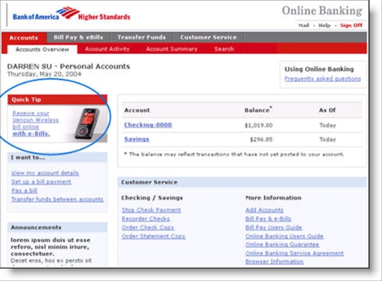
    In the prior post, I showed you BofA's ad on Verizon's site, here's what the Verizon placement looked like on the bank's site (note 3):

    Verizon banner in BofA's main online banking area

    Verizon placement in BofA's online banking area

    Landing page for the Verizon promo

    Verizon landing page from BofA promo

    Email me if you'd like the presentation slides, which also include more figures about ebilling adoption (note 4).

    Notes:

    Penetration of U.S. online household per Harris Interactive, Feb. 2007

    1. The joint presentation was by: Angeline DePauw, director electronic remittance Processing, Verizon Communications; Laurie Profilio Sass, eCommerce marketing, Bank of America; and Lori Stepp, managing executive E-bill Adoption Services, CheckFree

    2. It's hard to say which company gains the most in an ebill conversion. Verizon saves money by eliminating the paper and BofA potentially converts a customer into ebilling, an important retention benefit.

    3. The screenshot is from the NACHA Payments presentation; it is a mockup, note the 2004 date, but presumably is an accurate representation of what the promo looked like.

    4. CheckFree presented the latest penetration numbers at the conference, as determined in their Feb. 2007 research conducted by Harris Interactive. Three-quarters of ONLINE households, or about half of all households, now pay a bill or bills online with biller direct (55%) leading pay-anyone (38%) by a measurable margin (19% do both). See inset.