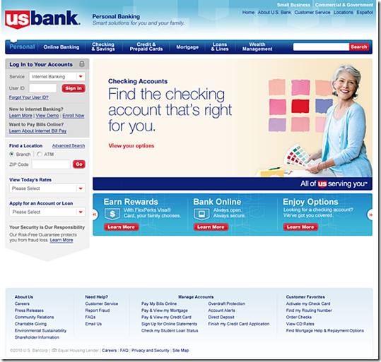
 Although U.S. Bank has long held a state-of-the-art online banking design, its homepage and public website haven’t kept up with modern standards. From the looks of the preview unveiled earlier this week, that will change when the bank rolls out on Friday a major site redesign.
The bank is wisely inviting online banking customers to take an advance peek at the new site. I learned about it Monday via a splash screen after logging in to online banking (see first screenshot below). The preview is also featured in the upper-left of the current homepage (see second screenshot below).
U.S. Bank is one of the last big banks still using a homepage dominated by a list of products and services. Presumably, the bank will move to flyout menus on the tabs across the top of the page (see third screenshot). Another expected improvement: liquid display.
For existing online banking customers, the biggest change is the repositioning of the login box from the middle-right to the upper-left, the industry standard.
Lessons: It’s important to give online customers advance notice of login changes so they don’t think they’ve arrived at a fake site. In fact, I think U.S. Bank should have gone further and simply included the preview in the splash page so everyone was forced to see it. Or at least the bank should have a prominent link to the preview within online banking. As it stands now, once you skip past the splash screen, there is no way back to look at the redesign (other than going to the homepage).
Login interstitial ad announcing the coming redesign (12 April 2010)
Before: current site
Notes:
1. Upper-left announcement of coming site redesign, with link to preview shown above
2. Login box placed in non-standard location mid-page on the right
After: Preview of new site design coming April 16 (link)


