 My favorite website of all time was from the ill-fated dot-com “fintech” card issuer, NextCard. In 1999, it was light years ahead of its time in design and UI. If only it had been equally savvy in its underwriting skills, it would be a digital banking giant by now.
What I loved about its website was the almost total lack of copy. In an era where most traditional brands dumped everything they could think of on the homepage, NextCard made due with just 50 words of copy, an almost “Google-like” experience (and this was before Google). See its circa-2001 homepage above.
The nice thing about the NextCard effort, besides the big red “easy” button dominating the page, is that the whole thing fit nicely on a single desktop computer screen. That was back when horizontal and vertical scrolling were the norm.
Fast-forward 15 years and the vast majority of banking websites are MUCH, MUCH, MUCH better. And I am a big fan of responsive design. It’s forced designers to pare back on overly busy home pages that have been a hallmark of banking sites since the 1990s.
 However, I think we are now in danger of becoming over-reliant on responsive design, at least on the desktop. Yes, it’s cost-effective to build a single site that works across all screen sizes. But if you are big enough to have a six-figure marketing budget, you can afford to tweak your site so it sparkles on both smartphones and desktops.
I don’t want to single out anyone, but I need an example, so I looked at a few sites in the Seattle area and chose Washington State Employess Credit Union to illustrate my point. Its site renders great on mobile phones or tablets with an intuitive swiping down (or is that up?) layout (see inset for iPhone 6 capture).
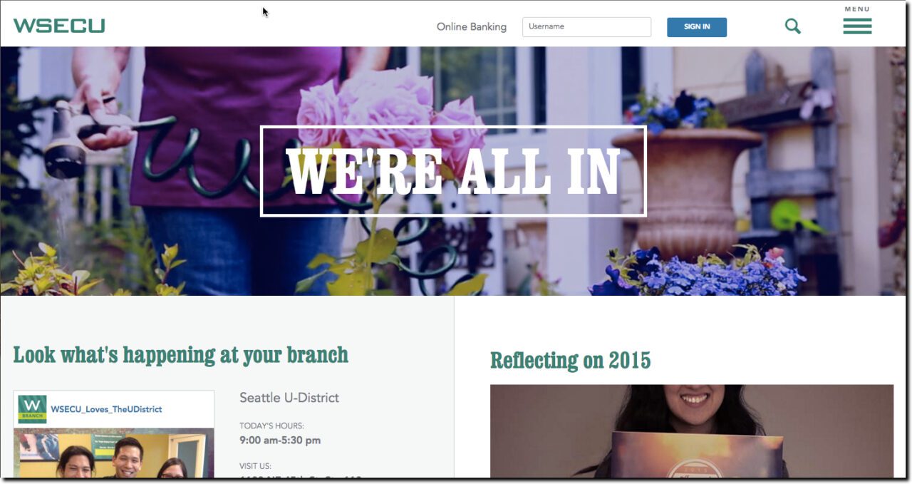
However, the same photos, fonts and layout rendered on a 13-inch laptop browser screen aren’t as elegant. The biggest issue is navigation. WSECU goes with the smartphone convention of a small “hamburger” menu in the upper right (see screenshot below). Users accustomed to mobile navigation will likely find it, but others may be perplexed.
With no visible desktop navigation, the eye is drawn to the “We’re all in” main headline along with the two running across the bottom (“Look what’s happening at your branch” and “Reflecting on 2015”). None of those are particularly enticing jumping-off points for the casual online visitor.
Overall, the WSECU site is pleasing to the eye and has easy-to-find login and search. However, the desktop version isn’t as effective as it could be explaining the products, services and benefits of banking there. And 20 years into web design, we should be more responsive to visitor needs.

