A paradox of the early digital banking era (1995 to 2007) was: Why is Capital One a laggard? The new company (spun out from Signet Bank in 1994) was widely revered as a data-analytics and marketing master. But it was practically a digital no-show for more than a decade, offering just a minimum level of functionality online. As recently as 2010, Capital One was the last major bank to launch a native mobile banking app.
Fast-forward six years. Capital One owns the innovation mantle, at least in the United States. It has Capital One Labs; it runs an innovation center in the Bay Area; and it now offers the most advanced set of mobile apps in the card-issuing business.
Its latest innovation? The first proactive service from a major issuer that alerts cardholders to deviations in spending with recurring charges. It’s called Second Look, and it certainly deserves one.
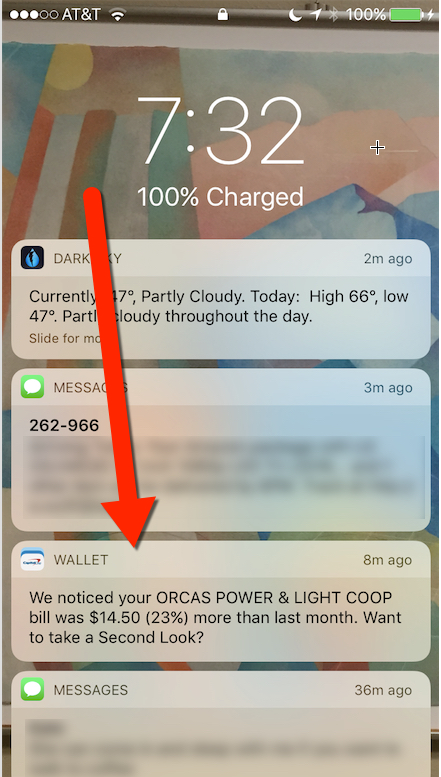
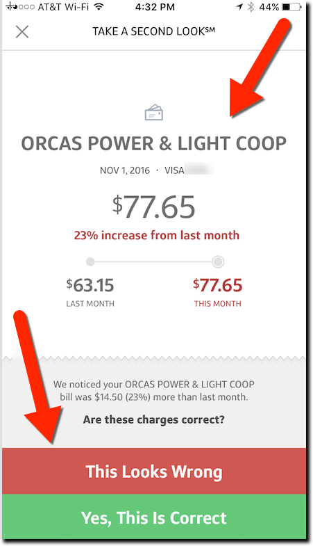
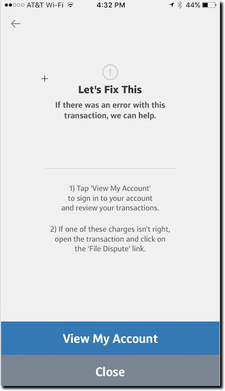
I was introduced to the new feature this week when I received a notification on my iPhone alerting me to a spending increase on my power bill (screenshot 1 below). After swiping through it and logging in via TouchID, the app displayed a chart showing how much my bill had increased last month (screenshot 2). And I was asked whether I was OK with the charge or not (bottom of screenshot 2). If not, the bank provided instructions on how to dispute the charge (screenshot 3). Customers can also elect to receive the alerts through email.
Another thing I really appreciated: The bank gave me enough info in the notification to make an intelligent decision whether I even needed to log in. The bane of the mobile-user experience is dealing with (ultimately ignoring) all the false positives you get through most notification services. I clicked through the notice out of curiosity. But thanks to the detail, I already knew that the $14 increase wasn’t a major problem.
Bottom line: This is just one example of a more proactive approach to helping customers deal with day-to-day finances. It’s still a relatively manual user experience, especially if you want to dispute a charge. However, as banks layer AI on top of their data hordes, outside APIs, and location-based info, we’ll see much, much more. Kudos to Capital One for leading the way.


