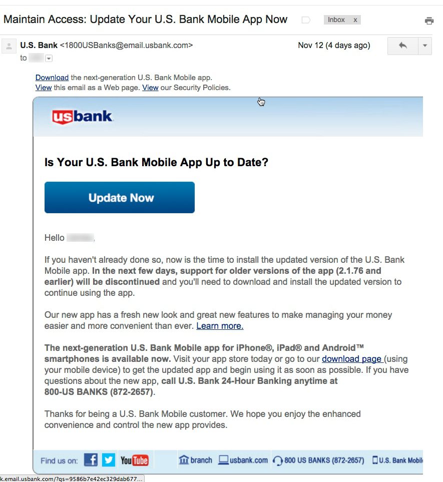
Email from US Bank to mobile banking customers (12 Nov 2015)
Last week I wrote about how much I liked US Bank’s new native app. So I understand why the bank is anxious to get users ported over to the new version. Customers are going to like it. Guaranteed.
Yet I was a little surprised, just a week into the new version, to receive an email warning that the previous app was about to stop working (see message above). This urgency makes customers question whether something is seriously wrong with the previous version. The message is also annoying in that it doesn’t really give the customer any clue as to whether their version is the current one, or not. It provides only the version number (2.1.76) which is the cut-off between good and bad apps.
This message offers so many opportunities to improve that I was compelled to compile a top-10 list of gripes (plus 2 bonus nitpicks). They are listed, more or less, in priority order:
- I had already updated to the new version, so this message was completely unnecessary. And if the bank doesn’t know which version I’m using, it should say so.
- There is no explanation of why it was suddenly so urgent to upgrade. Skeptical users were left to their imaginations, not something you want in these days of widely publicized security breaches.
 Instead of talking about version numbers, why not just describe the new app? It looks completely different! A quick description and screenshot would have been understood by 90% of the readers, and would have allowed users to move on with their day, rather than having to engage in a tedious “find the version-number hunt.”
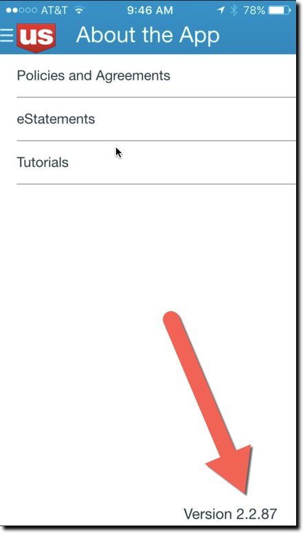
- If you must use a version number, then at least explain how to find it. The email failed to address that key point in the body, fine print, or within any links provided within the message. It’s not that simple to find the version number. You must log in, find the hidden primary navigation, choose “About the App” and notice the version number in the lower right corner (see inset).
- If you are going to make such a big change, use a whole number for the new version of your app. In this case, it would be easier to say, “Use v3.0 or later.”
- The links provided to update the app did not go to the iTunes app-update page, but instead went to a marketing page at USBank.com. And the marketing pages, while well done, also did NOT link to the app store’s update pages. In fact, to confuse things still further, the marketing page said the new version “was coming soon.”
- The only way to get help was to make a phone call to the general 800 number; no direct line to tech support was given. And not even an FAQ page, email address, chat, or any other type of digital link was provided for help in responding to this matter.
- The email message was not optimized for mobile. It was hard to read on my iPhone 6.
- It does not specifically address what happens if you don’t update within the next few days; “discontinuing support” has a number of meanings from simply not getting tech support to completely not working.
- The bank’s message concluded with thanks for being a mobile banking customer, but they could have also thanked me for taking time out of my day to deal with this “Maintain access … update now” emergency subject line in my inbox.
- <Nitpick #1> The first sentence of the second paragraph uses “new” three times.
- <Nitpick #2> The closing sentence repeats the “enhanced convenience” copy point. This is a generic benefit at best and shouldn’t be invoked twice in a 150-word message. The resulting inconvenience to update makes their value judgment of questionable importance.
Bottom line: Customer communications are not easy, especially with newer technology. So make sure to test them with some less-savvy users before hitting publish.

