I love the minutiae of digital banking. Others may be fascinated with how the blockchain will disrupt global payments or the impact of Dodd-Frank on debit-card rewards. Me, I just need a shiny new button to make my day. And as luck would have it, Bank of America obliged in its latest iOS update (Sep 22, v7.1).
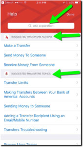
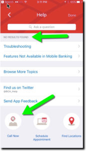
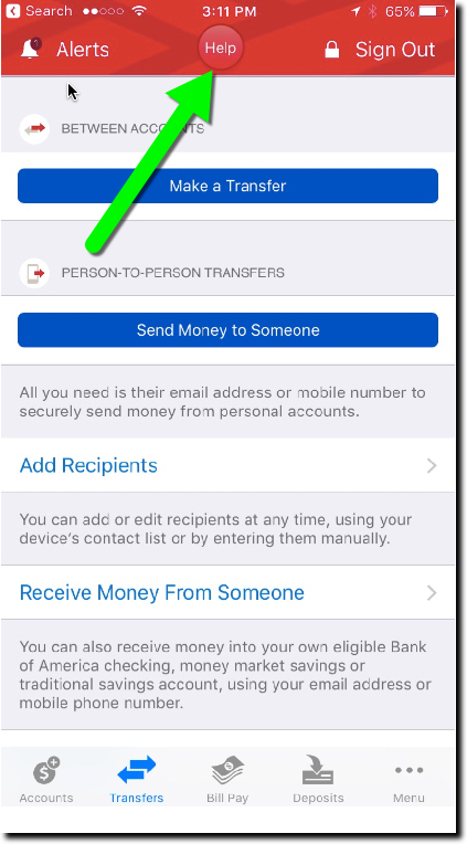
The bank added a Help button centered at the top of the screen on most pages (see above and first screenshot below). Pressing the button leads to a slightly context-sensitive, self-service menu with an “Ask a question” box on top (second screenshot). The search failed my advanced search stress test (Do you have SEP IRAs?, third screenshot), but otherwise seemed serviceable. And it was relatively straightforward to find the right button to connect to an actual human at the call center.
Bottom line: Locating a Help button in a prime position is a good way to show that you care about the customer’s experience. It would be nice if the BofA button led to a better search function, complete with an audio option, and better context-sensitive results (note in screenshot 3, the top result from my SEP-IRA question is “Troubleshooting”). And if I was being totally honest, the button is a little hard to see on a tiny screen, the red on red. But regardless, it’s a good start.


