![]() There is only one reason I visit a bank’s website: to learn about its online and/or mobile banking features. Granted, understanding digital banking is my livelihood. But normal people looking for a new checking account, credit card or loan also need to understand digital capabilities. Even for those that need the comfort of knowing there’s a branch nearby, online/mobile is still a key attribute for the vast majority of consumers, and businesses, shopping for banks.
There is only one reason I visit a bank’s website: to learn about its online and/or mobile banking features. Granted, understanding digital banking is my livelihood. But normal people looking for a new checking account, credit card or loan also need to understand digital capabilities. Even for those that need the comfort of knowing there’s a branch nearby, online/mobile is still a key attribute for the vast majority of consumers, and businesses, shopping for banks.
So I don’t understand why digital features are often relegated to a sub-menu buried in the Personal Banking section. Of the 10 largest U.S. retail banks, only two, US Bank and BB&T, feature online banking in high-level navigation. This is little changed from our mid-2013 overview.
My favorite among the mega-banks (again) is US Bank, which highlights digital on the upper left and uses both “online” and “mobile” in the navigation tab:
BB&T’s placement also works with “Online Services” on the far right of the top line. While that naming is okay, it would be better to see “mobile” mentioned. So, I’d recommend changing it to “Online & Mobile,” which is the same number of characters.

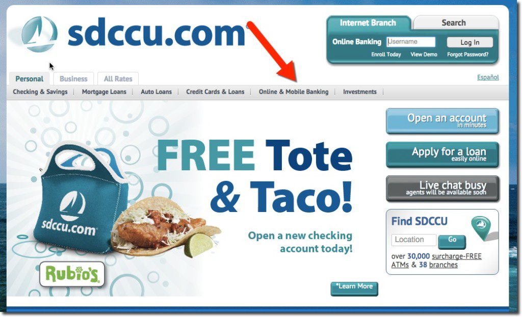
Plenty of smaller banks and credit unions are already showcasing their digital features. For example, San Diego County Credit Union uses “Online & Mobile Banking” along its top navigation.

