 David vs. Goliath has been a popular theme for a few millenia. Everyone likes the underdog. And when the established player is also seen as stodgy and clueless, the advertising opportunities multiply.
Credit unions and community banks have taken market share for decades using a variety of similar themes: local vs. outsiders, small vs. big, member concerns vs. shareholder profits, and so on. It was only a matter of time before this tried-and-true strategy went online.
Campaign #1: HomeStreet's My Bank Doesn't Get It
 The first campaign to catch our eye was from Seattle's HomeStreet Bank, which sent teaser postcards to local businesses in mid-April. The cards featured an image of a face and an intriguing URL, <mybankdoesntgetit.com> (see right). We've also seen the campaign running on the side of city buses.
After logging in to the unbranded site, users were encouraged to post a rant about something they disliked about their bank (see screenshots below).
#1  #2
#2 #3
#3
The site is about as soft-sell as you can get; users aren't even asked for their email address. The only sales message is an unbranded, lower-left link prompting users to click to go to a bank that does "get it" (see inset upper left and screenshots above).
 Users clicking on the link are taken to a HomeStreet landing page that reinforces the "get it" theme (see screenshot right). First, users see a welcome page that reveals the name of the with-it bank. Then users move to a more traditional product page with subtle reinforcement of the "gets it" theme (see screenshot below).
 However, once at the bank site, the sales momentum rapidly loses steam, and there's little in the way of compelling benefits to convince a business owner to go to the next step. Obviously, the bank's branding agency gets it, but not necessarily the website designers.
For viral marketing, HomeStreet includes an email-to-a-friend link. But what's missing is an email-capture device for visitors making the online rants. All the bank needs to do is add an inexpensive prize to the pitch, such as a free iPod Nano, and they'd have hundreds, if not thousands, of opt-in emails to market to.
Campaign #2: Washington Mutual's Trapped Bankers
Surprisingly, the second campaign is not from an up-and-coming community bank or credit union, but from behemoth Washington Mutual. The company has a long history of anti-banker advertising going back to the days when it actually WAS the underdog and not the sixth-largest retail bank in the country.
It was brave enough to provide a look at its new campaign at BAI's SmartTactics conference earlier this week in Las Vegas. Unfortunately, I was busy with another session and missed the joint presentation from Chris Matthews, the bank's brand & advertising SVP and its agency, Leo Burnett.
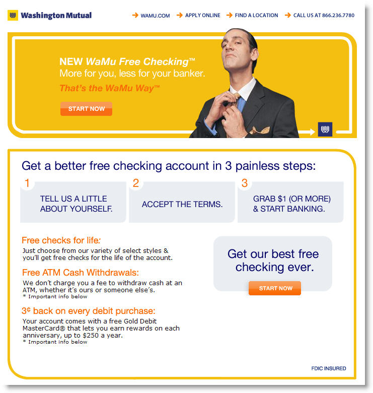
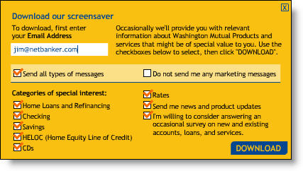
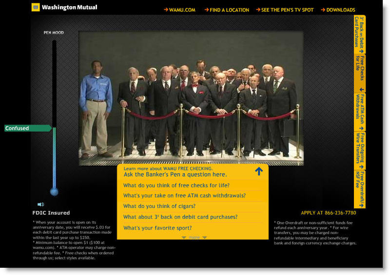
 The campaign was a hit with the crowd of 30-something bank marketers, especially the television spots depicting various methods to trap bankers such as baiting a trap with a plate of steaming lobster. The campaign has a Web component at <trappedbankers.com> where users can view one of the television spots, ask questions of the bankers trapped in a basement holding pen, and review the benefits of WaMu's free checking offer. The only lead capture device is an opt-in email address required to download a screensaver (click on inset for closeup), a huge 3MB offering that incidentally wouldn't load onto our Windows XP laptop.
 While the edgy advertising is likely to be popular with its younger target audience, I don't think the website is particularly appealing (click on inset left for closeup). The Flash-based presentation first required a download of version 8 to run, then used hard-to-read fonts on a black background.
There are several HTML remnants in the black background that if accidentally clicked, take you to a garbage page at <pointroll.com>, a rich media design house that must have had something to do with the WaMu site. And there is no way the site works on a dial-up, and even on broadband the use of streaming video creates some lag that makes the presentation a bit choppy. This is one of those high-tech websites likely to win design awards while turning off users.
Finally, I find the whole concept of "trapping" a bunch of fat old bankers and then teasing them in an underground holding pen to be slightly disturbing. Maybe it's that the banker profile hits too close to home, but I think they went too far. Instead of a positive, "we get it" message, there is an underlying theme of negativity, one that is borderline abusive, which turns me off. While it will gene
rate massive traffic, I wonder what impact it will have on account growth and brand image. There must have been quite a debate in the boardroom on this one.
Even if you like the creative, as in HomeStreet's campaign, I don't think the Web designers quite "get it." The bank should have a way to capture email addresses from the hundreds of thousands, or millions of visitors, and there should be a more direct link to sign up for an account. Currently, the bank just drops you onto their default personal banking page when clicking on the tiny WaMu link at the top of the trapped banker page.
Grades
We'll give each of them an A for effort, although we prefer the simpler design of HomeStreet Bank's campaign. However, both get downgraded on execution. HomeStreet gets a B- due to its lack of sales emphasis and failure to capture email addresses. WaMu, which also fails to capture email addresses from most visitors, receives a C- due to the overly complex website, lack of a custom landing page, and lack of a good, direct-marketing design.
—JB
For more financial interactive marketing ideas, check out the Interactive Financial Marketing Database from our sister publication, the Online Banking Report.
 But the new winner, with the longest online archives, is San Jose-based Technology CU which provides free online access to statements going back to 1993. That's 14 years and counting. Tech CU also requires an online request for the back statements, but with the archives hosted in-house, they are readable within seconds. In response to my question, SVP Michael Luckin timed the query for me, and was able to login, request and receive an older statement, and logout in 20 seconds. That ought to satisfy most members.


