Kickstart Your Banking Community with Crowdfunding

image

image If you read much tech news, you’ve probably heard about Kickstarter, or at least their most famous project that helped a budding entrepreneur make watches from iPod Nanos (above).

Kickstarter is the best known (note 1) of the so-called crowdfunding sites where the Internet is invited to help fund new projects in return for recognition and/or a tangible good related to the project. Kickstarter focuses on the arts world, helping connect artists, designers, publishers, and performers with patrons around the world, who kick in as little as a $1 to help get a project off the ground. There are dozens of others focusing on other areas as well. 

You're a Backerimage I used Kickstarter this weekend to fund publication of a new comic book called Steamfunk (screenshot below). I came across it when searching for local Seattle-area projects.

My niece is a steampunk fan, so I thought it would be a nice surprise for her. I dropped $15 into its pledge drive, and assuming the artist Zilla Doty receives at least the $3,000 he was seeking (note 2), in April I’ll have a signed copy of his inaugural edition to send to my niece (note 3).

Not only do I get a cool one-of-a-kind gift, I gain the satisfaction of helping a local artist get a project off the ground. Very gratifying.
_______________________________________________________________________

Bank Opportunity
_______________________________________________________________________

I bring this up, not because it’s a slow news day, but because I think leveraging crowdfunding could be a good way for community banks or credit unions to distinguish themselves in the local market. It would not be an easy project, getting people to part with their money never is, but it has the potential to attract new small business clients while supporting your community.   

Here’s how it would work (note 4):

1. Bank sends customers to a third-party crowdfunding site, which could be operated independently, or private-branded for the bank

2. Bank publicizes new community projects via its website, blog, Facebook page, and so on

3. OPTIONAL: Bank offers to match the crowd’s funding with a credit line/loan (if needed and assuming reasonable credit risks) or other banking services

For extra credit: Integrate crowdfunding with peer-to-peer lending. 

————————

Kickstarter project page
Note: This is how it looks after you’ve made a pledge

Kickstarter project page

———————————-

Notes:
1. According to Compete, Kickstarter had 750,000 unique U.S. visitors in Dec. 2011.
2. With 20 hours to go, the project has easily surpassed the $3,000 goal. 175 backers have pledged almost $5,000.
3. The pledge process is very smooth. Payment is made when you make the pledge and fulfilled through Amazon Payments. If the project fails to reach 100% funding by the end date, you get your money refunded. According to the company, 90% of the projects who make it past the 25%-funded mark end up with 100% funding. That’s an amazing stat.
4. No, I don’t have a clue what objections you might get from compliance, but I’ll bet it will be an interesting conversation.
5. We haven’t written specifically about crowdfunding at Online Banking Report, but we’ve covered P2P lending and small biz banking services.

USAA is Amazing

imageHow did USAA become the most innovative bank in America? I guess its big-bank competitors have been kind of preoccupied with other matters the past few years. And because USAA serves most of its 5 million banking customers remotely, it stands to profit from pushing the envelope in online/mobile delivery. 

The latest proof that the bank is both innovative and adored? Posting user reviews right in the middle of the homepage, an inventive and unique approach. And with an average score of 4.7 out of 5 for both checking and auto insurance, the reviews serve as a transparent and effective mass endorsement.

Here’s the breakdown of scores received on 6,350 total reviews for USAA’s free checking account (as of 12 Aug 2010):

     5 stars (excellent) >>> 5,550  (87% of total)
     4 stars (good) >>>>>>    329  (5%)
     3 stars (average) >>>>   154   (2%)
     2 stars (fair) >>>>>>>    110   (2%)
     1 star (poor) >>>>>>>     214  (3%)

Relevance for Netbankers: Frankly, I never thought I’d see user reviews posted anywhere on a bank site, let alone the homepage (note 1). If your customers love you, I mean really love you, customer reviews posted directly to an in-house site is a great way to prove it (note 2).

USAA homepage (12 August 2010)
Note: Ad on top for its new Auto Circle car-buying service, complete with its own iPhone app.


image

Notes
1. Bank of America also posted user reviews on its site, but the feature appears to have been discontinued a while ago. The last reference I could find on Google about the reviews was in Jan. 2008.
2. This would not be an easy project and would require a significant investment in ongoing monitoring and maintenance. More importantly, it requires a thick skin; your organization would have to be comfortable with a certain amount of complaints being posted. As good as USAA’s overall score is, there are still 314 poor reviews posted, 3% of the total. But allowing customers a salient vent-fest on your website may keep them from doing so in more public venues such as Twitter. It also gives you a chance to respond to and resolve posted problems.

Discover Card’s User-Generated Card Design Contest

image Personalized card designs have been offered by Capital One and others for years. But I’ve yet to see the idea turned into a contest. Discover Card is running a promotion for the best design submitted through its microsite or Facebook page.

The winner will pocket $1000 and the design will be featured on the next Discover Card Student Card. There is also another $1000 split among five runner-up designs.

To enter the contest, users must log in at the Discover microsite using Facebook connect (see screenshot #2, below). After creating the design, users end up on a Facebook page where they can provide optional personal information (screenshot #3). 

The promotion is powered by the Graffiti Facebook app.

As you can see by my handiwork (inset), most card designs are pretty crude. But there are also some pretty creative entrants. There is only one design tool available, a brush you run with your mouse. The only variations are color, brushstroke width and opacity. No uploads are allowed, so you cannot add any fancy graphics created in other apps.

The contest ends tomorrow and so far there are nearly 5,000 entries. 

Bottom line: It’s a drop-dead simple contest with excellent Facebook integration and a link to apply for Discover’s Student Card. It’s a great idea, with good execution, and the card issuer will end up with a cool new card design for a relatively small cost. Grade A+ 

Thanks to Payments News for the link.

1. Discover Card microsite (31 Dec. 2009)
Note: Homepage showing the 10-most recent entries with our lame effort in the lower-right.

image

2. Discover Card design creation page

image

3. Facebook optional personal info page

image

4. Designs appear on the Discover Facebook page under the Graffiti tab (link)
Note: Considering the crude input tool, some of the designs are amazing. As you can see, I will not be in the running for prize money. 

image

image

Bank of America iPhone Mobile Banking App Criticized in Early-User Reviews

image The good news: Of the 135 free applications in the new iTunes App Store, Bank of America’s is a solid number 20, three spots ahead of PayPal, according to rankings within iTunes this morning.

The bad news: The first batch of reviewers hated the app. Their main complaint: It’s not really a native app, just a front door to the bank’s existing mobile site.

The reviews: On a 5-star scale with one star the lowest choice, the app has only a 1.5-star rating (see note 1). Of the 81 reviews, only 19 rated it above one star. Throwing out the five 5-star ratings which are probably from people associated with the product, that leaves only 14 above the bottom rating, an abysmal score by any standard. Following is the breakdown:

Stars Number of Votes                            My Comments
*****             5 I’m skeptical of the objectivity of these reviews
  ****              0 Other than the suspect 5-star fans above, no one was willing to go 4 stars
   ***               6 Only six legit users were even OK with the app
    **             8 Most of these were critical in their comments
     *                62 one star is the lowest choice on the review form

Source: Online Banking Report review of iTunes data, 11AM PST, 11 July 2008

What’s innovative?
1. I was astounded to see 81 reviews in the App Store already. It just opened this morning! It should be noted that you don’t have to actually download the app to post a review. So if and when you post an app here, be prepared for criticism. Even more important, this demonstrates the impact the user voice will have going forward (see note 2).

2. Early adopters, especially techies, can be brutally honest, especially with large corporate efforts deemed lame. But even though the overall grade was very poor, a number of reviewers pointed out that the automatic ATM locator was a significant improvement.

3. BofA needs to upgrade this app ASAP. Some of the criticisms about font size and design can be fixed relatively easily.

Summary
Despite the harsh criticism from the first batch of reviewers, I think BofA did the right thing strategically. It’s too bad they didn’t have something a little flashier, but the bank will get far more mileage by being the first bank in the App Store that it will lose by disappointing the mobile early adopters. It’s unlikely they will lose any business from the negative reviews. They are mostly in the “you should have done better” category, not the “BofA sucks” variety.

You have only one chance to be first, and BofA took it. No one else will ever be able to say they were the first bank in the iPhone (who’s going to be the first credit union?). But the bank better get cracking on version 2.0! (see note 3)

Notes:
1. The only other app from a financial services company was Paypal, which mustered a meager 2-star rating. But it elicited only one-sixth the number of reviewers, just 13. Because you don’t have to actually download the app to post a review, BofA may be getting slammed by people just reading the reviews and jumping on the bandwagon with me-too critiques.

2. See our latest Online Banking Report for more on the growing importance of user reviews. We’ve also published reports on Mobile Banking and Mobile Payments.

3. This post marks the end of iPhone week at Netbanker. We’ll get back to our regularly scheduled programming next week.

Suggestion Box 2.0: Is MyStarbucksIdea a Blueprint for Banks?

image One perk of working for a large company is being recognized, or winning prizes, for contributing useful suggestions. While employees can be pretty cynical about the whole process, overall, it’s good for employee relations to solicit and reward suggestions. Employees appreciate the opportunity to voice their ideas to senior management and do their part in making the company/products better. And if they win a free dinner, it’s all that much better. 

The same concept can work even better with customers where you don’t have to worry about favoritism and corporate politics. But how do you solicit meaningful suggestions without getting bogged down in an expensive and time-consuming evaluation process? And more important, how do you prevent the really innovative ides from getting killed in the marketing/customer service/IT department, where the not-invented-here bias rules?

Interactive suggestion box from Starbucks
Amidst a sweeping round of innovations announced at its annual shareholders meeting today (see note 1; press release here), Starbucks provided a glimpse of the future of customer feedback with its MyStarbucksIdea, a user-generated discussion forum revolving around product and service suggestions (see screenshot below).

By involving users every step of the way, the system helps remove the inherent bias that plagues most company-run programs. The key is allowing registered users the power to vote on each idea, the best rise DIGG-like to the top, where other customers, along with the Starbucks top-brass, are likely to see them. Other than light moderating of the forum, Starbucks only has to process the very best ideas.

To provide the all-important company feedback to the community, the Starbucks site (note 2) has an area that will showcase the ideas that are actually implemented. The site says there are no monetary rewards, but I would expect that wining ideas will receive some small token of the company’s appreciation such as a $50 Starbucks card or t-shirt. You don’t want the incentives to be too high, or the system will be gamed and its appeal damaged. 

The most popular idea at Starbucks has to do with providing discounts…no surprise there. But the company has wisely introduced a dozen idea categories to help spur discussion in other areas. For instance, in “Other Product” section (second screenshot below), I found two that I voted for: microwave ovens to re-heat coffee and providing small stickers to keep the coffee from sloshing out the drinking hole while driving.

Implications for financial institutions
I believe that every financial institutions should have some type of suggestion program even if it’s just an email address (suggestions@yourbank.com). And I think the open Starbucks approach could work very well. However, if there are no ground rules, most banks and credit unions will be innundated with “ideas” to lower fees, raise savings rates, and so on. As much as you don’t want to stifle discussion, you may have to restrict or even forbid suggestions about pricing. Most people will understand that your pricing decisions are not made via the consensus of a public user forum no matter how many votes “interest-free loans” receive. 

To help spur ideas outside the usual complaints, create a list of categories such as online banking, wire transfers, checking accounts, branches, and so on to generate ideas for your different product lines.

MyStarbucksIdea homepage (19 March 2008)

Starbucks mystarbucks idea homepage

Top ideas in “Other Products” category

top ideas in "other products" category

Notes:

1. Starbucks also announced a set of rewards for users of its prepaid card including free premium drink upgrades such as soy milk, free beverages with the purchase of coffee beans, and the big one for the WiFi set, 2 hours of free Internet access with a purchase.

2. Interestingly, Starbucks new app is built on the Force.com platform from SalesForce.com.

Wells Fargo Launches CenterStage, a User-Generated Video Promotion

Tomorrow, Wells Fargo is expected to launch a user-generated video contest that will place the winning entry into a 30-sec commercial that plays during January's Rose Bowl, with an audience of 35 million or more. The winner will be chosen by public voting on the contest website. Entries are due by Nov. 26.

Although, this type of contest has been done before including last year's Super Bowl (see previous coverage of Intuit's TaxRap here and Lending Club here), it's the first time a major U.S. bank has launched such a high-profile effort. It should provide Wells with excellent publicity while supporting its social media and branding efforts.

The whole effort is first class, from the Center Stage website, to the pre-taped audio tracks in various genres, and the contest rules and prizes. And while the sample video's are cute, don't listen to them at bedtime. Trust me, you don't want "The Wells Fargo Wagon" running through your head as you try to get to sleep. 

Boeing Employees Credit Union Posts User-Generated Content

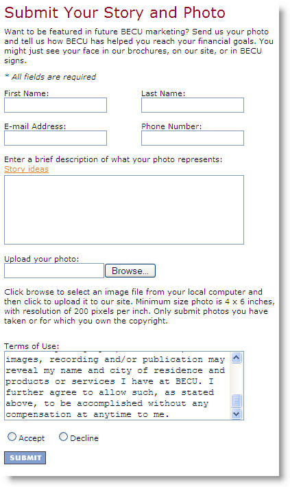
Playing into the summertime digital photo frenzy, Boeing Employees Credit Union <becu.org> is asking members to send a photo and short story for posting on the Seattle-based CU's homepage <becu.org> (see below for an example).

Photographs can be uploaded through the website, emailed in, or for those not into digital photography, a 4×6 or larger print can be mailed in. Either way, every person in the photograph must sign a release, also available on the website.

Here's how it looks on the homepage (click for larger version):

Becu_yourpics_homepage

Click on the continuation link below to see the landing page for the promotion and the upload form.

JB

Notes:
The landing page (accessible through link from lower portion of homepage, see above):

Becu_yourpics_landing_1

Here's the uploading form:

Becu_yourpics_upload