Finding New Subscribers for Your Email Newsletters and Alerts

How do you convince already-registered users to sign up for your latest email newsletter? One way is to offer an incentive. Earlier this week, the Seattle Supersonics offered users the chance to win a $500 shopping spree if they logged into their account and opted-in for the latest email newsletter.

An even more effective method was demonstrated by the New York Times today in the online version of its Business Section. In the upper-right corner, the user's existing email address is shown, along with a sign-up button (see screenshot below). All it takes is a single click to begin receiving the daily DealBook email.

The newspaper also provides a link to view a sample of the newsletter, a proven strategy for increasing response, and links to its Privacy Policy and back to account preferences to change the email address.

New York Times email signup CLICK TO ENLARGE

Once users click on the sign-up button, the text is changed to a thank-you message along with a link to change email preferences (see inset above).

TrueCredit Email: "Credit is Scary"

I'm a sucker for holiday-themed messages. There's something about a big, well-timed graphic that makes an email stand out from the crowd.

Here's the latest from TrueCredit, a prolific emailer to ex-customers such as myself. I usually hear from them every week or two.

Date: Tue 24 Oct 2006 9:27 AM
From: TrueCredit [truecredit@email.truecredit.com]
Subject: Autumn Special: James's 3 credit scores

Personalization used: My first name in the subject and message body

TrueCredit Oct. 24 email to ex-customers CLICK TO ENLARGE

Everbank’s Latest Email Newsletter

Everbank <everbank.com> has been an active emailer, sending a newsletter every few months for the seven years I've maintained an account there. The newsletters have always been chock full of content, from general finance topics to detailed discussions revolving around the bank's unique currency- and commodity-related products.

The newsletter design has evolved with the times, from plain text in the 1990s to the well-designed HTML missive we received last night (see below). The short headlines letter encourages customers to click through and read the full document at the Everbank website (see End Notes).
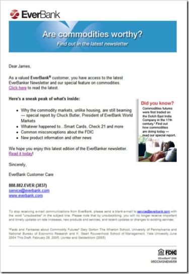
Email Sample
Date/Time: Oct. 11, 2006, 8:59 PM (received 10:24 PM Pacific Time)
From: EverBank [service@everbank.com]
To: James
Title: Are commodities worthy? Find out in the latest EverBanker newsletter
Personalization: Dear <firstname>
Signature: EverBank Customer Care

Everbank Oct newsletter CLICK TO ENLARGE

Analysis
Email
There is little to criticize. The short email is direct and to the point. Its layout lends itself well to viewing within the preview pane. The small "did you know" box adds an element of interest, and the drop-shadow makes it stand out. 

With four major articles, it makes sense to send just the headlines and ask the reader to click through to the website to read the full article. However, the bank should use the standard convention of hyperlinking each article directly to the appropriate place on the website.

The bank does include two hyperlinks to the Web-based newsletter, a "click here" in the first paragraph and a "read it today" at the end. However, for even better usability, the bank should add a big shiny button that leads directly to the Web version.

Web-based Newsletter
The website demonstrates good usability in its layout and content. A synopsis of each article is provided on the main page and users click through to read the complete article. It's useful and well-written information, better than a lot of what you read in mainstream consumer-finance publications. We especially liked the "whatever happened to" look-back at some recent initiatives, such as Check 21, and the overview of consumer-protection laws.

As good as the newsletter is, we couldn't stop thinking that it would work much better as a blog. That way, readers could pursue subject threads and more easily peruse all that Everbank provides. The bank could also experiment with accepting comments to make the whole experience more interactive.

Overall grades:
Content: A+
Email design: A-
Website (newsletter) design: A

End Notes
Click on the following link to see a screenshot of the newsletter landing page.

Newsletter Landing Page (here's the link)

Everbank_newsletter_11oct06_landing_1

Citibank’s e-Savings email

Last night, Citibank sent selected checking-account customers an email solicitation for its 4.75% APR e-Savings account. I live outside its branch network, so Citi may have elected not to send the message to customers serviced by traditional branches.

Citibank_email_esavings_with_imageThe message was direct and to the point (click on screenshot left). Citibank even included the impressive 4.75% interest rate in the message subject. The only distracting portion of the message was a garbled first word in the second paragraph. It was probably caused by incompatibilities in software rendering of the apostrophe in the first word, "there's." To avoid this type of error, make sure you proof your message in multiple email clients.

The bank continues to engender trust in its marketing messages by including the "email security" box in the upper-right corner which includes the customer's full name and last four digits of their ATM card. The security information is prominently displayed, in a blue shaded box to make it more prominent, even if the user has images blocked (see screenshot below).

The bank also includes short text messages that appear where the images would have been displayed (alt-text tags) making the message relatively readable even for users that never download the images.

Citibank_email_esavings_no_image

Surprisingly, the landing page for the offer was a generic product page. The campaign would be much more effective if the bank had reinforced the e-Savings benefits on the landing page like it does when it advertises online (see NB March 29). Click on the following link to see a screenshot of the landing page. —JB

Appendix

Landing page
(displayed when clicking on the "signup" button in the email).

Note: I tested the link on my laptop where I am not recognized as a customer and on my desktop that saves my username in a cookie. Both times I was served the same landing page (below).

Citibank_email_esavings_landing

Email: US Bank “Spring Clean Your Finances”

Emailmarketing_logoEvery month we receive dozens of emails from the many financial institutions where we have accounts and also, increasingly, from non-customer mailing lists at others. As part of our expanded coverage of email marketing, we plan to post many of them here. You will be able to access the entire sample collection by clicking on the "Email Archives" subject on the right-hand navigation. Alternatively, individual emails will also be filed within their pertinent product areas, in this example, "Loans & Credit" and "Personal Financial Management."

Today's message is from US Bank <usbank.com>, which sent the following solid, but fairly boring financial organization email to current customers.   

Here's a screenshot of what appeared in my inbox. You can also view the clickable version by following this link

Usbank_email_heq

On the landing page for the "Credit Card Clean Up" link in the blue-shaded area on the right, US Bank offers a useful calculator to determine the benefit of reducing credit card debt (see below).

Usbank_email_springcleaninglanding

If you'd like to learn more about the financial email marketing, check out Email Marketing in Financial Services: Leveraging the Inbox from our sister publication, the Online Banking Report.

Improving Your Website’s Welcome Message

When your customer makes a significant purchase or signs up for online banking, make sure you take the time to send a well-designed welcome/thank-you email message. It not only helps make a good impression with your new customer, but also can pay for itself by decreasing telephone inquiries about the status of the new account. The message can also be used for SUBTLE upselling, such as a balance transfer offer for new credit card accounts.

Dell’s Welcome Message

Dell_welcom_mainToday we received this message from Dell thanking us for purchasing a new PC. Even though we’ve been frequent Dell buyers for years, they are not taking us for granted. The welcome message includes friendly graphics and a short welcome message with an embedded link to the "order status" page (click on inset left for a closeup).

The bottom of the message, which requires scrolling for most users, contains Dell_welcome_bottomkey information for future use such as serial number, customer number, support numbers, rebate info and so on. There is also a link to purchase add-ons (click on inset right for a closeup).

Click here to download the entire email message on one screenshot.

JB

Paying for Email Delivery

Stamp_spdeliveryIt appears the pay-for-delivery email model could be gaining traction with announcements by Yahoo and AOL that they plan to start levying fees of $2.50 to $10 per thousand for guaranteed delivery. According to emarketing guru Anne Holland, who believes that these fees are inevitable, the cost to send email will roughly double for most large mailers.

Her advice:

  • Make sure email addresses are accurate
  • Prune inactive addresses from your list
  • Segment your list into finer increments
  • Look into RSS feeds for some of your messaging

We’d add:

  • If you allow users to designate more than one email address, consider a nominal annual fee for the extra messages
  • Along the same lines, you may want to reconsider the policy of unlimited free email alerts; changing it to a two-tiered approach with a couple free each month or unlimited for $3-$5/month

More information:

JB

ING Direct Personalizes Emails for Security

Ingdirect_personalized_emailING Direct <ingdirect.com> is the latest bank to move to greater personalization in order to distinguish its messages from phony phishing attempts. The bank has added the customer’s first name and masked all but the last three digits of the customer’s number (click on inset for a closer look).

The message at left was sent to customers to market ING’s latest deposit promotion: 4.75 percent APR for new money.

Ingdirect_personalized_alertThe same technique is also used for routine account alerts (see inset right).

Note: The high-impact sales pitch for its 4.75 percent deposit promotion.

Analysis
While it doesn’t prevent phishers from attempting to recreate the same look (see footnote), it’s an effective first line of defense. Besides, the personalized greeting is a friendler way to communicate with customers. Citibank has been using a similar approach for more than a year (NetBanker, May 30, 2005).

Citi_phishFootnote: Yesterday, we received a fake email that recreated the Citibank personalized area in the upper-right corner. The crooks just left blank the Email Security Zone in the upper-right corner, figuring many users won’t look that closely at the box (click on inset for a closer look).

JB

Everbank Reinforces Interest Rate Increase with Email

Everbank_emailThere is nothing like a long run of rate increases to make your deposit customers happier. You might as well take some credit; it probably won’t be long before they move in the other direction.

So every time you raise rates, make sure to let customers know with an email message. Of course, this assumes competitive rates. If you are increasing from 0.45 percent to 0.65 percent, you probably want to keep that to yourself.

EverBank raised checking account rates Jan. 1 from 3 percent to 3.5 percent depending on balance levels. On Jan. 3, it sent an email with the subject (click on inset for closeup view):

You’re earning more with EverBank – interest rates rise again!

Analysis
EverBank’s message is straightforward. Here’s what they did right:

  • Included security graphic/link in upper-right corner
  • Kept copy concise and to the point
  • Included a chart showing rate by balance level; subtle encouragement to add funds
  • Reinforced free online banking and bill pay (underneath chart)
  • Cross-sold its Yield Pledge Money Market and CD for those looking for better rates; Yield Pledge products are guaranteed to offer a rate in the top 5 percent at BankRate.com
  • Included toll-free phone number
  • Signed by real person with real signature; in this case, Frank Trotter, president

And a shorter list of improvements:

  • Personalization helps make a message look genuine, but there’s no personalization in the salutation: "Greetings EverBanker!"
  • Clicking through the security graphic leads to a generic page full of links to terms and conditions; the bank should create a page that specifically addresses users’ security concerns, especially regarding phishing emails
  • The bank should improve its unsubscribe function; currently, it’s an all-or-nothing choice triggered by sending a blank email with UNSUBSCRIBE in the subject line; that’s easy for users, but the bank’s just lost an opportunity to query the customer in more detail about what they do and don’t want to receive via email
  • Weak P.S.: "The FreeNet Checking Account gives you the yields and the service you deserve. Bank on it!"

Grade
Overall, we’ll give it an A-

JB

Everbank Markets to SmartMoney List

Everban_asiancd_email_previewEverbank <everbank.com> dropped an email solicitation (click on inset for closeup) to the registered users of SmartMoney.com. The message featured the bank’s newest specialty CD, the Asian Advantage which rewards depositors with above-market Everbank_asiancd_basket_2returns IF the dollar falls against a bucket of Asian currencies.

Last week, the Internet-only bank dropped an 8.5 x 5.5 inch postcard mailer with a similar theme. Recipients could respond by calling toll-free 800.926.4922 or going online to www.everbank.com/asiancd.

Analysis
This is a great example of deposit product email marketing.

  • Focuses on the unique selling benefits
  • Good graphics and copy
  • Landing page with a minimum of distracting navigation choices
  • Visible call-to-action with Apply Now! button

We like the opening sentence in the postcard better than the email (see below). With an advanced investing strategy, the direct statement of how the user will earn a profit is more understandable. However, without the results of the bank’s testing, it’s difficult to know which pulls a better response.

   Email: "There’s a great new way to invest in the active and healthy Pan-Asia currency market."
   Postcard: "Do you want to profit if Asian currencies gain on the U.S. dollar?"

Screenshots (links will not work):

  1. Everbank’s Asian CD full email
  2. Everbank Asian CD landing page
  3. Previous article on Everbank foreign-currency deposits

–JB

The CEO Spokesperson

You may have noticed the new Chrysler ads using former CEO Lee Iacocca. The company revived the 1980s ad campaign because it was so effective at the time. However, it takes an especially charismatic company leader to make a television pitch pay off. However, through email, all it takes is a good copywriter, a striking graphic or two, and an interesting message.

You have to be careful not to overuse this technique, but once a year or so, an email from the CEO/President could be an effective relationship-builder and marketing technique.

Ceo_email_networksolutionsFor example, today we received a message from the CEO of Network Solutions, the original domain-name registrar (click on the inset for a closeup). We’ve received hundreds of message from the company over the years, but don’t recall one from the CEO before. It got our attention and we looked at it long enough to determine it was selling services we weren’t interested in.

But the first goal of direct marketing is to gain attention, and this technique is a sure-fire method to do that.

JB

Setting Flags in Electronic Bank Alerts

Inbox_flagNow that consumers are beginning to receive multiple alerts and other email messages from their financial providers, you risk the problem of "alert fatigue." It happens with any warning system. If you get too many warnings or status messages, you start to ignore them, rendering the system ineffective.

One way to make your message standout is to add a "high importance" flag to your outgoing message. In Outlook and Outlook Express, a small red exclamation point will show on the subject line in the message list (click on the inset for a larger image). In this example, the Washington State Department of Revenue added the flag when it sent password-changed alert. But it didn’t add the flag when sending a routine payment confirmation.

The key to making the flag effective is to not overuse it. Don’t ever put it on an advertising or marketing message. And use great restraint when attaching it to balance or confirmation messages. It’s best use, might be for security-related notices such as password resets and other sporadic and relatively unusual activity.

JB