As I was taking a tour of US Bank’s gorgeous new mobile app (above), I was reminded of an ongoing problem in mobile UI, lack of navigational consistency. For anyone over 30, you’ve seen this play out before. It took nearly a decade (1995 to early 2000’s) for websites, especially in financial services, to conform to pretty straightforward navigation conventions (tabs on top, login in upper right, etc.).
 While responsive design—one website for desktop and mobile—has made things a little less standardized, desktop browser navigation is still pretty easy to figure out. And there’s always the back button to get you out of a jam.
Not so on smartphones. First-generation mobile banking UIs generally used the bottom of the screen to showcase 3 or 4 navigational choices, often with a More button to expand the choices. This worked OK since early apps usually had limited functions.
But as banks redesign their apps to a more modern esthetic, the bottom navigation bar is disappearing. That looks great, but how do users find key functions?
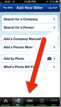
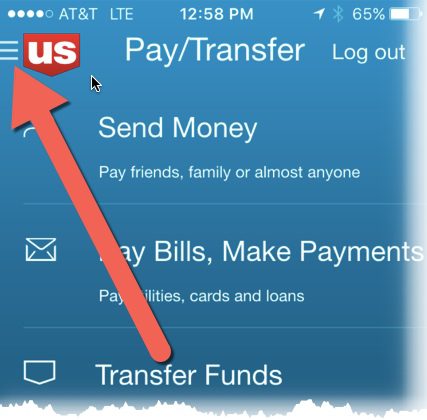
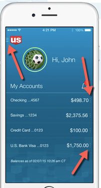
That brings me back to US Bank’s new app. When I finished admiring its newly sleek design, I was momentarily thrown for a loop on how to get out of the main page. The familiar buttons at the bottom were gone (see older screenshot right). And initially I didn’t see the “hamburger menu” in the upper left corner—a stacked column of three bars (upper left), or a stack of small dots (following line items)—which have recently become fairly common design conventions.

 So it turns out that US Bank has located navigation options in two spots, neither particularly easy to see on a phone.
(1) The hamburger menu is there in the upper left, but it’s small and looks like it’s part of the logo (see screenshot at left and closeup at right)
(2) The smaller context-sensitive menus are positioned directly to the right of each account. Deposit accounts have three navigation choices (Pay/Send, Transfer Money, Deposit)
Bottom line: US Bank has delivered what may well be the best looking big-bank mobile app yet, at least in the United States. It is also packed with new features such as no-login balance inquiry and customizations. So kudos to the team at US Bank, which also led the pack on desktop UI more than a decade ago!
That said, the almost-hidden primary navigation is a case of the design getting slightly ahead of its users. While users may soon get used to the new nav links, I recommend a few adjustments in the meantime:
- Add navigation instructions to the “feature tour” when users open the app for the first time.
- Make the hamburger menu stand on its own by increasing its size and placing it away from the US Bank logo (below the logo, or in the upper right which is wide open).
- Consider adding the word “menu” below it for a few months, at least until users get the hang of it.
——–
Update 16 Nov 2015: Digital design guru Jakob Nielsen just published an overview of mobile navigation echoing our concerns with the hamburger menus.
