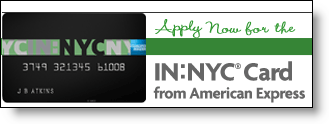
American Express Builds City Brands

Amex_inny_logoFinancial institutions have done amazing things with their websites since Bank of America launched the first major commercial banking site 11 years ago (Sept. 1994). However, other than single-market credit unions and community banks, there hasn’t been much attention paid to localizing the content to appeal to more narrow geographic segments, for example the customers in a single city or neighborhood.

Beginning a year ago, American Express began a campaign to bring specialized city-based cards to major metro areas. The cards are intended for the 25-to-35 year-old hip urbanites. The card design, marketing, and rewards all cater to the dining out, clubbing, and museum-going single scene.

The first card, IN:NYC <innyc.com> launched a year ago (30 Sep 2004) and was discussed in a front-page WSJ article today. The company won’t disclose any results, but did say that 90% of its customers have not previously owned an American Express card, an important statistic for a company worried about cannibalizing its other products.

The IN:NYC card has its own look, website, and rewards program focusing on unique beyond-the-velvet-rope experiences in local clubs and eateries. In an interesting viral marketing strategy, friends are able to pool points in order to qualify for bigger rewards, such as a VIP table in a hot club.

The key cardmember benefits include:

  • 0% Introductory APR for 6 months on purchases and balance transfers
  • No annual fee
  • Option to carry a balance
  • One INSIDE Rewards point for every dollar spent
  • INSIDE Double points on City Essentials

Amex_inchicago_websiteThe second city card was launched this month (19 Sep 2005) in Chicago. The IN:Chicago website is still a static billboard (see inset). Another card is in the works for Los Angeles, IN:LA, which is expected to launch later this year, although the company has yet to secure the rights to the website, inla.com.

Action Items
Many large banks alter their website content by state. However, the customization generally does not extend beyond minor pricing differences.   

To better compete with local institutions, banks should use their websites to deliver highly-customized geographic content. Event calendars, discounts, and other local event marketing could create better brand recognition and more word-of-mouth advertising opportunities. It would also give local branch staff more ownership of "their" website. Banks could use an easily remembered URL such as <ny.wamu.com> to house their local versions.

JB

Top Financial Search Terms

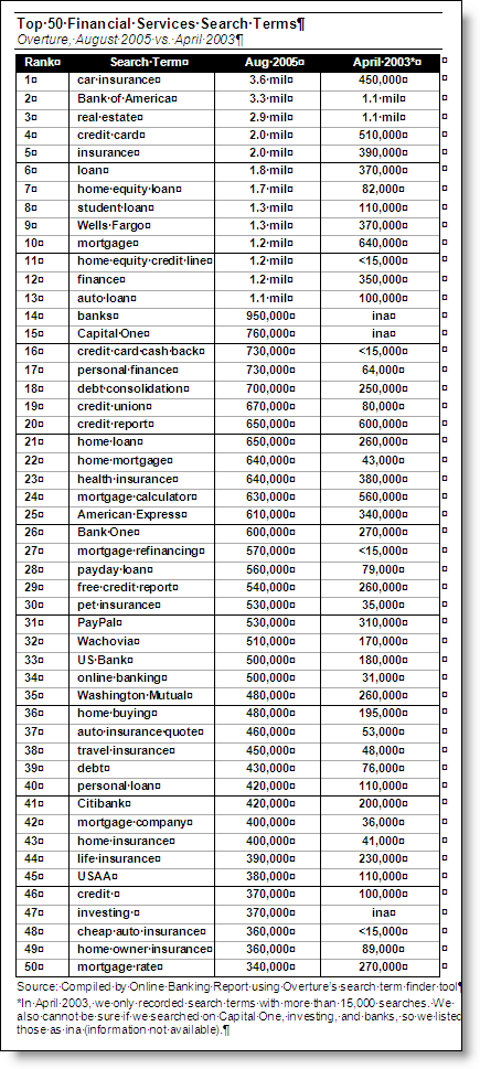
Top50_search_termsIn reviewing common banking, credit and insurance search terms today (August 2005) vs. two years ago (April 2003), there has been phenomenal growth in searchs on specialty loan terms, such as (number of searches on Overture each month):

home equity loan — up 21-fold from 82,000 searches to 1.7 million searches in August
home equity credit line — up more than 80-fold, from less than 15,000 to 1.2 million
auto loan — up 10-fold, from 100,000 to 1.1 million
student loan — up 12-fold, form 110,000 to 1.3 million
credit card cash back — up more than 50-fold, from less than 15,000 to 730,000
mortgage refinancing — up more than 38-fold, from less than 15,000 to 570,000
payday loan — up 7-fold, from 79,000 to 560,000

In comparison, some of the more generic terms have shown much smaller gains:

mortgage — doubled to 1.2 million from 640,000
debt consolidation — tripled to 700,000 from 250,000
mortgage calculator — up 10% to 630,000 from 560,000

Another big mover: online banking, up 16-fold, from 31,000 to 500,000

Click on the thumbnail above to see all 50 top search terms or download the Word file here: Download banking_search_terms.doc

You can use Overture’s keyword selection tool yourself at this link.

JB

Improving Your Bank’s Desktop Marketing Presence with Widgets

Konfabulator_logoIt’s been three years since our last report on improving your bank’s visibility on the PC desktop (Grabbing Desktop Mindshare, OBR 85). Back then, Google and eBay had just launched toolbars and we were advising banks to improve their desktop positioning through buttons, bars, and various browser plug-ins.

While there’s been less progress than we anticipated, several new services this year demonstrate the potential:

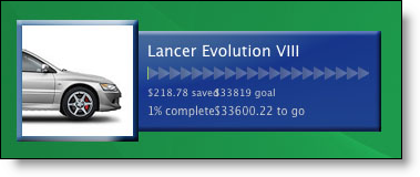
Yahoo_savings_meter_closeupIf you are looking for inspiration, check out Yahoo’s Konfabulator, a program that lets Windows  and Mac users add spiffy utilities to their PC desktop, such as a calendar or system performance monitor. Yahoo_savings_bell_1

There are several widgets of interest to bankers. Two savings meters (see above and right) allow users to track progress towards savings goals. This would be a good way to support and add value to your deposit accounts.

JB

Banking Comparison Websites

Froogle_logo_1Comparison shopping has been in the news lately. General consumer sites, Shopping.com and Shopzilla (formerly BizRate), and financial services specialist LowerMyBills.com, were purchased this year for a combined total of $1.5 billion (source WSJ, 9/14/05). And of course, Google entered the fray last year with its Froogle service.

  • Experian bought LowerMyBills for $330 million
  • Ebay bought Shopping.com for $620 million
  • E.W. Scripps bought Shopzilla for $525 million

Consumers like the shopping comparisons, with 60% of Internet users having used one according to Jupiter Research. The popularity, and merger activity, will attract more entrants such as Become.com, each looking for a new angle.

Buysafeshopping_logoOne new twist is to add value through shopping guarantees. BuySafe recently launched an online marketplace <www.buysafeshopping.com> where users can choose from 1.5 million products covered by the $25,000 BuySafe guarantee. Merchants pay for the protection with a 1% transaction fee.

One area that has seen relatively little activity considering its popularity with online users is financial services. For one thing, financial services, especially loan products are more difficult to compare, because the credit quality of the applicant determines which products are appropriate.

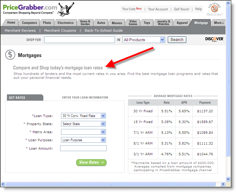
Pricegrabber_mtg_comparisonWe expect more financial comparison sites to join the ranks of BankRate.com, FISN.com, Banx.com and others. The mainstream shopping comparison sites will also add financial services to their coverage. Already Shopping.com, PriceGrabber.com and others have mortgage comparison services (click on inset for closeup). We’ll look at these service in more detail next month in Online Banking Report.

For price leaders, these sites have the potential to be wonderful sources of qualified leads. But if you are a premium-priced provider, you’ll have to work that much harder to keep your share.

JB

Banking and Coffee?

Exchangebankcoffeehouse_logoBlame it on my Seattle location, but I continue to believe there are good synergies between banking and the so-called coffee culture, both on- and off-line (full disclosure, I’m writing this in a coffee shop). I’m not talking about converting bank branches to coffee shops like Exchange Bank Coffeehouse (left); but using espresso and other coffee and tea tie-ins as a perk for banking online and/or other product usage.

Here’s why banking and espresso go well together:

  • Brand image: Thanks to Starbucks, coffeehouses have developed into a pop culture phenomena that is unlikely to fade in our lifetime (evidence: nearly 10,000 Starbucks locations worldwide, growing 1300+ per year). The community-building, relaxed, and relatively wholesome image of the modern coffee shop fits well with the brand images many financial institutions are attempting to convey.
  • Traffic patterns: Banking is usually a daytime activity, correlating well with coffee consumption.
  • Real estate: Whether located in a city center, suburb, or small town, bank branches are usually located in high-traffic locations. They often have enough extra space to squeeze in an espresso station and a few small tables.
  • Promotional opportunities: For years Horizon Air, a regional provider owned by Alaska Airlines, used its Starbucks beverage service to attract customers to its routes. Banks could do the same thing.

Examples

This is not a new concept. Umpqua Bank has had great success with its retail model that included coffee service and no teller line. The bank’s website carries a subtle coffee theme throughout with terms such as, find your own blend and savor. It’s Experience Umpqua Flash presentation starts with a close-up of a coffee mug on a table in the branch.

ING Direct operates four urban cafés in the United States that serve coffee and pastry along with financial advice. No transactions are processed on-sight, but customers have access to Internet terminals and ATMs.

Charterone_starbucksBut the bank closest to what we have in mind is Charter One Bank. Prior to its being bought by Royal Bank, the Cleveland-based bank embarked on a co-location program with Starbucks (see inset, Post & Washington, Indianapolis).

Financial institution opportunities
Partner with Starbucks or a local chain to create a joint banking and beverage program

  • Develop a usage program with free coffee as the perk, for example, paying two bills online each month and/or estatements instead of paper
  • Offer a prepaid coffee option that allows coffeehouse purchases to be charged directly to credit or debit card, or deducted directly from checking
  • Consider expanding the concept beyond transactional banking, with coffeehouse tie-ins for investments (see, The Coffeehouse Investor, OBR 49)
  • Use the book, The Coffeehouse Investor, as an incentive/premium
  • Use it as an incentive for going totally online, for example, "Go to XYZ Coffee Shop instead of the branch"

JB

Mandatory Online Banking Password Changes

Katie Kuehner-Hebert looks at the issue of mandating consumer password changes in today’s American Banker. She cited only a single bank doing it, West Georgia National Bank <www.wgnb.com>, which recently began requiring new passwords every 45 days. None of the financial institutions we are familiar with force password changes, although NextCard did when it first launched in 1997, but later it did away with the annoying requirement.

Analysis
This is one of the least effective ways to improve security. In fact, it may have exactly the opposite effect for two reasons:

  1. Customers cannot memorize a new password every 45 days, so they will have to write it down somewhere near their PC where it can be seen by others.
  2. Once users begin to realize what a hassle it is logging in to your website, they will forgo online access altogether or use it much less frequently, therefore reducing the frequency of account monitoring which can reduce the impact of identity theft and other fraud.

And even the method did reduce fraud, it’s unlikely to be cost effective due to the increased burden on customer service and decreased customer satisfaction.

Offer choice
Mandt_password_resetSome customers do like the idea of periodic password changes, but forget about mandatory changes. We like the M&T Bank <www.mandtbank.com>. The Buffalo-based banks allows customers to choose whether to have mandatory password changes at either 30, 60, 90, 180 or 365 days. They can also choose NOT to have a mandatory password change (click on inset for a closeup).

An even simpler way to give customers the choice is to allow customers to program an alert reminding themselves to change their password. The alert should NOT have a link back to the bank, otherwise it will look like a phishing message.

JB

E-Loan Extends “Employee Pricing” to Loans

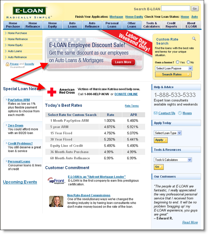
Eloan_employee_pricing_emailIn a logical extension of the auto industry’s "employee pricing" gimmick, online lender, E-Loan launched a similar program for loans. This email arrived in our in-box yesterday morning. We are not customers, but have signed up for marketing messages (click on inset for closeup).

According to the email message, the discount on an auto loanEloan_employee_pricing_landing amounts to 0.25%. On a mortgage, the savings are 0.5% of the loan amount. The sale runs through Labor Day weekend only, ending Sept. 6, 9am Pacific Time (click on inset on right, for an archived copy of its landing page).

Eloan_employee_pricing_websiteIn addition to the email blast, the special is splashed across its website (click on inset for archived copy of E-Loan’s homepage, Sept. 2, 2005).

Note also, the prominent Red Cross link in the middle of the page for making donations to aid Hurricane Katrina victims.

JB

Bank Websites Should Provide Secure Connections to Legitimate Fund-Raising Sites

Wachovia_homepage_graphicWhen natural disasters strike, such as the Southeast Asia tsunamis or Monday’s Hurricane Katrina destruction in New Orleans and the Gulf Coast, banks should use their considerable web reach to help their customers make safe and secure donations to sanctioned relief agencies such as the Red Cross.

With all the concern about online phishing and fraud, consumers need a trusted conduit to make donations. And the sooner the link is posted, the better. As bad as it is, for much of the country, it will no longer be top-of-mind in a few days or weeks.

Major banks fail to respond thus far
Granted its only been three days, but we were surprised to find that of the largest 50 U.S financial institutions only three, Chase (Chase.com and BankOne.com), Wachovia (Wachovia.com and Suntrust.com), and Washington Mutual (wamu.com), have posted links to the Red Cross to make online donations (see Wachovia banner above).

Seven others had hurricane-related information, but no links for donations:
Regions, AmSouth, Navy FCU, Compass Bank, and of course New Orleans-based Hibernia all had information on branch closings
USAA posted tips for dealing with the aftermath of a hurricane
Commerce Bank (NJ) ran a headline ticker on the top of the homepage offering to match donations up to a total of $50,000 (which strikes us as bit stingy if you are going to blast it across your homepage)

Action Items
The best response, from a customer service and PR perspective, is to announce a corporate contribution and provide secure links to the Red Cross and other relief agencies. Contributions should also be accepted via mail or in-branch.

Wachovia_redcross_1Wachovia does it right, with a small, but highly visible homepage link explaining its efforts and providing the important message, You Can Too (see inset above). Clicking on the link leads users to a landing page that explains Wachovia’s $250,000 corporate commitment along with two important links (click on inset for a closeup look):
1. Donate Now link to a Red Cross store established on Yahoo handle Katrina donations
2. Email this page to spread the word

Even if your bank is not prepared to make a corporate contribution, it can still support fund-raising efforts with a link to the official donation site.

JB

PayPal Launches Micropayment Pricing

Paypal_logoThe so-called micropayments market has been one of the most hyped non-issues of the Internet era. First, it’s not a monumental problem; there are many workarounds available, such as ACH processing, monthly billing, and so on. Second, the market, by definition, is not huge. Even a billion 99-cent downloads generates just $100 million in interchange revenue at PayPal’s new prices (see below).

Nevertheless, it’s good to see solutions evolve. Today’s PayPal announcement should help continue that natural progression. Ebay’s online payment arm announced that it wil provide a micropayment option priced at 5 cents per transaction plus 5% of the transaction amount. That means a dime in interchage for a 99-cent song compared to closer to $0.25 to $0.30 under industry standard pricing today.

It won’t change the world, but as they say, every penny counts.

JB

Marketing Bank Accounts to Students

Although the profitability is marginal due to low balances and frequent transactions, we subscribe to the conventional wisdom that it is worth going after college student accounts for three reasons (in order of importance):

1. Cross-selling to the parents
2. Student loans and other credit products
3. Future business from the graduate

While your branches may want to use point-of-sale material targeted student traffic, online promotions should be pitched at parents who will likely make the banking decisions for incoming freshman.

To test our theories, we took a spin around the web to see assess the state of back-to-school bank marketing. Here’s the good, bad, and ugly of what we found.

Top 25 Banks
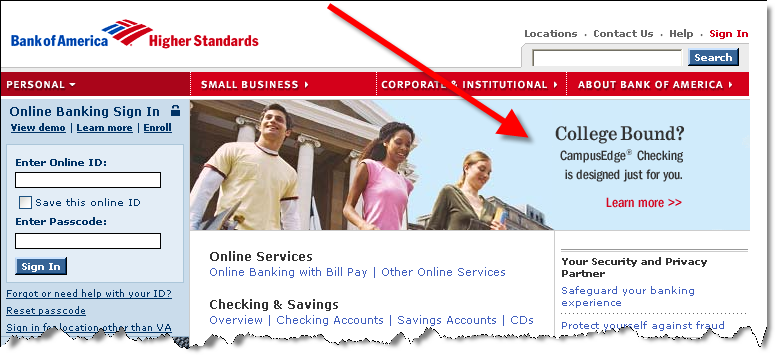
We took a look at the 25 largest U.S. retail banks, and surprisingly only Bank of America had a prominent promotion. Wells Fargo had a small banner running for student loans and Key Bank and M&T Bank each had text links to a student banking offer. The other 21, showed no special student banking copy or graphics on their homepages.

1. Bank of America www.bankamerica.com

Bofa_college_promoBank of America’s homepage (see inset), devotes most of its promotional real estate to a student banking promotion. The picture grabs your attention and the Learn More links drops visitors onto a landing page that does a good job selling the account benefits.

Grade: A

2. Wells Fargo www.wellsfargo.com

Wells_homepage_promo Wells Fargo doesn’t put near the emphasis on student banking as does Bank America. Instead, the bank uses one of its two small banners in the lower right to sell student loans (see inset). However, the banner is rotated with several other promotions, so it’s not always visible.

The graphic image isn’t particularly attractive, but the copy, Which Student Loan is Right for You? and Use our loan selector are good draws. However, upon clicking, users are forced into a selector tool with no option for general information first.

Grades:
B+ for the promotional graphics
C- for the landing page

3. Key Bank www.keybank.com

Keybank_homepage_1Key Bank uses its Highlights box in the lower right to promote student checking (click on inset for closeup). With many users trained to ignore banners, this is an excellent way to gain attention. After clicking through, the landing page does a good job of selling account benefits, although the initial headline about its ATM rebates, Get up to $6* back each month, strikes us as a confusing way to start things off. It would be more effective to highlight the key benefit, FREE, right at the outset.

Grades:
A for the homepage promotion
A- for the landing page

4. M & T Bank www.mandtbank.com

Mandt_homepage_1M&T’s approach is similar to Key Bank’s, a text link on the right of the homepage (see inset). It’s not quite as effective because the copy just floats on the page, there is no box to draw the eye to it. But with a relatively sparse homepage, the promotion should get noticed. The promised bonus should also improve click-throughs. However, the landing page needs to be reworked. Not only is there no mention of the promised free gift, there are too many navigational choices and no clear path for the user.

Grades:
B for homepage promotion
C for landing page

Outside the Top 25
Since we weren’t overly inspired by what we saw at the big banks, we decided to dig deeper in search of the ultimate back-to-school offer. Here’s what we found:

1. Tennessee State Bank www.tnstatebank.com

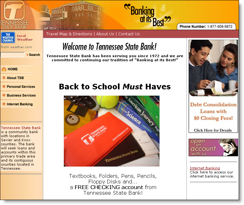
Tennessee_bank_home After a Google or two we ended up at Tennessee State Bank, a $480-million asset bank headquartered in Pigeon Forge, TN.  The bank’s homepage (click on inset) is dominated by a back-to-school promotion with a picture of its checkbook cover in the foreground with textbooks, a tennis ball, and maybe an adding machine in the background.

Not a great photo, but acceptable.

However, the copy is terrible.

Textbooks, Folders, Pens, Pencils,

Floppy Disks and…

a FREE CHECKING account from

Tennessee State Bank!

The free checking will get the attention of parents, but folders and floppy disks? That’s so 1990s. How about laptops, cell phones, or DVD players? Better yet, remember the medium. How about instant online transfers, free online banking, and 24/7 online service?

One final note: There is no hyperlink with the promotion. Neither the headline, photo or copy are clickable to another area to signup or even learn more.

Grades:
A for timeliness
D for execution

Update 9/1/05:

  • National City added a small banner on the right promoting free student checking accounts.
  • Citizens Bank (Royal Bank) is running a medium-sized banner in the lower portion of its homepage for student loans

JB

HSBC Joins the U.S. High-Rate Savings Account Race

Hsbc_us_highrateHSBC’s U.S. unit launched a 3.50% APY savings account that competes directly with ING Direct (currently 3.30%) and other high-rate financial institutions. The rate is featured in an eye-catching red box smack dab in the middle of HSBC’s homepage (click on inset for a close-up). 

For more information on high-rate savings products, select Checking & Deposit Accounts from the navigation in the right-column of this newsletter. Also, read our latest Online Banking Report devoted to the subject, Lessons from the High-Rate Marketers (OBR 120/121).

Update 9/1/05:
The rate was raised to 3.75% today vs. 3.30% at ING Direct

JB

Citibank’s Security Pop-Up

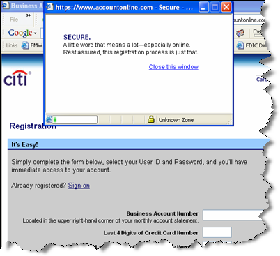
Citi_popupUnder the "every little bit helps" theory, Citibank’s popup window when registering for online credit card access is a nice touch.

The popup (click on inset for closer view) reassures users that they are entering information into a secure site. The well-crafted verse goes like this:

Secure.
A little word that that means a lot–especially online.
Rest assured, this registration process is just that.

The window closes itself in about 10 seconds, if the user hasn’t done so already.

JB

To learn more about how to promote online security and peace of mind, check out Marketing Security: The sensitive issue of publicizing security and authorization enhancements from our sister publication, the Online Banking Report.