Recent email marketing research found that two-thirds of Americans regularly check email via smartphone and a significant number of total opens (as high as 70%) are now opened on a mobile device. Since most emails that look good on mobile look fine on a desktop (but NOT vice versa), you can pretty much disregard the desktop when creating a design template for your email alerts and marketing messages.
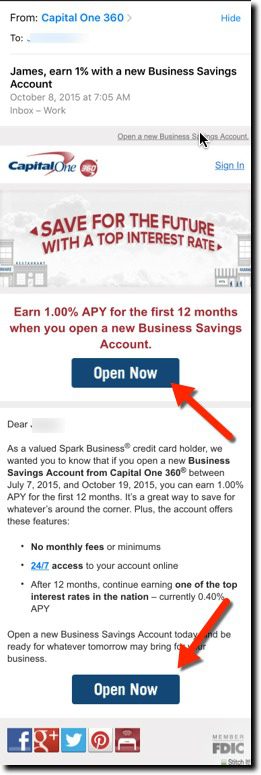
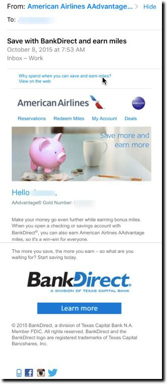
Here’s a few examples from my inbox during the past few weeks. Both Capital One and BBVA’s Simple use appropriate font size and a good mobile layout. Simple does an especially good job at grabbing attention with a small animation at the top of the message. In comparison, the BankDirect pitch is not well optimized for mobile, though it’s readable if you work at it. But it does nothing to grab your attention visually.
——–
Bank email samples (viewed on iPhone 6)
First: Business Savings account promo from Capital One
Easy to read opening line and big Open Now buttons on first screen and below the fold
Second: BankDirect to American AAdvantage mileage club members
Harder to read the small type, and call-to-action is below the fold
Third: Simple announces its 100%-no-fee policy change
Grabs attention with small animated graphic at top with big “Hi FirstName” visible on first screen. The remainder of message is in a font easily read on a mobile phone:


