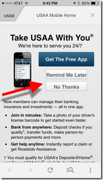
 Last week, I caught up with the USAA folk to share thoughts on the future of mobile banking. They explained how they are converting visitors on the mobile web to their native app with a popup (interstitial) prompt (see inset). It’s the first time I’ve seen a bank use that desktop technique on the mobile web.
It had been more than a year since I took a tour of major banks using my phone’s browser (Safari, iPhone 5, iOS7). The last time proved relatively uninspiring. Several banks showed a mobile-optimized view, but most defaulted to their desktop-PC view which is unusable without tedious “pinch and zooming.” And no one pushed users to the native app.
Today, that’s changed dramatically. Of the 20 major mobile banking websites I visited, only one (Citibank) delivered a desktop-PC view (and that varied depending on which URL was used to enter the Citibank site). And four of the 20 pushed their mobile app heavily (and three more showed a download link to the app store).
________________________________
Recommendations
________________________________
- While there has been much talk about pushing customers to less-costly HTML5 and responsive-design mobile websites, it’s still an app world (1 million and counting on iOS alone). And that’s not changing if Apple has anything to say about it. If you have a native app, make sure your mobile customers know about it.
- Every mobile web front landing page should include a prominent link (above the fold) to your native app(s). And it’s not enough to simply show the Apple and Android app store logos. That’s too subtle for many novice smartphone users.
- The call-to-action should list at least one benefit to the native app. Facebook, for instance, simply says, “browser faster.”
- Test an interstitial landing page such as the one currently used by USAA. Users can choose “remind me later” to defer their decision to download the app, or they can kill the interstitial permanently by choosing “no thanks.”
Table: Mobile web default view from 20 major mobile FIs
Key: Native promo = Promotes native app
Mobile web = Delivers mobile-optimized view
Pinch & Zoom = No mobile optimization on main landing page, requires pinching and zooming to navigate
| Mobile Optimized View? | Native App Call to Action? | App Store link? | Large Promo? | |
| Native app promo | ||||
| Bank of America | Yes | Yes | Yes | Yes |
| Barclays (UK) | Yes | Yes | Yes | Yes |
| Moven | Yes | Yes | Yes | Yes |
| USAA | Yes | Yes | Yes | Yes |
| Mobile web | ||||
| American Express | Yes | No | No | No |
| BB&T | Yes | No | No | No |
| BECU | Yes | Yes | No | No |
| BMO Harris | Yes | No | No | No |
| Capital One | Yes | No | No | Yes |
| Chase | Yes | No | Yes | No |
| Fifth Third | Yes | No | No | No |
| ING Direct (Turkey) | Yes | No | No | Yes |
| Regions | Yes* | No | No | No |
| Schwab | Yes | Yes | Yes | No |
| Simple | Yes | No | No | Yes |
| SunTrust | Yes | No | No | No |
| US Bank | Yes | No | No | No |
| Wells Fargo | Yes | No | Yes | No |
| Pinch&Zoom | ||||
| Citibank | Varies by URL | No | No | No |
| GoBank | No | No | No | No |
*Regions uses popup to provide choice of mobile view or full website