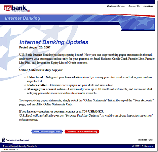
 Using a splash screen after logging in to online banking (see screenshot below), U.S. Bank is asking customers to move to electronic statements, specifically for credit card and loan accounts, although the online-only option is also available for checking accounts. I saw the message, dated Aug. 20, for the first time today. I've been a customer of U.S. Bank through the entire online era (note 1) and this is the first time I recall being asked at login to go paperless. Unlike PayPal, BofA, and others, U.S. Bank rarely uses the login splash screen technique.
Let's look closer at the bank's pitch:
Title: Internet Banking Updates
NetBanker comments: OK…but would be more effective if it directly mentioned the purpose of the message
Opening line: U.S. Bank Internet Banking just keeps getting better!
NB comment: That's a bad opening line. This is not a new feature. Some U.S. Bank customers have had electronic statements available for 13 years now. Everyone customer has had them for at least 9 or 10 years. The only new thing is that you stop receiving paper statement, hardly the "bank getting better." Most customers know this is a cost savings move for the bank.
Benefit statement (bullets): Online Statements Only help you: Deter fraud, Reduce clutter, Manage your account online….
NB comments: Beside the grammatically challenged opening, the bank did a good job getting the anti-fraud message into the first bullet. The second bullet, "reduce clutter," is OK, but the third is pretty weak. Why are you telling online banking customers they will benefit from "managing your account online?" And only 18 months of archives is hardly going to give customers a good feeling about doing away with their paper statement.
 Call to action: The bank provides specific instructions on how to turn off the paper statement.
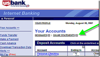
NB comments: The specific instructions are good, but a small graphic of where to click would be more powerful (see the example at right). Also, the choice to view the message later is a user-friendly option.
Overall graphic design: The splash screen is laid out like a letter.
NB comments: That's OK, but a graphic image or two would give it a more modern and professional image.
Overall grade: C
NB comments: The bank does a good job getting right to the point. But the overall look and feel along with some of the specific copy points lower the score. This would have been an A- in 1997, but a decade later, Internet users expect and deserve a more sophisticated message.
Note:
1. Full disclosure: I was the lead product developer on U.S. Bank's online banking system launched in 1994.
