It's not often that a press release leads directly to a Netbanker post, but here's an example. We received an announcement last week that South Carolina Federal Credit Union <scfederal.org> was launching a complete rebranding under the "life simplified" theme (press release here).
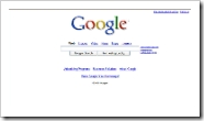
We eagerly headed to its homepage, expecting to find a site that did for banking what Google did for search. In other words, a website that instantly lays out the critical tasks for online banking customers.
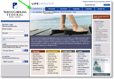
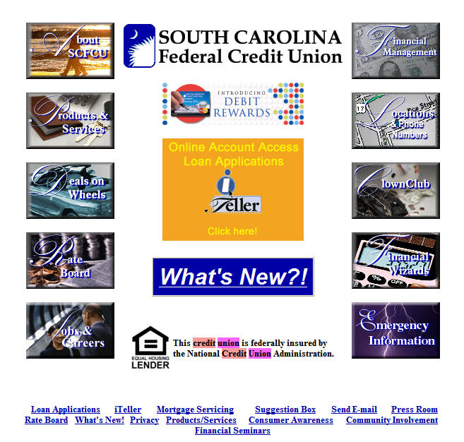
What we found was good, and light years ahead of its old homepage (see End Notes below), but it was not revolutionary. The homepage design follows most best-practices including the left-hand log-in area, tabular main navigation, and site search and other utilities in the upper right.
The first navigation tab is Convenience. That's an unusual choice that could help the CU differentiate its member benefits. However, the laundry list of electronic and online banking features cited have been industry standards since 1997.
 Website visitors are not going to walk away thinking "that credit union really saved me time." If anything, the homepage is somewhat cluttered with 80 hyperlinks, many in small type, plus another dozen or so in two lefthand, drop-down boxes. Five choices are simple (see Google above). Eighty are not.
The credit union missed a great chance to build a website that clearly directs users towards what they most want from their credit union: online access, customer service, and research.
Grades
Homepage design: A- (a bit cluttered)
Navigation: B (too many choices)
Homepage fit with "life simplified" branding effort: C-
End Notes (click on the link below to see the old homepage)
Previous homepage (from Google cache, Oct. 3)

