 There’s been substantial progress made in website design by banks. Sure, there’s still the occasional clunker, but most we look at today (see note 1) rate solid grades in the B+ to A- range. That’s up from many Cs and Ds at the turn of the century.
However, as good as banking websites have become, they still tend to be relatively busy, making visitors spend more time than necessary finding their way through the site (note 2). It’s rare to find a financial institution that dares to follow Google’s “less-is-more” approach.
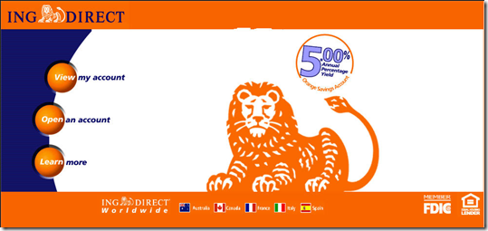
The lone major bank in the U.S. with a 25-word or less homepage is ING Direct, which like Google, has maintained the same look and feel since launch (see screenshots below, today and eight years ago). NextCard (prior coverage) also did less is more, but in its case, that mantra unfortunately was also embraced by its underwriting department, and the company failed in 2002.
But now we have another example: Progress Bank (note 3). While the depth of its online capabilities could be improved (how about online account opening?), the homepage is brilliant (screenshot below).
The Florida-based community bank uses just 26 words to describe its five major areas AND pitch a high-yield checking account. Each major area: online banking login, personal banking, business banking, and About Us, has its own circle. And as you mouse over each one, the image in the center circle changes. It’s quite striking.
In addition, the brightly colored circle in the lower left contains a pitch for the bank’s featured product, its green 5% APR checking account (note 5).
Bottom line: I love the look, although I hope they did some A-B testing before springing it on users. It’s a great branding statement, but it is also so different, there’s a risk that customers might not perceive the bank to be as trustworthy as one with a more traditional layout.
Progress Bank homepage (11 May 2009)
ING Direct homepage (12 May 2009)
ING Direct homepage (2001)
NextCard homepage (2001)
Notes:
1. Online Banking Report All-Access subscribers are entitled to a complimentary high-level website review. Please email our website analyst to schedule a review.
2. The exception is online banking login visibility, which is very good. Most financial institutions follow the industry standard of displaying a prominent login area in the upper left or right.
3. Credit Jeffry Pilcher at The Financial Brand for the find.
4. For more info, see our Online Banking Report on Website Usability.
5. Unfortunately, the ingenuity disappears as soon as you click on the offer. The pitch is then delivered via a bloated 2-page brochure in PDF format. And there is no ability to apply or inquire about the account online.


