There is little doubt that mobile (and whatever it evolves to) is where the vast majority of customer interactions will take place in the not-so-distant future. So why do so many banking-app home screens look like they were overlooked in the design process?
To help you avoid the same mistake, and find inspiration, we’ll use our Mobile Monday to focus on native apps with interesting user interfaces or other distinguishing features. First out of the gate is the just-updated iOS app from Rye, NY-based USAlliance FCU. In its v1.2 update Friday, the 70,000-member credit union added a number of new features, i ncluding Touch ID support.
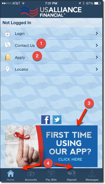
But the key new development on the home screen was mobile account opening. The service is powered by Mobile Strategy Partners, a company founded by David Eads, who previously worked at mFoundry and Kony, both Finovate alums. USAlliance is the first of a number of clients the company has in the pipeline.
The USAlliance home screen is utilitarian and yet provides more functionality than 99% of other FIs, including most of the giants. Here are the key functions: Numbers correspond to the red number on the screenshot right:
- Contact Us: This is pretty common now, but is still hard to find on some apps.
- Apply: This is the big new addition, and rare among financial institutions.
- Onboarding help: There is usually a process to get logged on the first time. The CU has a large banner directing first-time users through the authentication process.
- Mobile banking functions menu: The bottom menu shows the functions available to logged-in members. Non-logged-in members get a message explaining the process.