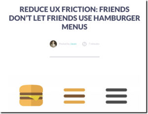
 I am not a huge fan of the hamburger navigation menu. If you are a smartphone native, I’m sure your eyes go right to the little pack of horizontal lines in the corner. But if you got your first smartphone in your 40s, you probably could use a little more help.
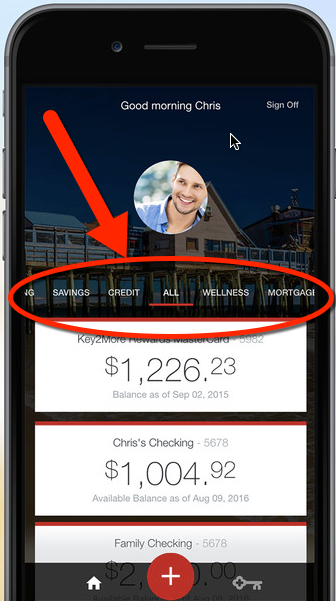
So I applaud Capital One, recently named in Fast Company as one of the best-designed mobile apps (see note 1), which in a 7 September iOS update ditched the so-called hamburger menu for something that’s actually visible on the page. See Fig 1 before and Fig. 2 after. I also learned today that Key Bank made the same decision to ditch the burger, but instead of a lower nav bar, they went with the more web-centric look of a near-the-top nav (Fig 3).
(Update 29 Sep: A reader informed me many banks are ditching the hamburger menu in light of Apple’s design advice here, here and here.)
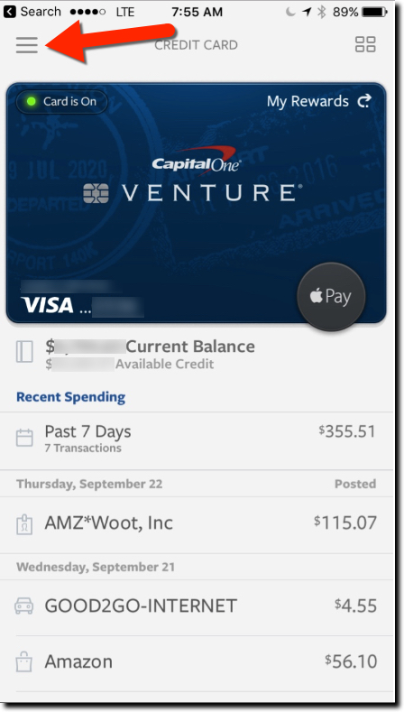
Previous
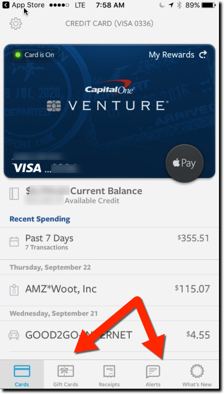
Current
Unless you are Facebook, Instagram, or other apps where customers spend hours every week, you need to make it easy for infrequent users to find their way through your app. And even though mobile banking is relatively simple, many providers make it needlessly hard to navigate with cute, hidden menus.
I understand why designers minimize the navigation, mobile real estate is precious, and even a half-centimeter devoted to on-screen navigation is a lot. But what’s more important, showing more transactions on the main screen or how to actually do something meaningful?
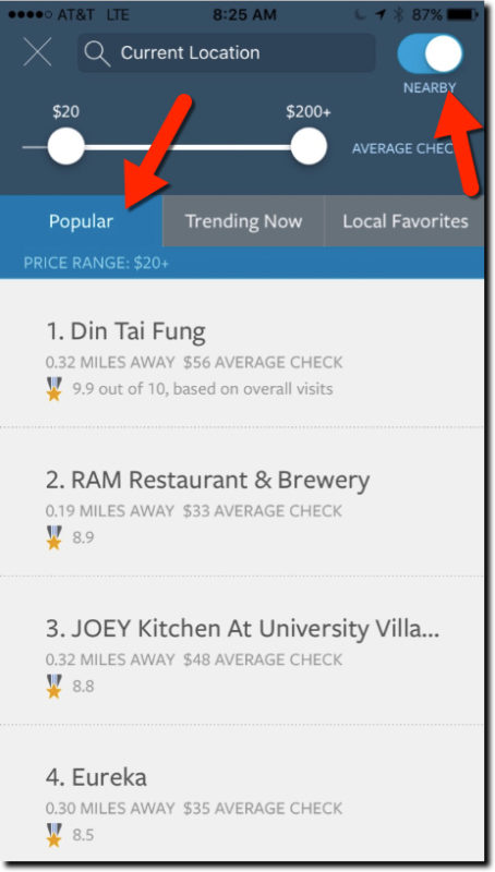
The update also included a new restaurant finder to identify popular eating establishments based on transaction data across all Capital One cardholders (Fig 4). It’s reminiscent of the Citigroup/Microsoft/Morningstar joint venture Bundle (F10), which, not coincidentally, was acquired by Capital One four years ago.
———-
Notes:
1. Only two financial companies were named in Fast Company’s list of 100+ best-designed products or apps in the October issue. The other was RobinHood, the simple, mobile stock-trading app.
