Online banking users often visit their primary bank’s website several times each week. Outside of webmail and chat services, few companies have this much traffic from their customers.
However, most online banking customers only touch down on the homepage for the briefest of moments; typing in a username and password then moving on. The challenge is to get them to notice your marketing and service messages.
One possible way to move those logging in eyeballs off the username/password corner, is to post easily-scannable, interesting, and ever changing information in a different area of the homepage, enticing the eyeballs to wander. In the banking world, there are few content choices available that fits this criteria.
Weather information.
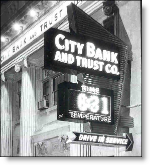
 The time/weather sign in front of the bank branch used to be, and still is in some places, a common sight on main street.
Why not take that same approach online? Place a personalized weather "sign" some distance from your login area. If you have the capability to move content elements around, test different locations and see which cause the most click-throughs on other sales and service elements.
Analysis
Thankfully, most banks have retreated from the idea of becoming a news and information portal. It’s just not possible to compete with CNN.com, Yahoo Finance, and others in disseminating news and investment info.
However, weather is another matter. Almost everyone is interested in the subject matter; it takes only a few seconds to absorb, so it’s not distracting; it’s dirt cheap to post on your website; it changes constantly; and it can be easily personalized to the user’s zip code.
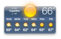
 Although it still carries negative connotations as an example of bubble-induced folly (e.g., at Net.Finance this week, a Wells Fargo exec told how in 2000, the bank was actually seeking suppliers for "horoscopes and weather info."), the latest upgrades to Apple’s OS X, Tiger, include a cool dashboard, which includes among other things, a weather display (see inset).
For more information, see OBR 85.
— JB