Everbank <everbank.com> has been an active emailer, sending a newsletter every few months for the seven years I've maintained an account there. The newsletters have always been chock full of content, from general finance topics to detailed discussions revolving around the bank's unique currency- and commodity-related products.
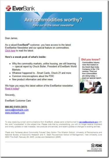
The newsletter design has evolved with the times, from plain text in the 1990s to the well-designed HTML missive we received last night (see below). The short headlines letter encourages customers to click through and read the full document at the Everbank website (see End Notes).
Email Sample
Date/Time: Oct. 11, 2006, 8:59 PM (received 10:24 PM Pacific Time)
From: EverBank [[email protected]]
To: James
Title: Are commodities worthy? Find out in the latest EverBanker newsletter
Personalization: Dear <firstname>
Signature: EverBank Customer Care
Analysis
Email
There is little to criticize. The short email is direct and to the point. Its layout lends itself well to viewing within the preview pane. The small "did you know" box adds an element of interest, and the drop-shadow makes it stand out.
With four major articles, it makes sense to send just the headlines and ask the reader to click through to the website to read the full article. However, the bank should use the standard convention of hyperlinking each article directly to the appropriate place on the website.
The bank does include two hyperlinks to the Web-based newsletter, a "click here" in the first paragraph and a "read it today" at the end. However, for even better usability, the bank should add a big shiny button that leads directly to the Web version.
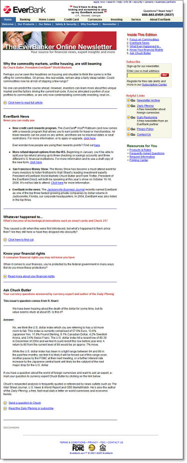
Web-based Newsletter
The website demonstrates good usability in its layout and content. A synopsis of each article is provided on the main page and users click through to read the complete article. It's useful and well-written information, better than a lot of what you read in mainstream consumer-finance publications. We especially liked the "whatever happened to" look-back at some recent initiatives, such as Check 21, and the overview of consumer-protection laws.
As good as the newsletter is, we couldn't stop thinking that it would work much better as a blog. That way, readers could pursue subject threads and more easily peruse all that Everbank provides. The bank could also experiment with accepting comments to make the whole experience more interactive.
Overall grades:
Content: A+
Email design: A-
Website (newsletter) design: A
End Notes
Click on the following link to see a screenshot of the newsletter landing page.
Newsletter Landing Page (here's the link)

