PayPal has always had one of the better financial sites. It started out very simple in 1999, but over the years it became a bit bloated with competing messages for its various constituencies. And the overall look, while true to its roots, looked a little 2007-ish, which makes complete sense since that’s when the company last remodeled.
So a major overhaul was due. Here’s a quick look at the biggest changes. It’s a good roadmap for any financial website, though PayPal’s status as a payments platform makes some of its design decisions different than what a retail bank should do.
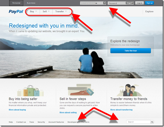
The main homepage makes a better first impression now that it mimics the trendy design feature of a large peaceful background image (used by Citibank, Square, Salem Five and many others). The page is also significantly simplified.
But the biggest change is in the primary action words used for transactions:
Before: Pay Online | Send | Get Money
Now: Buy | Sell | Transfer
The new verbs are short and to-the-point, but regular users will miss the Send (originally it was called Beam Money) and Get Money (aka Request Money prior to 2007) names which have been around for more than a decade.
Overall, it’s a great change and helps PayPal maintain parity with Square and a number of other hip payments upstarts.
________________________________________________
Personal homepage
________________________________________________
In addition to the above, there are a number of other changes:
- Instead of tabs, PayPal now uses text to indicate top-level navigation of Personal and Business (it also eliminated the redundant Home tab)
- Moved login from an upper-left box (typical for banks) to the top line in the upper right (typical for newer ecommerce sites)
- Dropdown arrows are used to uncover sub-navigation items below Buy/Sell/Transfer
- Moved the utility functions (Contact Us, Search, etc. down to the bottom instead of along the top)
Before (19 June 2012)
After (9 July 2012)
________________________________________________
Business homepage
________________________________________________
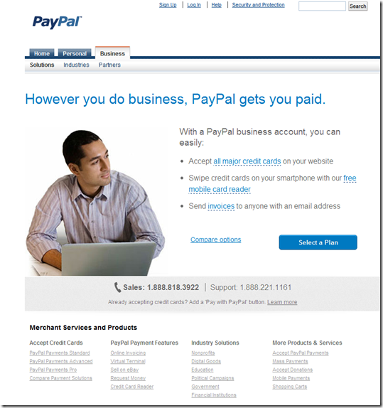
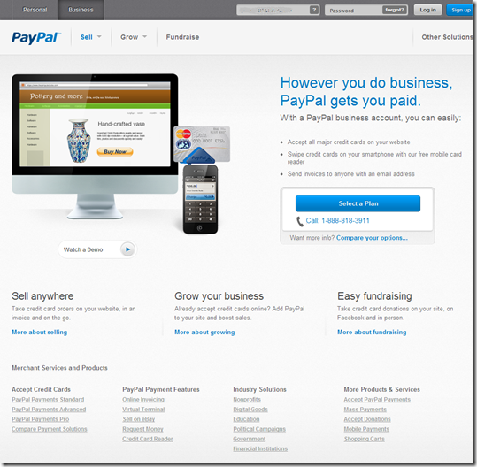
The Business page changes weren’t as dramatic because it’s mostly a marketing page:
- The three main navigation items changed from Solutions | Industries | Partners to Sell | Grow | Fundraise, a nice improvement.
- There is now a direct login on the page in the exact same spot as on the Personal page
- The PayPal Here dongle is now pictured in the middle
Before
After
_________________________________________
Other functions
__________________________________________
Note: Click on any of the thumbnails to enlarge
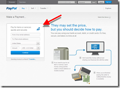
Before: Pay Online After: Make a Payment
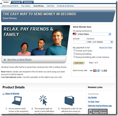
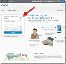
Before: Send Money After: Transfer | Send Someone Money
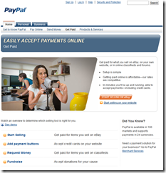
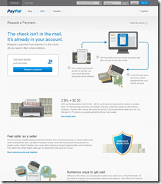
Before: Get Paid After: Request a Payment
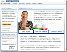
Before: Get to know PayPal After: Account Features
————————————
Note: We cover financial website and mobile design issues periodically in our Online Banking Report (subscription).

