Up-to-date website copyright notices are one of those little details that seem hardly worth mentioning. But, like cleaning the branch windows, when left unattended they can create a poor impression over time.
Most commercial websites carry copyright notices on the bottom of the page with the current year or a range of years listed. It looks sloppy if you don't show the current year, even 2006 is OK for a while. But you certainly don't want to follow the example of Main Street Bank <mstreetbank.com>, which still shows 2004 at the bottom of its homepage (see screenshot below).
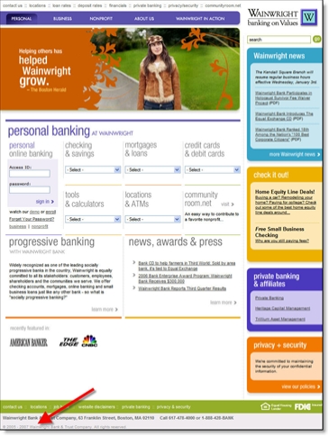
And kudos to anyone who's already added 2007. One winner, Wainwright Bank <wainwrightbank.com> already displaying (copyright) "2005 to 2007" on Jan. 2. And not so coincidently, Wainwright has an absolutely gorgeous website, something I don't say very often, especially in the financial services arena (see screenshots below).
