Citibank’s e-Savings email

Last night, Citibank sent selected checking-account customers an email solicitation for its 4.75% APR e-Savings account. I live outside its branch network, so Citi may have elected not to send the message to customers serviced by traditional branches.

Citibank_email_esavings_with_imageThe message was direct and to the point (click on screenshot left). Citibank even included the impressive 4.75% interest rate in the message subject. The only distracting portion of the message was a garbled first word in the second paragraph. It was probably caused by incompatibilities in software rendering of the apostrophe in the first word, "there's." To avoid this type of error, make sure you proof your message in multiple email clients.

The bank continues to engender trust in its marketing messages by including the "email security" box in the upper-right corner which includes the customer's full name and last four digits of their ATM card. The security information is prominently displayed, in a blue shaded box to make it more prominent, even if the user has images blocked (see screenshot below).

The bank also includes short text messages that appear where the images would have been displayed (alt-text tags) making the message relatively readable even for users that never download the images.

Citibank_email_esavings_no_image

Surprisingly, the landing page for the offer was a generic product page. The campaign would be much more effective if the bank had reinforced the e-Savings benefits on the landing page like it does when it advertises online (see NB March 29). Click on the following link to see a screenshot of the landing page. —JB

Appendix

Landing page
(displayed when clicking on the "signup" button in the email).

Note: I tested the link on my laptop where I am not recognized as a customer and on my desktop that saves my username in a cookie. Both times I was served the same landing page (below).

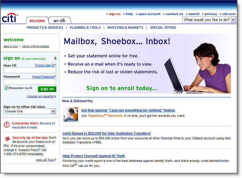
Citibank_email_esavings_landing

Email: US Bank “Spring Clean Your Finances”

Emailmarketing_logoEvery month we receive dozens of emails from the many financial institutions where we have accounts and also, increasingly, from non-customer mailing lists at others. As part of our expanded coverage of email marketing, we plan to post many of them here. You will be able to access the entire sample collection by clicking on the "Email Archives" subject on the right-hand navigation. Alternatively, individual emails will also be filed within their pertinent product areas, in this example, "Loans & Credit" and "Personal Financial Management."

Today's message is from US Bank <usbank.com>, which sent the following solid, but fairly boring financial organization email to current customers.   

Here's a screenshot of what appeared in my inbox. You can also view the clickable version by following this link

Usbank_email_heq

On the landing page for the "Credit Card Clean Up" link in the blue-shaded area on the right, US Bank offers a useful calculator to determine the benefit of reducing credit card debt (see below).

Usbank_email_springcleaninglanding

If you'd like to learn more about the financial email marketing, check out Email Marketing in Financial Services: Leveraging the Inbox from our sister publication, the Online Banking Report.

eBay Personalized Email Marketing

Ebay has been on the forefront of fighting online fraud, introducing Account Guard on its toolbar in Feb. 2004 (see Online Banking Report, #105/106 and #85), as well as a number of safeguards into its service delivery over the years.

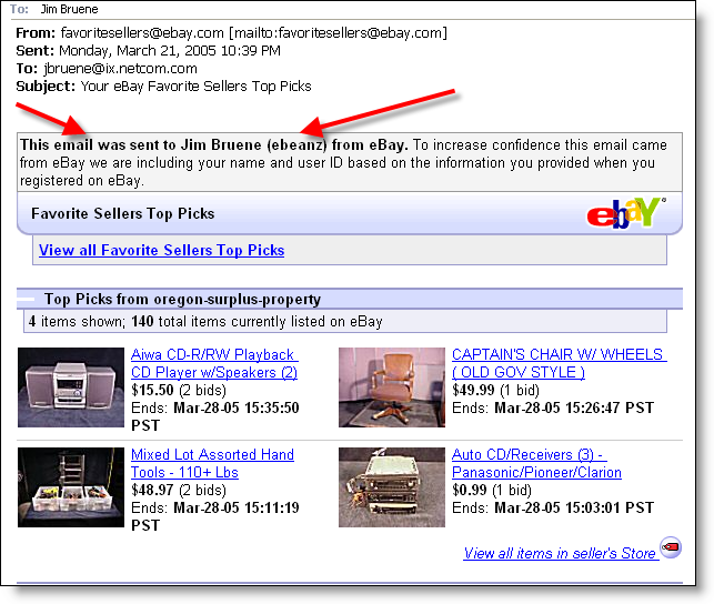
Ebay_personalilzed_email_4The auction giant recently elevated the personalization in its emails, incorporating name and eBay username, in an effort to help users recognize genuine messages.


View closeup of personalization

JB 

If you’d like to learn more about the future of financial email messaging, check out Email Marketing in Financial Services: Leveraging the Inbox from our sister publication, the Online Banking Report.

Charter One Bank Screws Up their Email Messaging

Charter_one_message I first wrote about the benefits of email alerts in the third issue of Online Banking Report nearly ten years ago (OBR 3, June 1995). Since then I’ve enjoyed watching the service unfold, and I’ve never met an alert I didn’t like — until this week.

An email messaging pioneer, Charter One Bank, with a suite of email/fax/voice alerts named OBR Best of the Web in 2003, laid an egg this week.

I’ve had an account there for years and have received seven or eight hundred daily mini-statements in that time. Surprisingly, those daily messages have remained absolutely the same. No advertising, no service messages, no cross-sales. Not even a holiday greeting.

Imagine my surprise when last week I received, in addition to my daily statement, a New Message Alert (click on screenshot above) that said in part:

On March 21 a new message was delivered to your Online Banking Message Center. Please click here to view this important message.

Surprisingly, it didn’t occur to me that this could be a phish (it wasn’t). I really was afraid something had gone terribly wrong with my account. I couldn’t remember my username or password and the "lost password" function returned an error message. So I had to wait until I was home where it was written down.

As I anxiously logged into my account, expecting the worst, I wondered how I would cover the check I’d just written off the account. The first thing I did was check my balance. Phew, it was what I expected, just enough to avoid monthly fees. Then I crossed my fingers and navigated to the secure message center where the all-important message waited.

Imagine my "customer experience" when I found that Charter One had sent me on this harrowing chase only to inform me that (click on screenshot below):

Effective April 10, 2005, Charter One Bank’s Online
Banking service will no longer process one-time or
recurring online transfers to or from a passbook
savings account.

Charter_one_message_center_1 Not only do I not have a passbook savings account, I have no other accounts beside checking, so I am ineligible to make any type of transfer on the system. What a terrible waste of my time.

Seven days later, I get yet another message insisting that I log back into the site for another "important message." This one wasn’t much better. The bank was alerting me to an upcoming bill payment service slowdown. Never mind that I had never sent a bill payment nor activated the service in more than two years of maintaining an account at Charter One.

Moral of the Story
As a consumer, after enduring two false alarms, I feel this way about the bank:

1. They do not know me as a customer.
2. They do not care if they waste my time.
3. They have no ability to send targeted email.
4. They lack a basic level of common sense.
5. They do not know how to communicate through email.

Analysis
It would have been so easy to keep this from happening. The bank could have done any of the following:
a) Sent these message only to users of the specific accounts/functions
b) Assuming their system doesn’t allow (A), they could have sent the entire message to my Internet email address so I didn’t have to login to see it
c) Not sent the message at all to my Internet email and simply posted the message within the online banking area

Takeaways
The email relationship with your customer is powerful, yet extremely fragile. A few irrelevant "important information" messages, especially if a website login is required to access the message, can kill the entire channel.

JB

Improving the “Look and Feel” of Bank Emails

In our most recent tests, we found great improvement in the quality and
timeliness of responses to Web-based queries. However, we found that the “look
and feel” of email responses left a lot to be desired. The typical bank response
was a few lines of text and perhaps a link or two to general information. And
because of poor choices in the FROM and SUBJECT fields, the responses looked
spam like and easily overlooked.


Compare those bank messages to email responses from leading Web-based
retailers and service providers such as GoDaddy, an Internet domain name
registrar (screenshot below). Most savvy retailers use graphically
appealing HTML messages to get their point across effectively, and when
appropriate, up-sell the user on a solution that solves their problem. In the
GoDaddy example below, I asked a question about website capabilities and
received an excellent response along with an appropriate upsell into their
$3.95/mo hosting option (see note point 4 on the screenshot below).


GoDaddy knows shows their savvy in responding to customer service inquiries.
Not only is it good looking and answers my question, it arrived eight minutes
after the question was submitted, beating by three minutes the
expected call center hold time listed on the website. That’s how to deliver
e-service, faster than alternative channels. The email response grabs your
attention with a well-designed layout including the following (see
corresponding numbers above
):

1.      Answer to my question (at the top)

2.      A real person responding to the question

3.      Link to a privacy
policy                                                 
                                                                

4.      Banner to select the service upgrade about which I had inquired

5.      Phone numbers for customer support

6.      Repeat of my original question (not visible on the
screenshot)          

My only major complaint with GoDaddy’s message is that it fails to identify
itself in either the email From field (it used “Support”) or the
Subject
field (it used: “Other: One page website incident 040506-001360”). 

Bank Examples

In comparison, the typical bank response is delivered in plain text with few
helpful links. Following are examples of banks responses to a general
non-customer query via their websites.  

The question posed: Do you offer overdraft protection that does not
charge for each advance?

Email response from Chase to a question about whether they
offered no-fee overdraft protection: The speedy response, 41 minutes, answered
the question correctly and concisely and provided a phone number for more
information. However, there were no links in case I wanted to sign right up for
the account I asked about. Score: A for service, D for sales. (09 Apr 2004)