 The ink wasn’t dry on my 2014 wishlist, when I got a message from BillGuard founder Yaron Samid, informing me that its new mobile UI was already doing what I’d most hoped for:
Wish #1: A Gmail-like priority inbox/feed for my financial transactions.
It’s as yet not quite Gmail-level functionality — for example, I’d like more tagging options than just “flag for later” — but compared to the state-of-the-mobile-art today, it’s pretty awesome. Thanks to BillGuard for getting the year off to a great start (note 1).
__________________________________
How it works
__________________________________
 BillGuard aggregates credit and debit card transactions and flags suspicious items for review (see previous posts). So in that way, it has always acted like the Priority Inbox function within Gmail. However, its desktop UI looks more like a traditional PFM than an email inbox.
But for the smartphone, BillGuard has dramatically changed the interface. As you can see in the inset, they use “Inbox” as the name of the transaction register. There is even a red bubble showing how many new charges are available for review (see inset right).
The five primary items on the main screen:
- Large green “card” >> Summarizes current month’s spending across all aggregated cards (you can also swipe through the individual cards)
- Inbox >> New transactions and any that you’ve flagged for followup
- All >> All transactions in a single infinitely scrolling list (I have 1,000+ transaction going back three years, and I can scroll through all of them in less than a minute). You can look at all transactions or just the recurring ones.
- Analytics >> Month-over-month spending graphs
- Savings >> Merchant-funded offers
___________________________________
 More on the UI
___________________________________
1. Inbox view (click screenshot for a larger graphic):
- Transactions are sorted with suspicious and unknown merchants listed on top and new, unviewed transactions below
- Users can choose the right “Follow Up” tab to view only those transactions they have flagged for followup (see #x below)
- User can swipe the transaction right to move it out of the new transaction inbox, as shown in the green “Metropolitan Market” transaction at right
- The transaction “card” contains expanded info on known merchants such as full name, location, and URL
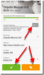
- There are three key buttons:
A. Green checkbox to okay the transaction, removing it from the inbox
B. Orange “followup” button to keep the transaction in the pending list for later review
C. Small gray box in upper right with a number that indicates how many transactions you’ve had with this merchant; clicking it brings up the list of all (10 in this case)
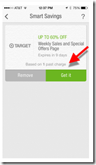
- Based on my transaction history, a discount offer from Target is displayed; clicking the green button brings up redemption options, in this case:
– Email offer
– Shop now
———————————-
Notes:
1. The mobile UI was actually released in the latter part of 2013.
2. Screenshot at top of post is an iPhone notification.

