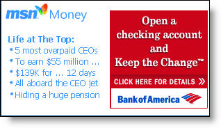
 Although we have concerns about the underlying program (see NetBanker Oct. 5, 2005), you have to tip your hat to the marketing execution of Bank of America’s Keep the Change campaign. Today a small but distinctive postage-stamp ad on MSN’s homepage, tied in with MSN Money headlines (see inset), invites readers to "Open a Checking Account and Keep the Change."
 It’s an intriguing headline and likely does well prompting clickthroughs. The landing page (click on inset right for a closeup) is also well done. A graphical explanation of the keep-the-change rebate is shown on the right, which helps alleviate the need for prospects to wade through the 479 words of fine print on the bottom of the landing page.
Another landing-page graphical element that you should immediately consider adopting: pictures of the three key banking products being pitched with simple checkboxes for selection (see below). However, in this case it’s used in a backwards fashion. Users are supposed to tell the bank which accounts they already have, rather than the ones they want to buy. This is counter-intuitive and should be redesigned.
 After selecting the BofA accounts already owned, users arrive on a secure Checking & Savings Account Application page that does a good job reinforcing benefits and referencing the original "Keep the Change" hook (click on inset left). A pop-up box offers live chat with a Deposit Specialist if desired.
Summary
The bank scores high for great online copywriting, superb graphics, and good ad positioning at MSN. We also like how Bank of America reinforces the benefits of automated savings. However, the offer is complicated and smacks of a gimmick that will do little to engender long-term loyalty or create a real savings ethic. Finally, the low 0.50 percent rate paid on the underlying savings account damages the program’s credibility and makes it less likely the account will be used to amass meaningful deposit balances.
Grades:
A+ for online advertising and sales (banner, landing page, application)
B+ for encouraging savings
C- for the debit card rewards program
