 Unless it was mission critical, or compliance mandated, there is a good chance your pet project was put on hold during the 2008-2010 financial crisis. Most website-redesign projects, despite good ROI, drop into that “discretionary spending” bucket.
But as we approach the one-third-mark of 2011, we are starting to see the results of design projects green-lighted in the last budget cycle. Bank of America, the most-visited financial website, rolled out its new design late last year.
But smaller financial institutions are also doing great work, ofttimes offering a better user experience than the big brands, which must be all things to all people. The Financial Brand rounded up a half-dozen great examples in a March 23 post.
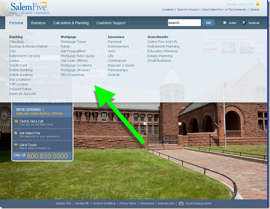
One that I particularly liked (note 1) is Salem Five’s new homepage (shown below). Not only is it gorgeous, the navigation is outstanding with a large box containing key info (see points A and B below) and drop-down mega-menus (second screenshot) for everything else.
A few highlights of the new design (letters correspond to those shown on the screenshot):
A. The small outlined box on the left contains important info including the online banking login and current rates for key products.
B. The bank makes it easy to find contact info by listing the toll-free number at the bottom of the box. The bank also features LivePerson-powered click-to-call, one of the recommendations from our most recent report (note 3).
C. Despite the minimalistic design, the bank still has four low-key, text-based promos running across the screen.
D. Users can choose from 19 background themes to use as the backdrop (note 2).
Salem Five homepage with customizable backgrounds (18 April 2011)
Salem Five uses drop-down “mega menus” to help users navigate to the far corners of its website
Notes:
1. I’m a bit biased because I’ve been following Salem Five since the summer of 1995 when we both spoke at the first-ever conference on Internet banking.
2. I’m not sure many users really want to choose their homepage backdrop; I personally prefer that the images be randomly rotated. However, it does show considerable web-savvy that the bank offers a customizable design option. After Salem Five is done showcasing the feature, the option to change pics should probably be taken off the homepage. It’s taking up prime real estate in the upper-right corner.
3. For more info on click-to-call and other “live help” techniques, see the most recent Online Banking Report (March 2011).

