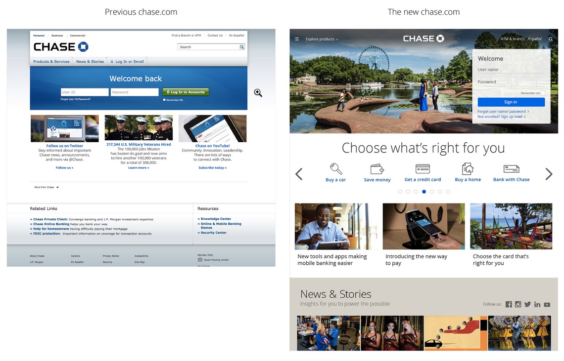
Chase unveiled a new homepage (on right above), the second in the past three years. While the first (on left above), unveiled in Oct 2012, was a massive rebuild, the latest is a more of a large remodel. I was not a huge fan of the 2012 version, so I’m glad to see the improvement, especially the downsizing of the page-dominating log-in area.
The first impression is good and the overall look and feel supports the Chase brand. But I think other homepages (e.g., Umpqua Bank, Verity Credit Union or even Capital One) do a better job showcasing banking products as opposed to “lifestyle” content that Chase seems enamored with (see #5 below). However, website design is much more than the homepage, and Chase’s previous design is a top performer in Change Sciences overall 2014 website usability and conversion ratings. So clearly Chase knows how to convert their massive website traffic. I’m sure they will be closely following the metrics after the change and will tweak any under-performing areas.
Chase’s press release provides a handy outline to lay out a few thoughts on its website. (And I apologize in advance to the Chase team for a bit of snark sneaking through; press releases have a way of doing that to a person.)
So here are the five points taken verbatim from the press release along with our comments:
1. Feel at home: Localized images personalize the site for returning visitors.
My take: This is a great feature brought over from Chase’s mobile app. Customized images are a nice and a relatively easy way to localize—still important in a country with 10,000 banks and credit unions, 99% of which are locally oriented. However, Chase’s implementation is a bit jarring. The eight images dizzily zoom right-to-left every 7 seconds and never stop. Luckily, they don’t begin until after you’ve been on page for 20+ seconds, so you can log in before the show begins.
2. Take a scroll: As with any newsfeed, customers can scroll down the homepage and have access to relevant content.
My take: Take a scroll is a clever bit of wordsmithing, but it’s a bit unusual to claim it as a benefit. That said, I do like the comparison to a newsfeed, a more modern concept generally not associated with banks.
3. Navigate with ease: The easy-access menu stays clearly in sight as customers scroll down the homepage.
My take: Chase’s fixed navigation is a UI feature that’s important on longer pages. But is it smart to mimic the mobile UI so closely? A universal complaint about mobile websites is their inconsistent navigation compared to desktop websites where nav has become well standardized. Yes, the design looks cooler, like a ginormous iPhone screen, but does the aesthetic win come at the expense of usability? With those jumbo images flashing by every 7 seconds, you do not want to linger. There is also inconsistent navigation: The homepage uses the mobile approach while the inner pages have the older navigation—do we assume that’s temporary?
4. See the choices: Customers can find which checking accounts, credit cards or mortgages best fit their lifestyle.
My take: Chase claims: “Customers can find which checking accounts, credit cards or mortgages best fit their lifestyle.” I’m pretty sure real people don’t think about their bank accounts that way, but what I believe the bank is saying here is that exposing readers to products within the “news and stories” section (see below) will lead to more sales. I have my doubts, and Chase can alter this quickly if the metrics aren’t supporting the tactic.
5. Learn from both experts and customers: News and Stories’ timely advice and insights move to a more prominent place.
My take: Big brands have been toying with “content marketing” off and on for 20 years. I understand the bank’s desire to market this way, but with so many other credible sources of personal finance info, you just end up looking amateurish compared with the NY Times, CNN Money, not too mention the hundreds of personal finance blogs. And even if you pay Pulitzer prize-winning journalists to write original content, you cannot avoid the fact that the article is POSTED TO A BANK SITE. My advice, stick to facts, tutorials, and links to third-party resources.