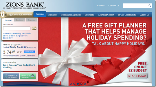
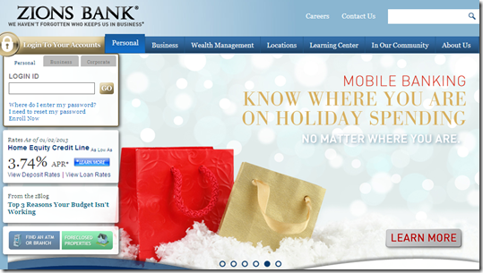
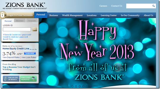
 Before we move on to more weighty matters, here’s one last example from Holiday 2012. Zions Bank had the most decked out website we’ve observed in the past two weeks. Because it ranks just outside the 20 largest U.S. banks, it didn’t make last week’s holiday roundup. But since it was so decked out, I thought it was worth a followup.
On New Years Day, Zions had holiday-related messages playing on three of its six rotating homepage themes.
- EZ Budget, its budgeting tool that helps track and manage spending for an event (previous coverage of the tool)
- General mobile banking pitch with a “tracking holiday spending” use case
- Happy New Year greeting
Bottom line: Without breaking the bank, Zions projects a timely, modern look that supports its brand.
——————————–
Zions Bank hompage featuring EZ Budget spending tracker (1 Jan 2012)
Zions Bank homepage featuring mobile banking wrapped in holiday theme
Zions Bank homepage with “Happy New Year” greeting


