One week into the iPad era there are still no banks or credit unions with iPad-specific apps (note 1). There also aren’t any major PFM or other financial brands present, other than Square and E*Trade. Mint’s not even there yet.
What’s going on? On Friday, The Financial Brand’s Jeffry Pilcher tweeted the question that’s on a lot of bankers’ minds:
While I suspect Jeffry is mostly being provocative, it’s a question worth discussing. Should financial institutions build an iPad app?
The Web experience on the iPad is outstanding. It has a lightening-fast Safari browser built in. It loads my bank’s webpage as fast or faster than my MacbookPro or Thinkpad X41. The iPad virtual keyboard makes it easy to type username and password. And for the most part (Flash is a problem), websites look and perform perfectly on the iPad (use ipadpeek.com if you want to see what your webpage looks like in an iPad layout).
So yes, online banking works fine on iPads. But you can say the same thing about most evolutionary products. Telephone calls work fine on corded phones. Cars work fine without cup holders. Refrigerators work fine without ice makers. And so on.
An iPad app isn’t about utility, it’s about a great user experience. The ability to click on a banking button on the main iPad screen and launch a perfectly sized online banking app shaves 30 to 45 seconds off the traditional browser-based approach (open Safari, navigate to my bank, and find the login button). There are also things you can do with an app, such as location-aware ATM/branch finder, that make it a better experience (note 2).
So here’s why most major financial brands should have an iPad app now:
- Free publicity (part 1): As of today, there are only 39 iPad apps in the Finance category. Each of the 562,000+ iPad owners, and millions of others browsing the iTunes App Store, would see your brand showcased there.
- Free publicity (part 2): There was, and is, a tremendous amount of hype around the iPad. Being the first bank/CU in your country/state/region/city/neighborhood with an iPad app will net you numerous mentions online and in print.
- It’s cool: While financial institutions are rightly focused on the basics right now, there is still considerable value in being seen as a technology leader.
- It’s inexpensive: Building a basic iPad/iPhone app is a relatively simple project. If it did nothing more than connect to online banking and show nearby ATMs/branches, you’d receive most of the benefits listed above.
- It’s the future: Apps and widgets will play a large role in banking info delivery going forward, especially in mobile banking. You should be designing apps for every significant platform. In the U.S. that means the iPhone and Android, then iPad and Blackberry after that (see note 3).
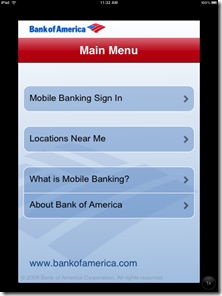
And one final note for the 67 U.S. financial institutions that already have iPhone apps. Yes, you still need an iPad one. While the iPhone app runs fine, it is displayed in a small window the size of an iPhone. Users can press a button in the lower-right corner to doublesize the app, but images and text become fuzzy, and it just doesn’t look right (although it is functional as you can see in the screenshots below).
Bank of America’s iPhone app displayed on iPad screen (5 April 2010)
Note: Click on the images below to see the quality difference
Normal size Double sized
Notes:
1. As of 11 PM Pacific April 10, the only major financial brand with an iPad app is E*Trade MobilePro, which is more about stock trading, not banking.
2. For more on financial apps and the iPhone, see our March 2009 Online Banking Report.
3. For more on the importance of mobile banking and payments, see the most recent issue from Online Banking Report.
4. Hat-tip to Banking Kismet for blogging on the subject.


