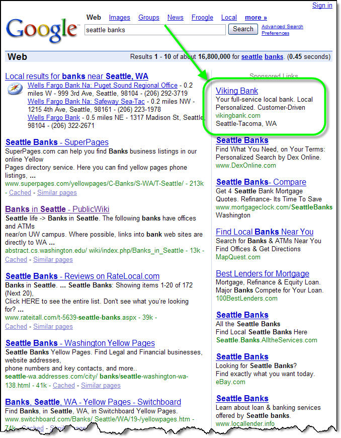
 We've been poking around on the search engines to see what banks are doing to attract new customers moving into their area. In a search today for "Seattle banks," we were impressed to see a local community bank, Viking Bank, with the top spot on Google AdWords (upper right in inset). Viking was the only area bank with a paid listing. The other seven listings making the first page of Google results were from various information aggregators, such as MapQuest, or lead generators such as 100BestLenders.com.
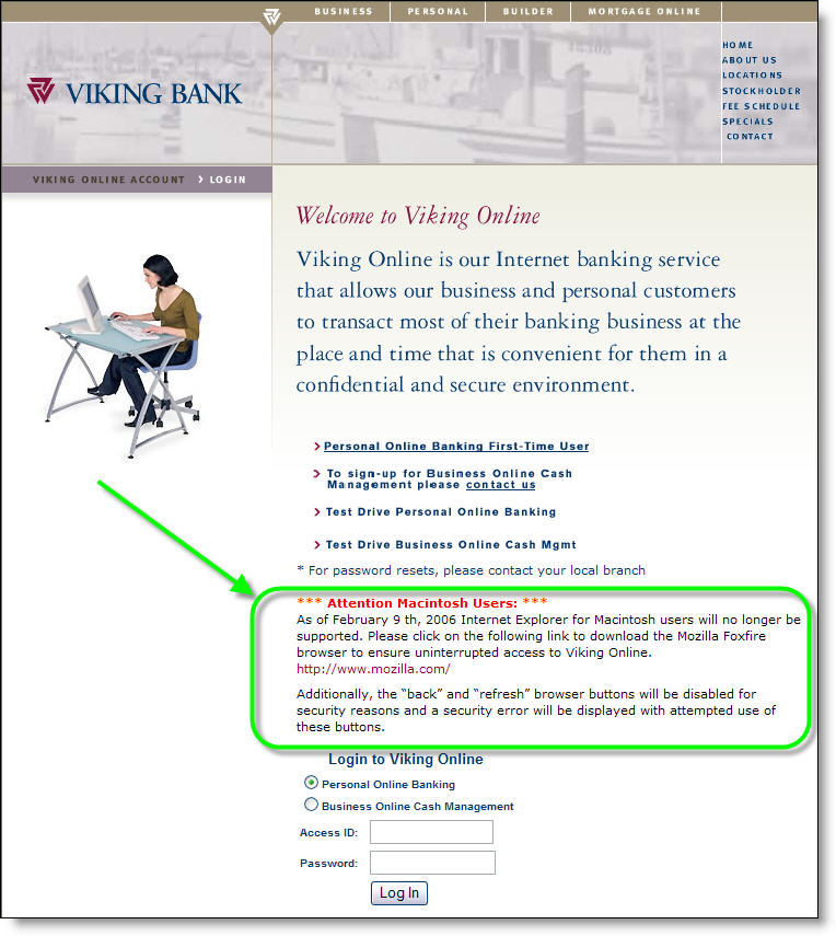
However, clicking on the ad sent us to one of the worst landing pages we've ever seen. For some reason, the bank is paying big money to drop Google searchers onto its log-in page, which has not a single benefit listed. In fact, the item that draws the most attention, especially since it loads first, is a warning about a service problem for Mac users (click on screenshot below for a closeup). To make matters worse, the Viking Bank logo isn't even clickable, so prospective customers have to search the navigation to find a way off the log-in page.
 Analysis
Viking Bank's search-engine buy is smart. You want to be seen when users search on "yourcity" and "banks." But you must spend some time to build a landing page that quickly communicates user benefits (see NetBanker April 5).
—JB