Here’s an unintended consequence of mobile banking.
I learn more about my bank by reading the description of the changes in its latest mobile (iOS) update than all other channels combined. And since I’ve downloaded about 100 banking and financial apps (and manually update them all), I read a LOT of mobile updates.
Very few financial service apps use that space to communicate creatively. Often, it will just be something terse like, “fixing bugs.” Now, I like succinct copy, but at the time of a mobile update, you have the undivided attention of your customer, if only for a few seconds. Use it! (though don’t abuse it).
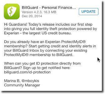
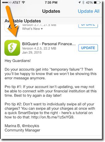
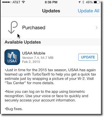
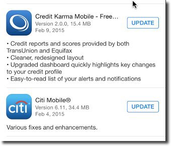
 While a number of web companies do a good job (Yelp, Redfin come to mind), the best financial services communicator on my phone is BillGuard (see inset). BillGuard not only spells out changes being made now, but also recaps prior major improvements, and reinforces their brand with a friendly sentence or two of often unrelated information. They also sign off each update with a real person and Twitter handle. Credit Karma and USAA have also recently posted interesting update information (see below); Citibank, not so much (last screenshot)
Bottom line: I know it takes extra time to get approvals for the “marketing copy” on an app update, but this is a great chance to improve user perceptions. And you can recycle that approved copy into other media as well (blog posts, email newsletters, employee training, etc).
——-
Mobile update examples:


