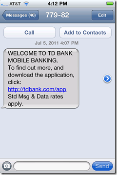
 I was reading one of my favorite personal finance blogs today, Lazy Man and Money, and I noticed an intriguing ad from TD Bank. Actually, the blog is covered in TD ads, with the faces of spokescouple Regis & Kelly peering out from every corner.
But originally I noticed only the ad in the upper-right corner (see first screenshot below). The mobile interactivity, along with the 10 spaces asking for my number, grabbed my attention.
The text-message campaign is powered by Cielo Mobile, whose URL was displayed in the browser status bar after I clicked the banner.
________________________________________________________
How it works
________________________________________________________
1a. Users type their mobile number into the interactive banner ad (upper-right).
1b. The banner returns this thank-you message:
2. The link in the text message (left) opens the mobile webpage (right).
3. The app is downloaded from the iTunes App Store and this is the first screen at launch:
_________________________________________________________
Analysis
_________________________________________________________
Apparently, I’m not the target audience for this banner ad since I don’t have an account at TD Bank. But if inclined to change that, I’d like a little more help opening an account. The bank does better than most by including links to its call center and webpage on the first screen of its native iPhone app (see #3 above), but there should be a direct call to action, or even a different app, for non-customers.


