Unless you are a hardcore cord cutter, you’ve seen a Rocket Mortgage spot since it’s big-budget launch at the 2016 Super Bowl. Quicken Loans has done a great job positioning itself as both quick, and easy, in the mortgage market. The new division accounted for $7 billion in mortgage volume last year, about 8% of the company’s total.
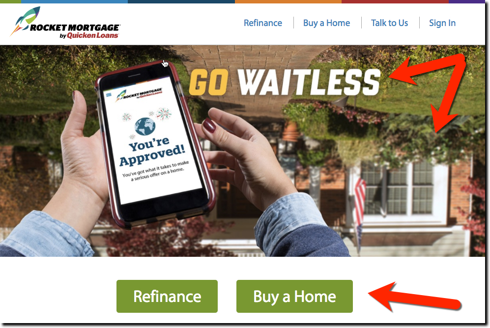
Last week I reviewed the UX/UI of its website. Other than the disconcerting upside down homepage graphic (which I admit, does align well with its advertising messages), the website does a great job engaging prospective customers and moving them through the sales funnel. I especially liked the beginning of the application process, which many banks and credit unions fumble.
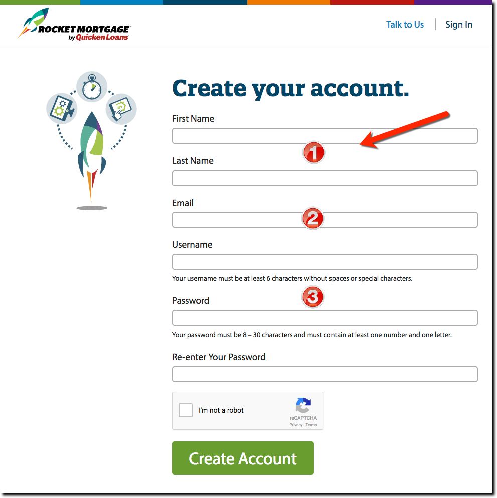
Instead of trying to entice users to Apply, the mortgage lender simply asks them to Create your account, a simple and lightening-fast process that requires just name, email address and username/password (see above). Once that’s over, the lender can work on converting them to full applicants. This technique is especially important with a big considered purchase where consumers are tempted to procrastinate at every step of the risky and time consuming process of applying for a home loan.
Bottom line: Although Create your Account is much better than Apply as a first step, it would be even less intimidating if Rocket Mortgage just started with Registration, the universal first step for most sites.
Author: Jim Bruene is Founder & Senior Advisor to Finovate as well as
Principal of BUX Advisors, a financial services UX consultancy.


