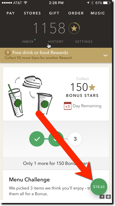
 In a major update last week (v4.3.2, 30 Jan 2017), Starbucks added a floating balance to its mobile app main page. So instead of navigating to the pay tab within the app, users always see their card balance as soon as they launch the app. And the balance stays floating in the lower right corner no matter how far down the page you scroll.
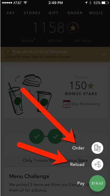
Furthermore, clicking the green button grays out the page and brings up two options tethered to the green button (see screenshot below):
- Order
- Reload
It’s a small thing, but it helps users know before they get to the front of the line whether they have enough funds in their prepaid account. It is also a good shortcut to the card reload function, though I’m not sure how many users will know/remember it’s there.
Bottom line: Banks should make sure that the balance is visible on all areas of their debit card interfaces. It’s an even worse user experience to find out you don’t have the funds after you’ve ordered your meal or rung up your grocery store purchases.

Author: Jim Bruene is Founder & Senior Advisor to Finovate as well as
Principal of BUX Advisors, a financial services UX consultancy.