 Over the next few months, we will take a long look at the marketing of loans and credit lines online. The information will be summarized and analyzed in an Online Banking Report scheduled to be published in fourth quarter. However, as we find interesting examples, we’ll report them here first, along with links to the live sites.
The first example is a good one from HomeLoanCenter.com. We ran a search on Google for "home equity Washington DC." One of the two AdWords banners on the top (click on inset for a closeup) was titled "DC Home Equity."
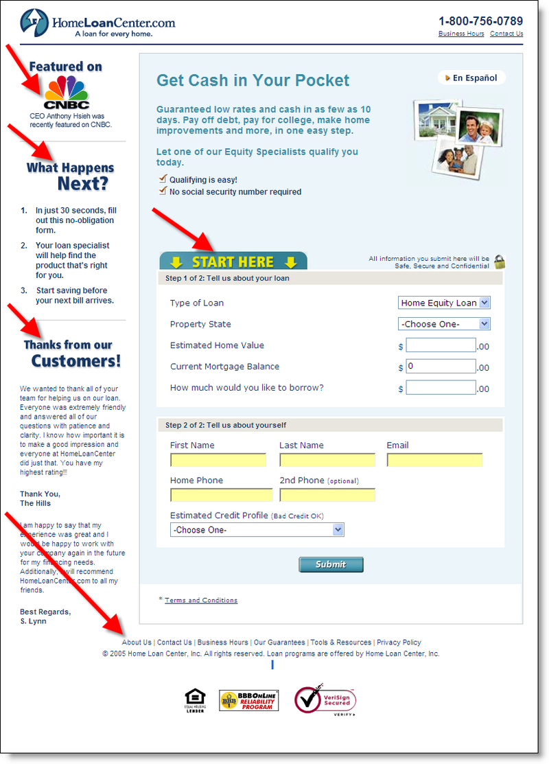
 Clicking on the link took us to the lender’s landing page (click on inset for closeup). Although, the page doesn’t reinforce the geographic element of our search, it otherwise does an excellent job in reassuring the user and leading them into the application process.
Along the left side are three important elements:
- Third-party endorsement from CNBC
- 3-point "what happens next" instructions
- Customer testimonials
The middle of the page includes a toll-free phone number, several brief benefits, and a prominent Start Here to begin the application process. Prospects are only asked to provide a few key data points:
- name/email/phone
- state
- home value/mortgage balance/desired borrowing
- self-evaluation of payment history from a drop-down list
The page contains virtually no clickable links. Other than the prominent Submit button, the only links offered are in fine print at the bottom (About Us, Contact Us, Business Hours, Our Guarantees, Tools & Resources, Privacy Policy). This is a good trade-off. You don’t want to lose loan prospects by distracting them with navigation choices, but you want to give those that need more information an outlet.
Overall score: A
—JB