 I’ve written about ING Direct’s holiday animations before. While they won’t win any new business by themselves, they are part of a brand image that ING Direct cultivates. And it works because many consumers respond positively to a sense of humor even from institutions that are supposed to be serious.
With consumer confidence at an all-time low, and banks not exactly on anyone’s holiday-card list, it’s probably not a good time to create a whimsical branding campaign. But if you are ING Direct, which has built its image on bright-orange graphics and hip advertising, you can still have a little fun with the bank’s favorite orange holiday, Halloween.
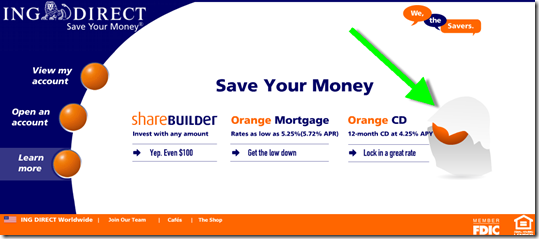
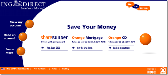
Visitors to the direct bank’s homepage this week initially see white space where the bouncing orange ball normally does its thing. Within a few seconds an orange-eyed ghost comes out of the background (see first screenshot below). It comes towards you, then reveals the orange ball underneath the white “costume” (see second screenshot). Then it ends with the usual homepage (see third screenshot; note 1).
Very clever (I’d even say LOL, but I’ve vowed to never to use that term professionally).
ING Direct homepage (28 Oct. 2008)

Notes:
1. The animation runs just once. That’s an important element of restraint to preserve the viewing experience. Don’t endlessly cycle animations or you’ll annoy your visitors. They can refresh themselves if they want to see it again.

