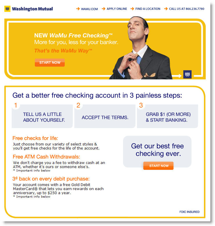
 Washington Mutual, one of the more creative offline promoters, is beginning to apply its talent to online promotions. We're still not particularly fond of the "trapped bankers" creative (see NB April 28), but we like the bank's new "more than free checking" campaign.
We first ran across the promotion July 7 in a skyscraper-animated banner (175 x 500 pixel) on the right side of Rotten Tomatoes <rottentomatoes.com>, the popular film review aggregator (see inset).
The banner was good, but what we really liked was the landing page (see below). The design was clean and fresh (not so hard to do), and the copy was original and user-friendly, with just the right dose of humor (not so easy to do).
Our only criticism is the crucial final step. Users clicking the "Get Started" button are delivered to a much different and more bank-like screen to begin the application. The relatively dull look (see below) is a real letdown after the originality of the landing page. It's so different, it may cause users to stop and rethink their decision to apply.
The bank would likely convert more prospects if they continued the landing page theme through the first page of the application. Overall, we'll score the effort an A-.
–JB

