Guess Who’s Back? NetBank

imageIt’s been 5 years since NetBank failed (see our post). At the time it was the largest bank failure in 14 years. But little did we know then (Sep 2007), that the $110 million taxpayers coughed up to cover its deposits was nothing compared to what was about to happen in the financial markets (note 1).

After the failure, ING Direct bought the NetBank retail deposit business and took ownership of the domain netbank.com. But they never did anything with it besides forwarding the URL it its homepage. 

But evidently Capital One didn’t want to be associated with that failed endeavor and/or it thought the "net" was too limiting for the mobile world. So, the Netbank URL and name were sold sometime this year to Bank of Internet (note 2). The URL has pointed to BofI since at least September. No word on the purchase price, but given that investing.com just sold for $2.5 million, I’m guessing it was in the $500,000 to $1 million range. 

Anyway, the back story matters little anymore. It’s a good name, and once the Google search results no longer have those 5-year-old "failure" articles on the first page, the baggage should be reduced to almost nothing (note 3).

As you can see from the banner running across the homepage (see second screenshot below), the new NetBank is targeting the account towards the "underbanked" (note 4). But the account is positioned as "real checking" as opposed to a prepaid card.

And it has one key feature that sets it apart from most checking accounts: the ability to deposit cash into the account via Green Dot’s MoneyPak.

The checking account costs $6.95/mo with direct deposit, or $8.95 per month. It pays 0.25% interest and is loaded with all the important account features (checks, debit card, p2p transfers, rewards, PFM, mobile remote deposit and so on).

It’s a good value compared to many alt-banking products. However, consumers in good standing with the U.S. banking system and willing to forego the MoneyPak option, would save with BofI’s free checking with no overdraft charges

Bottom line: It’s good to have the brand back in the game. Now, when will someone revive NextCard’s name?

——————————-

Before: Last known screenshot of bank before failure (20 Aug 2007, from Archive.org)

image

After: NetBank’s new homepage (13 Dec 2012)

image

—————————–

Notes:
1. For those that want to relive those dark days, here is the 54-page U.S. Treasury audit of why Netbank failed (published 23 April 2008).
2. I don’t know whether Capital One acquired netbank.com in its ING Direct acquisition or whether ING Direct sold it directly to BofI. It was not a material asset in the $9 billion deal.
3. Someone needs to do BofI a favor and get that Wikipedia entry updated ASAP. 
4. Or at least those currently locked out of the banking system due to bad ChexSystem scores.

Bank of Internet Launches No-Overdraft-Fee Checking Account

imageI’ve been working on a blog post, “overdrafts in the digital age,” for a few days. But it’s ballooning to the point where I may turn it into a full Online Banking Report. Or just publish it in several parts here.

Either way, I’m looking for examples of new approaches to overdraft protection. For example, Bank of Internet recently did away with the fee altogether on its Rewards Checking account. The bank won’t necessarily honor the check (unless the user is covered by linked-account overdraft protection), but they won’t charge a fee if they give it the heave-ho (note 1).

The account also boasts no monthly fee, an APY up to 1.25% (if electronic transaction minimums are met), an ATM fee rebate, Intuit’s FinanceWorks PFM with Cardlytics-powered cash-back, mobile remote deposit (Mitek-powered, I presume) and Fiserv’s POPmoney P2P payments. It’s like a Finovate greatest-hits account.

————————————–

Bank of Internet homepage features Rewards Checking (27 Sep 2012)

Bank of Internet homepage featuring no-overdraft-fee checking

Rewards checking landing page (link)

BofI rewards checking landing page

———————————-

Note:
1. Bank of Internet won’t impose a fee, but the merchant who submitted the check (and who will be dinged by their bank) very likely will. So it’s not necessarily a fee-free event.
2. For info, our report on fee-based online services (subscription, May 2011)

Bank of Internet Launches MyRVBank

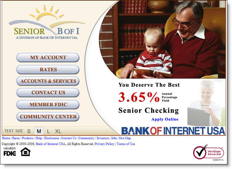
Bofi_rvbank_logo Bank of Internet <bofi.com>, has launched its second niche, direct-bank brand, MyRVBank. This one is targeted to the 8 million U.S. households with recreational vehicles. The site is virtually identical to its Senior Bank <seniorbofi.com>. The only differences, aside from the URL, are the homepage picture, different button designs, a few unique links in the Community Center and the blog. Click on the screenshots below for closeups (follow the continuation link at the bottom of the article to see a comparison of the product pages).

Bofi_rvbank_home  Bofi_seniorbank_home

Analysis
Creating microsites for market niches is a good strategy. The RV market has been targeted by at least two banks in the past, Chase Bank in 1997 and Affinity Bank. Neither of those programs is still in operation.

Bank of Internet shows how to do niche marketing on a shoestring budget, basically re-purposing its existing Seniors' website. The bank said it spends less than $100,000 on the niche site. From the looks of it, I'd estimate it's quite a bit less than $100,000.

The only content differences are in the Community Center which contains several links to blogs and other resources of interest to RVers. The bank also sponsors a blog, MyRVBank Blog, hosted on Google's free Blogger site <myrvbank.blogspot.com>.

Blogging is a great idea, and we think every financial institution will eventually host a blog (see NB Aug. 29); however, the bank's RV blog is bad. It's designed to demonstrate the joys and pitfalls of life on the road, with a hired guest blogger, Tim McWhorter, chronicling his year-long trip with his wife and four kids across the country.

Here are a few of the problems with the blog:

  1. No pictures: Travel blogs MUST have pictures at least every once in a while
  2. Small type: The font is small and the text-only postings have almost 25 words per line, an uncomfortable read for most users, especially the seniors they are trying to attract.
  3. Poor layout: The blog doesn't even use many of the free tools available to make it more visually interesting; for example, entries without dates, no author profiles, no explanations of purpose, no recommended links, no post categories, and no permalink so other blogs can link to specific entries.
  4. No email address: Most blogs provide a means to communicate with the author(s).
  5. No RSS feed: The blog does not allow users to sign up for an RSS feed.
  6. Infrequent posts: There are seven posts since the supposedly grand RV adventure started June 24; only three about the trip and four generic posts about fuel economy, buying an RV, and so on.
  7. Boring: It's just as well that there are few posts, because what's there is mind-numbing dull. Here's an excerpt about the trip:

When we came back outside, the sky had darkened and thunder was easily heard off in the distance. We had five miles to get back to our car with several large uphill climbs ahead of us! Yikes! We made it back to the car and loaded up the bikes. We did not even make it out of the parking lot before it started pouring down rain! We were very relieved to make it back before the storm which was also accompanied by high winds and lots of lightning.

Bank of Internet has the right idea here, but they need to invest a bit more in design and content to make its niche marketing effort more appealing. In addition to sprucing up the blog, the bank should work with marketing partners such as KOA to provide more RV-related value adds. The bank should also do a better job highlighting features of interest to frequent travelers, such as the $10 month in ATM surcharge rebates.

JB

Appendix: Product page comparison, Senior Bank vs. MyRVBank (click for closeups)

Bofi_seniorbank_products  Bofi_rvbank_products

Bank of Internet’s Niche Banks

Bofi_seniorbank_1Bank of Internet <bofi.com> announced today the launch of its second specialized online bank, Senior BofI <seniorbofi.com>. While it may not be the sexiest name on the planet, it does help establish the link to the more established entity, Bank of Internet, a comfort to the market it’s going after, seniors.

This marks the second specialized online bank operated by BofI, the five-year-old, online-only bank. The other is Apartment Bank <apartmentbank.com>, which caters to owners of multifamily-housing properties.

Analysis
We like BofI’s strategy of going after national niche markets with specialized services. The ApartmentBank concept is especially unique given the small total universe it serves. Looking at the recent fundings, it appears to be gaining some traction, especially in Texas, Arizona and a few neighboring states. The website lists 12 deals worth $16.6 million, half the dollar volume from Texas (click for screenshot of Apartment Bank).

Bofi_seniorbank_amazonad_1We are less enthusiastic about the initial Senior Bank implementation. Given the competition for this segment, the bank will need to mount a stronger effort. Other than the user-friendly SMALL/MEDIUM/LARGE/X-LARGE font selection tool in the lower-left of the homepage (click on screenshot above for closeup), there isn’t much to differentiate the bank, or its products, from thousands of other banks, most of whom cater to seniors with special accounts and pricing.

For example, The Community Center is dominated by a list of DVDs for sale at Amazon, including Batman Begins, and TV shows, Lost, Firefly, and Friends (see inset). The bank loses whatever credibility it had gained on its homepage once seniors see random selections from Amazon’s inventory dumped onto the website. Seniors don’t even like to shop online, especially for DVDs aimed at 20-somethings.

The Grades
A for strategy
B for implementation of Apartment Bank
C- for implementation of Senior Bank

JB