 Contractually, Capital One had just one year to transition away from the ING Direct name and rebrand with its own creation. Last week, it announced the new name:
Capital One 360
While I like the “360” thing, I’m a little disappointed they didn’t give it a separate brand, like NAB’s UBank. Here’s how the bank explains it to customers:
Red’s the new Orange. Since Capital One’s colors are red and blue, our new colors are going to be red and blue, too. After all, we’ve got to make sure we’re color coordinated and lookin’ good for the family photo.
My take: Most financial institutions are best served by overlaying their trusted name on all their initiatives. But given the provenance of ING Direct, a quirky independent anti-bank bank (though it was owned by a huge financial conglomerate), I thought this might be an exception to the rule. But I don’t fault the bank one bit for taking the lower-risk approach.
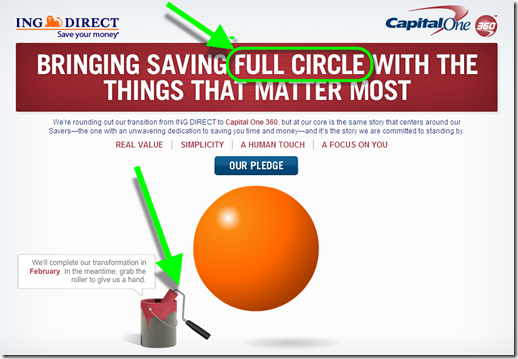
It will be interesting to see how Capital One positions the 360 brand long-term with its other bank and card divisions.  The “360” implies a full view of your finances, so I wonder if they’ll be dropping PFM features into the account soon. There are no clues on the bank’s “Our pledge” page (accessed via the blue button above the ball).
And long-time fans are wondering how much of the old ING Direct quirkiness will be maintained, if any. One promising sign, the landing page at <capitalone360.com>, has a clever play on words along with an interactive feature that allows the user to “paint” over the orange ball revealing a maroon 360 one. Very well done.
———————————-
Capital One 360 landing page before “brushing” (14 Nov 2012)
Capital One 360 landing page after brushing
Note: Not that it really matters, but I was expecting the ball to bounce, as it used to on the ING Direct page, after the 360 was revealed.

