 One area that’s long been marked “needs improvement” on most banks’ digital report cards is site search. But it’s getting much better. Five of the 10 largest U.S. banks—BofA, Wells, Citi, Capital One, PNC—now offer “autocomplete suggestions” something even Google didn’t fully implement until 2008.
That’s great progress, but even at these digital leaders the search results can fall short. Most FIs still present a laundry list of results with some sorting for relevance. For easy searches such as “checking,” all the majors deliver relevant results. But only one takes it to the next level, Capital One (also an honorable mention to BB&T for including thumbnail pictures, making results look much more interesting, and to PNC, for including product recommendations for some searches, e.g., “checking”).
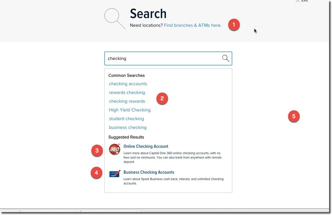
Of the 10 U.S. megabanks, Capital One is by far the winner in our search for good search. They do five things in the initial search that most others do not:
- Since search is often related to branches/ATMs the bank includes a link to that at the top of the search page (see #1 in screenshot)
- The suggested search terms are well curated (see #2)
- Most-likely product-results are included at bottom with eye-catching graphics (see #3)
- The bank does not automatically assume you are a consumer. In this example, they showed links to both consumer (interestingly, only to the 360 products inherited from ING Direct) and business checking (see #4)
- The UI is very Google-like with lots of white space and no distractions
————–
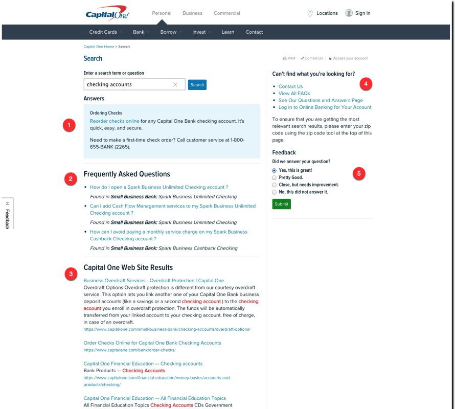
In addition, Capital One’s search-results page is laid out in a user-friendly manner:
There are five key sections (noted above):
- Capital One assumes all searches are “questions,” so it provides the most likely answer in a shaded box at the top of the search results
- Other curated FAQs related to the search-term
- Full site-search results
- Contact Us section for more help
- Feedback loop
———-
Interestingly, unlike the other nine mega-banks, Capital One does not offer site-search directly on the homepage. A search icon is prominently located on the top right, but the bank takes you to a separate page to begin the search. I prefer searching directly on the homepage, but that’s not nearly important as delivering relevant and well-structured results.
———
Note: We looked at these major U.S. retail banks: Bank of America, BB&T, Capital One, Chase, Citibank, HSBC, PNC Bank, Suntrust, US Bank, Wells Fargo
———-
 We’ll be delving deep into issues like this at the second annual FinDEVr event for digital bank builders on 6/7 October in San Francisco.


