 When I moved to Seattle, Starbucks had just four locations. So I’ve had a ring-side seat in their climb to worldwide ubiquity. Though not a huge fan of their coffee, I greatly admire their business model, technology, and payments innovations.
I have been paying with the Starbucks mobile app for the past few months (note 1) as have 14% of its customers. It’s great as long as there is a queue. That gives you plenty of time to go through the 9-step mobile payments process (10 steps with tipping):
1. Dig out your phone
2. Enter the smartphone passcode (if applicable)
3. Locate the app
4. Open it
5. Press pay
6. View balance to ensure there is enough cash available
(not applicable if auto reload is enabled)
7. Wait for cashier to press the correct key on terminal
8. Position your phone under the QR reader
9. Wait for cashier to give you the OK
10. (Optional) Dig in your wallet/purse/pocket for tip money
While this process seems ridiculously time-consuming compared to a card swipe (or cash), if you are waiting in a queue (typical), you can take care of all that before your turn to order (especially if you already have your phone out and are logged in).
__________________________
The new Starbucks app
__________________________
 The latest version of the Starbucks mobile app (iOS released 20 March 2014) cuts two steps from the 10-step process. More importantly, the crucial “hit pay” (step #5 above) has been replaced by a shake of the smartphone to signal it to display the Starbucks QR code needed at the point of sale. While not a huge timesaver, it pretty much eliminates navigation within the app before payment, quite an improvement in UX once you get the hang of it (note 2).
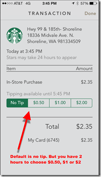
The new app also offers electronic tipping, a welcome improvement for the staff, since the move to no-signature card-transactions many years ago took away credit-card tips.
The app integrates four components into the homescreen (see screenshot #1 right):
A. Top navigation with choice of:
— Pay: Opens up QR code (in lieu of shaking) (see screen #2 below)
— Stores: Starbucks store locator with map and list
— Gift: Opens to virtual gift-card function with integration to iPhone contacts (see screen #3)
B. Loyalty program: A screen-dominating donut shows exactly where you stand on the path to the next loyalty level.
C. Messages: Links to a “feed” of available offers (screen #4) including:
— discounts
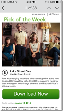
— free iTunes song and app downloads (with integration to iTunes for easy redemption) (screen #5)
D. Account history (see screen #6)
— purchases and reloads
— tipping function allowed for two hours after purchase (screen #7)
__________________________
Lessons
__________________________
There are some lessons here for card issuers:
- Focus: Go to Starbucks.com on your desktop browser, and you’ll see about 150 navigation choices delivered via mega-menus across six main tabs. It’s worse than most bank websites. However, the mobile app has just three primary navigation choices (Pay | Stores | Gift), plus rewards, messages and transactions on the main screen. Starbucks rightly chose to concentrate on exactly what customers need when they are on the go.
- Integrate rewards/loyalty: Despite the “shake to pay” process improvement, the Starbucks mobile payment experience is still cumbersome and by no means easier than paying by card. However, because the app is integrated with rewards, all of sudden it becomes compelling, both for early adopters (certainly) and the mass market (note 3).
- Annotate the transaction: Besides the new tipping function, the transaction history includes both a feed of the transactions (screen #6), plus the ability to click through to a full receipt (screen #7). While not super interesting at Starbucks, when so-called “level 3” data is available for more complex purchases, it becomes an important part of the value delivered.
- Mobile first: If you offer information or services consumed on the go, mobile services (app & website) are the key interaction point going forward. Starbucks CEO Howard Schultz understands this (note 4). Does your CEO?
__________________________
Screenshots
__________________________
2. QR code (scanned at POS) 3. Virtual gift cards
4. Offer stream 5. iTunes integration to redeem
6. Transaction history &nb
sp; 7. Transaction detail with tipping
—————————–
Notes:
1. Previously, I was paying with Square Wallet since no reloading is required. But now I’m on the quest for Gold Status at Starbucks, so Square will have to take a backseat.
2. Since users are not accustomed to shaking their phone to make it do something, it may take a while for everyone to figure out this shortcut. Luckily, the Pay button has been moved to a position of great prominence, for those that prefer to use the old navigation process.
3. The Starbucks app is now on my wife’s iPhone. Besides the map, weather, Yelp, and French translations, it will be only the fifth app she uses frequently.
4. Starbucks CEO Howard Schultz is a genius and seems to genuinely care about his employees and the world. If he had only stayed out of pro sports ownership (go Sonics!), his record would be virtually untarnished.


