![]() As mentioned earlier this week (previous post here), Flushing Financial's new Internet offering iGoBanking features a great price, modern homepage design, visible rates, and an overall good user experience.
As mentioned earlier this week (previous post here), Flushing Financial's new Internet offering iGoBanking features a great price, modern homepage design, visible rates, and an overall good user experience.
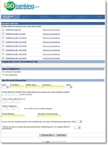
 At least until prospective customers decide to buy. Once the user clicks the grammatically challenged link, "iGo Open a New Account," things go downhill quickly. The application (see screenshots right and below), hosted by CashEdge (see related post here), fails to maintain the user experience from the bank's homepage.
In fact, the application is a circa 1999 all-text affair that leaves you wondering if the graphic designers at CashEdge are on strike. Here are a few of the problems:
- No Customer Service or Help on the application
- No telephone number
- No way back to the homepage, the bank's logo is NOT clickable
- Overall lack of design and graphics, even the logo in the top looks like a low-resolution version
- The application steps are hardly visible because the white font is too thin to be easily read through the blue background
- Social security number required on first page
- Application is massive in length for a simple savings account (see screenshots below); we realize the need for regulatory compliance and security, but it should be either shortened or broken into smaller steps to maintain
For more on best practices in application design, refer to Online Banking Report (#104).
Screenshot: iGoBanking application page 2 (click to enlarge)
