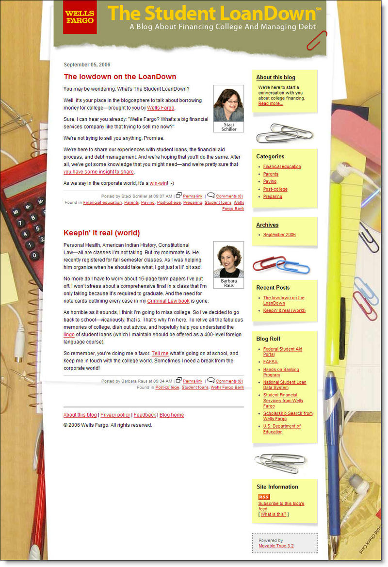
 Wells Fargo launched its second blog today, The Student LoanDown <blog.wellsfargo.com/ StudentLoanDown>. The site, which is not yet mentioned on the main Wells Fargo site, is designed to offer guidance on the student loan process (click on inset for closeup).
The first post claims they won't try to sell anything. It's a claim not technically accurate since there are several links to the corporate lending site, and a position that's not really necessary. As long as you are upfront about the corporate affiliation, it's OK to highlight your own products and services PROVIDED it's done in a way that is both interesting and useful.
The website is powered by Six Apart's Moveable Type and launched with just a single post from two of its four listed authors. Wells Fargo joined the so-called blogosphere back in March when it launched an odd site called Guided by History, a look back at the 1906 San Francisco earthquake and what we can do today to be better prepared for natural disasters.
While that site is pure community service, The Student LoanDown hopes to educate students and parents while driving more business to its student loan unit. Live less than 24 hours, it's too early to give it a full grade, but here are our first impressions.
Pros:
- A bank that blogs, and one that will provide good PR, regardless of whether students like it
- Even if it looks a bit hokey, you can tell the bank put an effort into the design, unlike Bank of Internet (see NetBanker Aug. 31)
- A good cross-section of authors, one from marketing, one who's a May college graduate, one communications consultant, and a bank-sponsored, literacy-program manager (where are the guys though?)
- Full bios and pictures of the authors
- Comments are open (but moderated of course), which is a good feature provided the function is used. The bank will probably have to do some subtle encouragement, perhaps with employees, to get some Q&A started
Cons:
- There are only two postings, neither of which offered anything useful or interesting; try to launch with something interesting, even if it's a blatantly commercial sweepstakes
- The design is a bit hokey; Trey Reeme over at OpenSourceCU called it, "a little on the MySpace side with a WF feel" (hint: that is not meant as a compliment)
- The content needs more pizazz
–JB