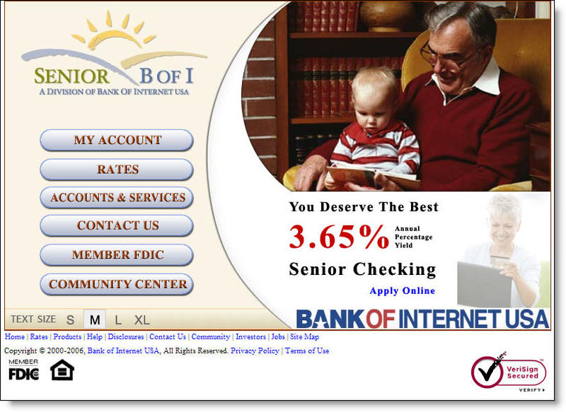
![]() Bank of Internet <bofi.com>, has launched its second niche, direct-bank brand, MyRVBank. This one is targeted to the 8 million U.S. households with recreational vehicles. The site is virtually identical to its Senior Bank <seniorbofi.com>. The only differences, aside from the URL, are the homepage picture, different button designs, a few unique links in the Community Center and the blog. Click on the screenshots below for closeups (follow the continuation link at the bottom of the article to see a comparison of the product pages).
Bank of Internet <bofi.com>, has launched its second niche, direct-bank brand, MyRVBank. This one is targeted to the 8 million U.S. households with recreational vehicles. The site is virtually identical to its Senior Bank <seniorbofi.com>. The only differences, aside from the URL, are the homepage picture, different button designs, a few unique links in the Community Center and the blog. Click on the screenshots below for closeups (follow the continuation link at the bottom of the article to see a comparison of the product pages).
Analysis
Creating microsites for market niches is a good strategy. The RV market has been targeted by at least two banks in the past, Chase Bank in 1997 and Affinity Bank. Neither of those programs is still in operation.
Bank of Internet shows how to do niche marketing on a shoestring budget, basically re-purposing its existing Seniors' website. The bank said it spends less than $100,000 on the niche site. From the looks of it, I'd estimate it's quite a bit less than $100,000.
The only content differences are in the Community Center which contains several links to blogs and other resources of interest to RVers. The bank also sponsors a blog, MyRVBank Blog, hosted on Google's free Blogger site <myrvbank.blogspot.com>.
Blogging is a great idea, and we think every financial institution will eventually host a blog (see NB Aug. 29); however, the bank's RV blog is bad. It's designed to demonstrate the joys and pitfalls of life on the road, with a hired guest blogger, Tim McWhorter, chronicling his year-long trip with his wife and four kids across the country.
Here are a few of the problems with the blog:
- No pictures: Travel blogs MUST have pictures at least every once in a while
- Small type: The font is small and the text-only postings have almost 25 words per line, an uncomfortable read for most users, especially the seniors they are trying to attract.
- Poor layout: The blog doesn't even use many of the free tools available to make it more visually interesting; for example, entries without dates, no author profiles, no explanations of purpose, no recommended links, no post categories, and no permalink so other blogs can link to specific entries.
- No email address: Most blogs provide a means to communicate with the author(s).
- No RSS feed: The blog does not allow users to sign up for an RSS feed.
- Infrequent posts: There are seven posts since the supposedly grand RV adventure started June 24; only three about the trip and four generic posts about fuel economy, buying an RV, and so on.
- Boring: It's just as well that there are few posts, because what's there is mind-numbing dull. Here's an excerpt about the trip:
When we came back outside, the sky had darkened and thunder was easily heard off in the distance. We had five miles to get back to our car with several large uphill climbs ahead of us! Yikes! We made it back to the car and loaded up the bikes. We did not even make it out of the parking lot before it started pouring down rain! We were very relieved to make it back before the storm which was also accompanied by high winds and lots of lightning.
Bank of Internet has the right idea here, but they need to invest a bit more in design and content to make its niche marketing effort more appealing. In addition to sprucing up the blog, the bank should work with marketing partners such as KOA to provide more RV-related value adds. The bank should also do a better job highlighting features of interest to frequent travelers, such as the $10 month in ATM surcharge rebates.
—JB
Appendix: Product page comparison, Senior Bank vs. MyRVBank (click for closeups)


