Although the profitability is marginal due to low balances and frequent transactions, we subscribe to the conventional wisdom that it is worth going after college student accounts for three reasons (in order of importance):
1. Cross-selling to the parents
2. Student loans and other credit products
3. Future business from the graduate
While your branches may want to use point-of-sale material targeted student traffic, online promotions should be pitched at parents who will likely make the banking decisions for incoming freshman.
To test our theories, we took a spin around the web to see assess the state of back-to-school bank marketing. Here’s the good, bad, and ugly of what we found.
Top 25 Banks
We took a look at the 25 largest U.S. retail banks, and surprisingly only Bank of America had a prominent promotion. Wells Fargo had a small banner running for student loans and Key Bank and M&T Bank each had text links to a student banking offer. The other 21, showed no special student banking copy or graphics on their homepages.
1. Bank of America www.bankamerica.com
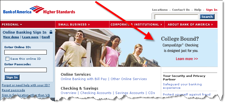
 Bank of America’s homepage (see inset), devotes most of its promotional real estate to a student banking promotion. The picture grabs your attention and the Learn More links drops visitors onto a landing page that does a good job selling the account benefits.
Grade: A
2. Wells Fargo www.wellsfargo.com
 Wells Fargo doesn’t put near the emphasis on student banking as does Bank America. Instead, the bank uses one of its two small banners in the lower right to sell student loans (see inset). However, the banner is rotated with several other promotions, so it’s not always visible.
The graphic image isn’t particularly attractive, but the copy, Which Student Loan is Right for You? and Use our loan selector are good draws. However, upon clicking, users are forced into a selector tool with no option for general information first.
Grades:
B+ for the promotional graphics
C- for the landing page
3. Key Bank www.keybank.com
 Key Bank uses its Highlights box in the lower right to promote student checking (click on inset for closeup). With many users trained to ignore banners, this is an excellent way to gain attention. After clicking through, the landing page does a good job of selling account benefits, although the initial headline about its ATM rebates, Get up to $6* back each month, strikes us as a confusing way to start things off. It would be more effective to highlight the key benefit, FREE, right at the outset.
Grades:
A for the homepage promotion
A- for the landing page
4. M & T Bank www.mandtbank.com
 M&T’s approach is similar to Key Bank’s, a text link on the right of the homepage (see inset). It’s not quite as effective because the copy just floats on the page, there is no box to draw the eye to it. But with a relatively sparse homepage, the promotion should get noticed. The promised bonus should also improve click-throughs. However, the landing page needs to be reworked. Not only is there no mention of the promised free gift, there are too many navigational choices and no clear path for the user.
Grades:
B for homepage promotion
C for landing page
Outside the Top 25
Since we weren’t overly inspired by what we saw at the big banks, we decided to dig deeper in search of the ultimate back-to-school offer. Here’s what we found:
1. Tennessee State Bank www.tnstatebank.com
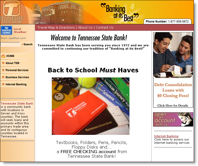
 After a Google or two we ended up at Tennessee State Bank, a $480-million asset bank headquartered in Pigeon Forge, TN. The bank’s homepage (click on inset) is dominated by a back-to-school promotion with a picture of its checkbook cover in the foreground with textbooks, a tennis ball, and maybe an adding machine in the background.
Not a great photo, but acceptable.
However, the copy is terrible.
Textbooks, Folders, Pens, Pencils,
Floppy Disks and…
a FREE CHECKING account from
Tennessee State Bank!
The free checking will get the attention of parents, but folders and floppy disks? That’s so 1990s. How about laptops, cell phones, or DVD players? Better yet, remember the medium. How about instant online transfers, free online banking, and 24/7 online service?
One final note: There is no hyperlink with the promotion. Neither the headline, photo or copy are clickable to another area to signup or even learn more.
Grades:
A for timeliness
D for execution
Update 9/1/05:
- National City added a small banner on the right promoting free student checking accounts.
- Citizens Bank (Royal Bank) is running a medium-sized banner in the lower portion of its homepage for student loans
—JB